Lecture 4
Multivariate Visualization
A picture is worth a thousand words. This may be especially true in statistics. While plotting univariate or even bivariate data is not too difficult, and we can learn much from such plots, multivariate data is much more difficult to visualize effectively. We often have a number of variables in a data set and we want to learn as much as we can about their relationships. We explore some techniques here.
One reason why many data analysts use R is because R can create graphics that are both informative and visually appealing without too much effort or time (if you use the right packages and know what you are doing). We will explore methods for visualizing multivariate data using three dominant plotting tools: base R plotting, plotting using the lattice package, and plotting using the ggplot2 package.
Base R Plotting
R comes built in with functions for plotting, the primary one being the plot() function, which we have seen before. It is a generic function that will often pick the right plot for the object passed to it. That said, we do have control over how to make a plot using base R.
A scatterplot plots each data point as an ordered \((x,y)\) pair, with \(x\) being the value of the variable corresponding to \(x\) for each data point, and \(y\) the value for the corresponding \(y\) variable. Thus scatterplots are useful for visualizing bivariate data.
We can make scatterplots using base R with plot(x, y), where x and y are numeric vectors containing the x and y coordinates to plot, respectively. The plot created by default will be a scatter plot, though there are many parameters for plot() that will change not only whether a scatterplot is drawn but other characteristics of the resulting plot, such as the extent of the axes, the character of the points, axis labels, and many others.
Suppose we wished to compare the sepal length of iris flowers to the petal length of iris flowers in the iris data set. We could do so in base R with the following:
plot(iris$Sepal.Length, iris$Sepal.Width)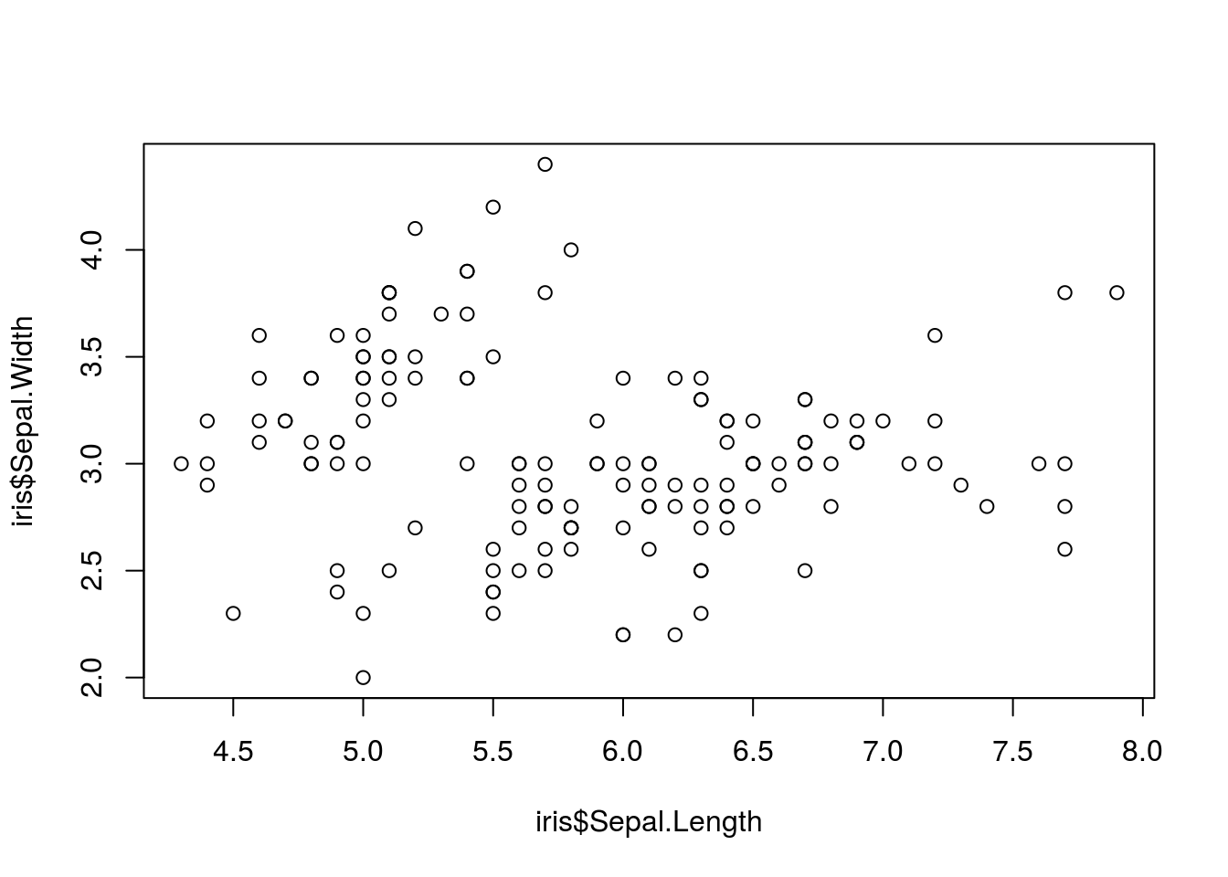
This plot gives us some basic information about these variables, but a lot is not shown. In particular, we know that there are three species of iris included in the iris data set, and we would like to display this information on the chart. We could do so using the following:
with(iris,
     # First, the scatter plot
     plot(Sepal.Length, Sepal.Width,
          # Make the color depend on the species
          col = as.numeric(Species),
          # Also make the character depend on the species
          pch = as.numeric(Species),
          # Some labels to make the plot more informative
          xlab = "Length", ylab = "Width", main = "Dimensions of the sepal of iris flowers"
          )
     )
# Add a legend to the plot
legend(
  # The first two arguments are the coordinates of the legend on the plot
  6.1, 4.4,
  # The next argument is the species of flower to label
  c("setosa", "versicolor", "virginica"),
  # The colors used for encoding
  col = 1:3,
  # The character used for encoding
  pch = 1:3
)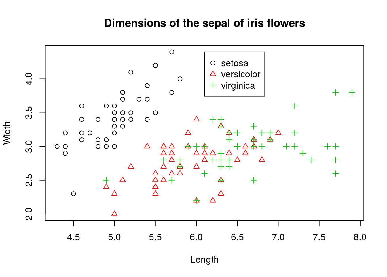
We kept the scatterplot, but distinguished different species by color. To further differentiate points, we also changed the shape of the points and made them depend on species. In other words, we doubly encoded the species information in both the shape and color of the points in the scatterplot.
Suppose we don’t want all the species on the same plot. Versicolor and virginica flowers are intermixed, making them difficult to distinguish in the plot. We may try to create three plots side-by-side by changing the settings of a function called par(), which controls how plots are created. The following code does so:
width_range <- range(iris$Sepal.Width)
length_range <- range(iris$Sepal.Length)
# Manually split into three datasets
iris_setosa <- subset(iris, subset = Species == "setosa")
iris_versicolor <- subset(iris, subset = Species == "versicolor")
iris_virginica <- subset(iris, subset = Species == "virginica")
# The par function controls plotting parameters like margin size, borders,
# and many others. For this purpose, we would like to use margin to allow us
# to plot multiple plots, specifically in a 1x3 grid. The parameter we can
# set with par to control this is mfrow, which we set with a length 2 vector
# with the first coordinate being the number of rows, and the second
# coordinate being the number of columns. First, save the current par
# settings:
old_par <- par()
# Now, change the settings
par(mfrow = c(1, 3))
# After setting this way, we call plots as usual, but when they are made
# they will be added to the 1x3 graphic left-to-right, top-to-bottom.  I
# also use formula notation to create the plot here. To make a (x,y) plot,
# use y ~ x.
plot(Sepal.Width ~ Sepal.Length, data = iris_setosa, ylim = width_range, xlim = length_range,
    main = "setosa")
plot(Sepal.Width ~ Sepal.Length, data = iris_versicolor, ylim = width_range,
    xlim = length_range, main = "versicolor")
plot(Sepal.Width ~ Sepal.Length, data = iris_virginica, ylim = width_range,
    xlim = length_range, main = "virginica")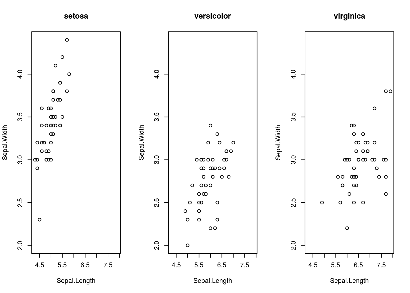
# You should reset par to its original settings once done, or you will
# continue to get plots using these settings, which may not be what you
# want.
par(old_par)
## Warning in par(old_par): graphical parameter "cin" cannot be set## Warning in par(old_par): graphical parameter "cra" cannot be set## Warning in par(old_par): graphical parameter "csi" cannot be set## Warning in par(old_par): graphical parameter "cxy" cannot be set## Warning in par(old_par): graphical parameter "din" cannot be set## Warning in par(old_par): graphical parameter "page" cannot be setNow, suppose that a third variable we wish to plot is numerical rather than categorical. We may use a bubbleplot to do so, where we create a scatterplot but each point in the scatterplot is a circle with area representing the value of a third variable. (Note that the third variable must be encoded by area, not diameter! This is because people percieve area, not diameter, and using diameter to encode information rather than area will create plots that are confusing and misleading.) We can create a bubble chart in R by making the cex parameter in plot(), which controls the size of points, dependant on one of the variables in the data set.
The following plot is a bubbleplot that shows states average teacher salary, average total SAT score, and encodes the percentage of SAT takers as the area of the bubbles.
# The SAT data is in UsingR
library(UsingR)
plot(total ~ salary, data = SAT,
     # filled circles
     pch = 16,
     # rgb is a function for creating colors via RGB values. The alpha parameter controls transparency. I make the circles semi-transparent.
     col=rgb(red = 0, green = 0, blue = 0, alpha = 0.250),
     # cex controls the size (length) of the points. The following makes the points' area dependant on the perc variable in SAT, with division by 10 just to keep sizes under control
     cex = sqrt(perc/10))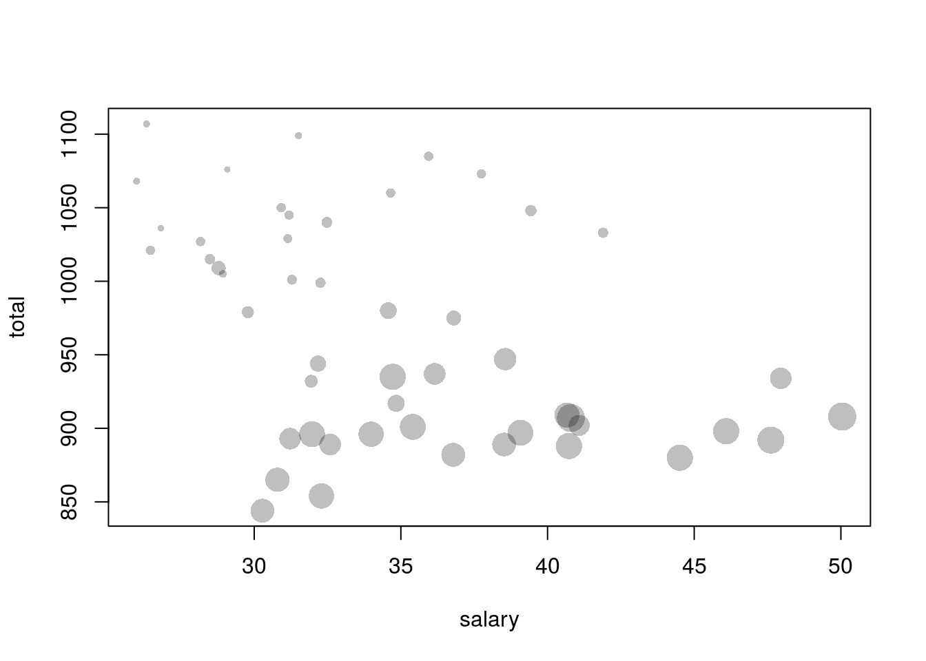
So far, we have seen ways to visualize three variables together, basing our graphics on scatterplots. What about data sets with more than three variables?
A scatterplot matrix creates multiple scatterplots in a grid (matrix), each showing a different combination of variables. The variables become the rows and columns of the matrix, and the plot in a particular row and column of the matrix represents a particular combination of the variables.
The pairs() function will create scatterplot matrices. The first argument passed to it is a data frame containing the data to be plotted, and other parameters can change details about how the plot is made. I create a scatterplot matrix for the iris dataset below.
pairs(iris[c("Sepal.Length", "Sepal.Width", "Petal.Length", "Petal.Width")],
      # Make color depend on species
      col = iris$Species)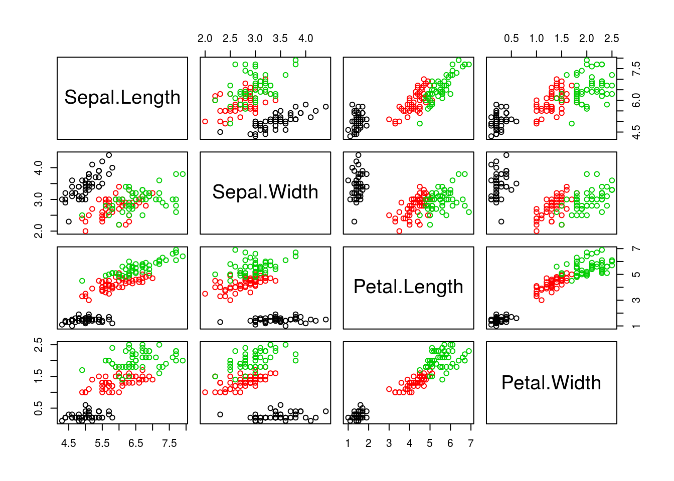
Another way to visualize multivariate data is with a parallel coordinate plot. This plot will display variables as vertical axis lines and data points as lines connecting the axes. The point where a data point line intersects an axis represents the value of that variable for that data point.
The parcoord() function (in the MASS package) creates parallel coordinate plots. The first argument is a data frame containing the data to be plotted, and other parameters control other features of the resulting plot. An example for the iris data is shown below.
library(MASS)
parcoord(iris[c("Sepal.Length", "Sepal.Width", "Petal.Length", "Petal.Width")],
    col = iris$Species)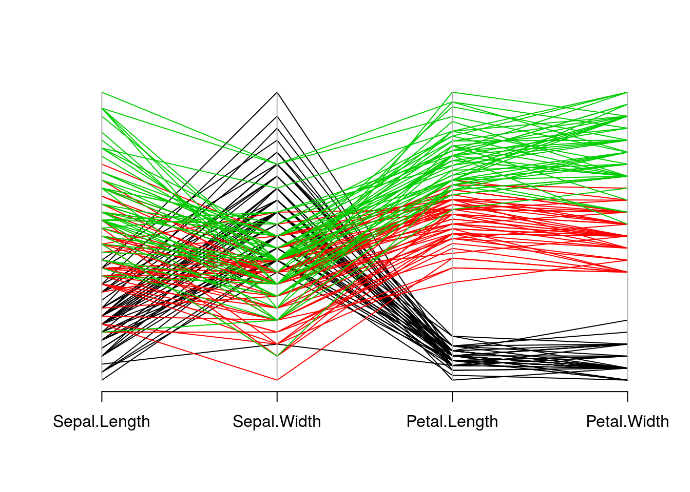
A heatmap is a matrix where the rows are data points, columns are variables, and in each cell of the matrix the value of a variable for an observation is represented in color. The hue or intensity of the color depends on the value of the variable.
The heatmap() function will create heatmaps in R. The first argument is the numeric matrix with the data to plot. I create a heatmap for the mtcars data set below.
heatmap(as.matrix(mtcars), Rowv = NA, Colv = NA)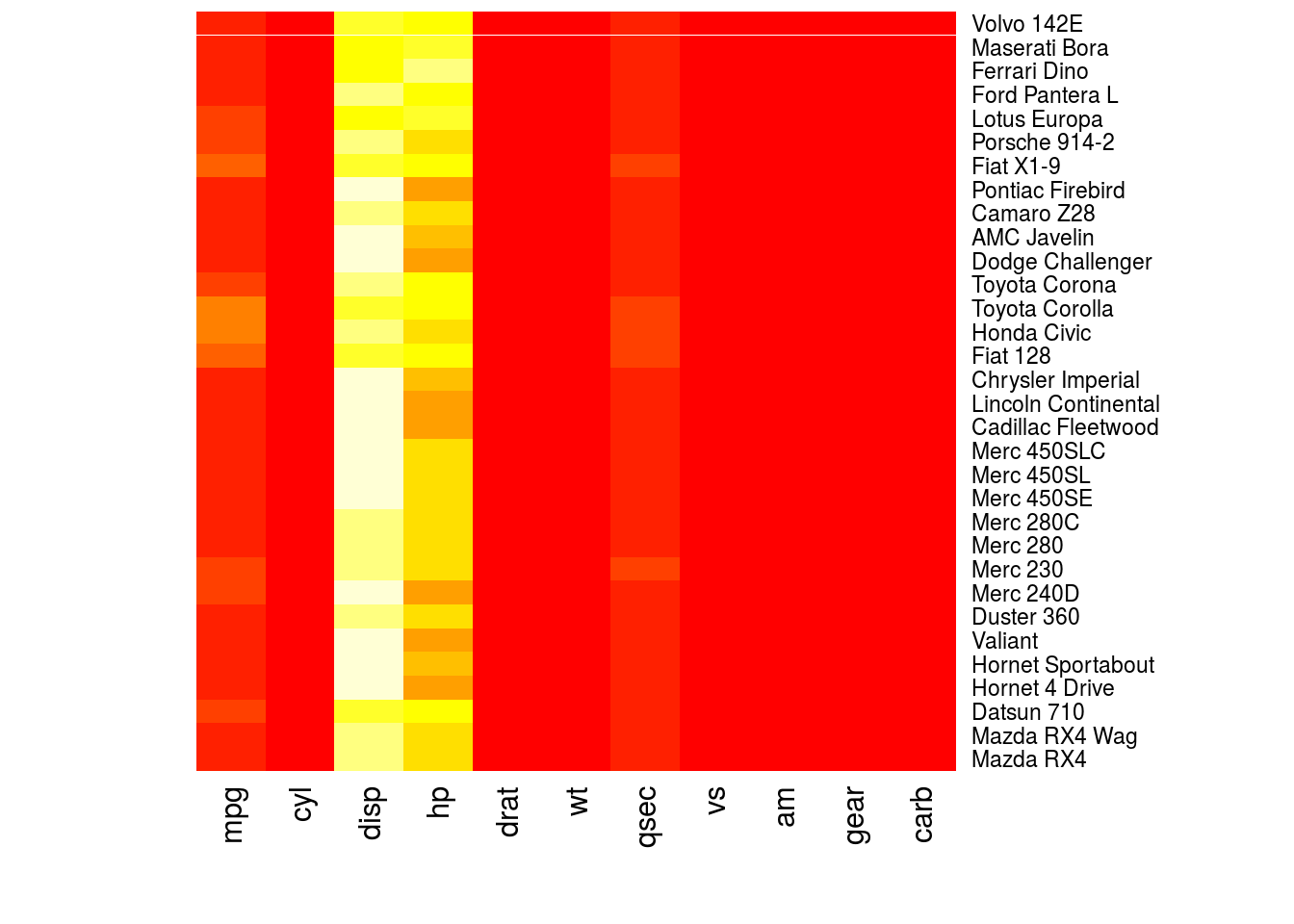
# This is not a useful plot; the heatmap function thinks that all the
# observations are in the same units. What I will do is create a numeric
# matrix with the standardized value of each variable, where I subtract the
# mean of each variable from each observation, then divide by the standard
# deviation.
plotmat <- sapply(mtcars, scale)
rownames(plotmat) <- rownames(mtcars)
heatmap(plotmat, Rowv = NA, Colv = NA)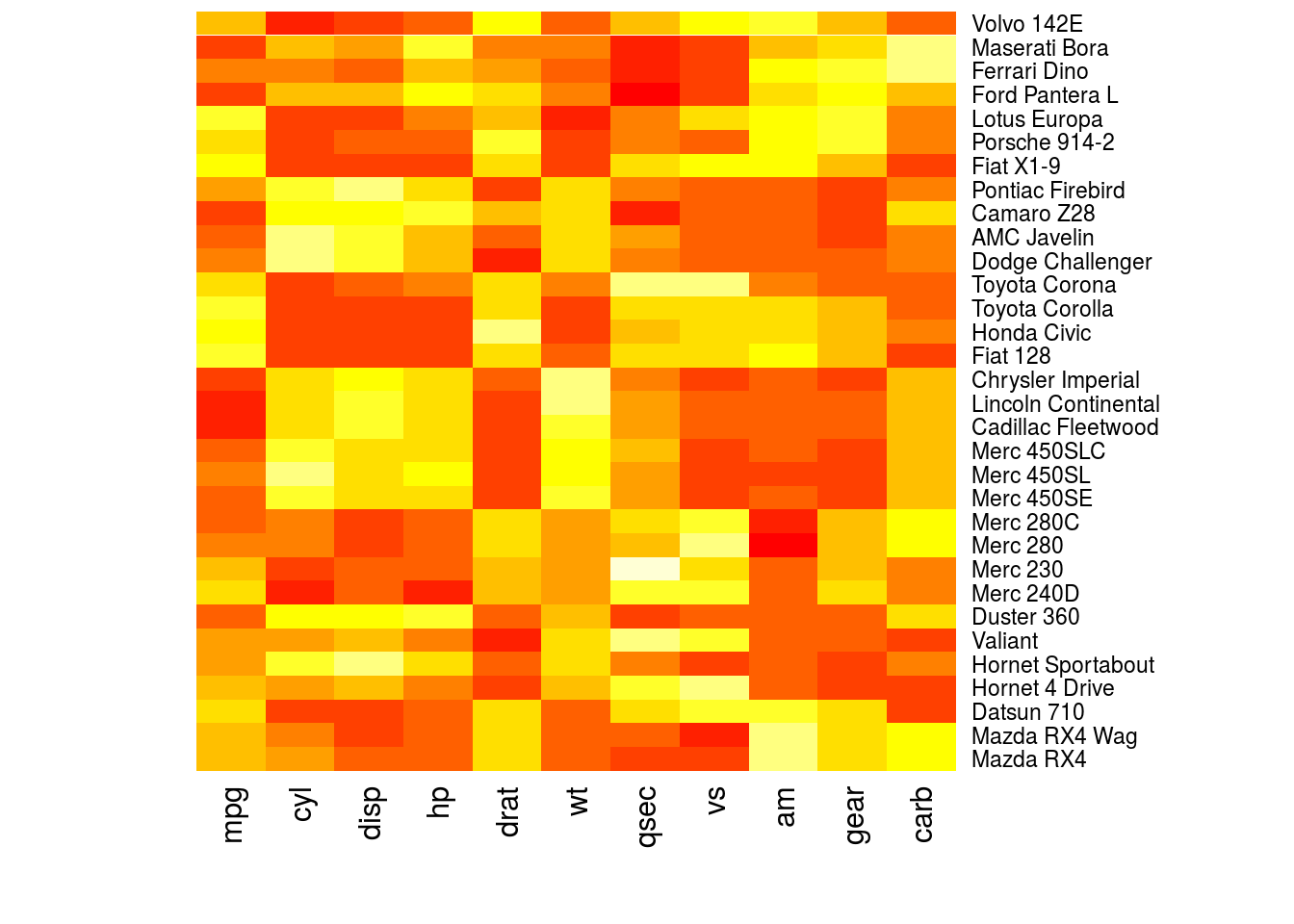
Plotting with base R has the advantage that all installations of R include the base R systems. All other plotting implementations are best seen as useful user interfaces for the existing base R system (particularly a plotting system called grid, which is the basis of lattice and ggplot2). Additionally, plot() is a generic function that can be programmed to create the most useful plot for the object passed to it.
That said, many data analysts prefer to use packages such as lattice or ggplot2 for much of their graphical work, avoiding base R plotting. Unless there is a convenience function or plot() method for whatever plot you wish to make, it can be unacceptably tedious to make plots using only base R, especially if they are complex plots. The legend we created for the second iris scatterplot, for example, needed a legend, which we created manually in a manner both tedious and not very robust to changes in the plot.
lattice Plotting
One of the first packages made to make plotting in R easier was the lattice package, which is now included with standard R installations. lattice aims to make creating graphics for multivariate data easier, and relies on R’s formula notation to do so.
We can create a basic scatterplot in lattice using xyplot(y ~ x, data = d), where y is the y-variable, x the x-variable, and d the data frame containing the data.
library(lattice)
xyplot(Sepal.Width ~ Sepal.Length, data = iris)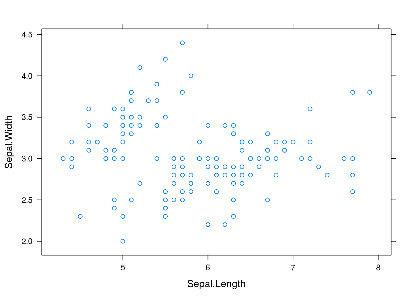
What if we wish to create multiple plots, breaking up the plots by different categorical variables? We can do so with xyplot(y ~ x | c, data = d), where all is as before but c is a categorical variable with which we break up the plots.
xyplot(Sepal.Width ~ Sepal.Length | Species, data = iris)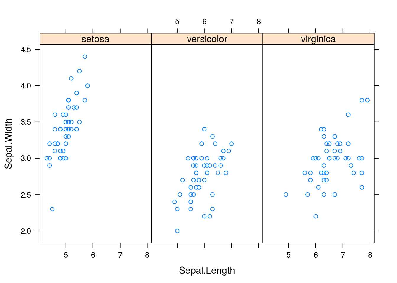
# Compare to the solution with base RThe aim of lattice is to create complex graphics using a single function call. Thus we can create other interesting graphics in lattice that we could make in base R. Some examples are shown below.
# Lattice comparative dotplot of iris petal length
dotplot(Species ~ Petal.Length, data = iris)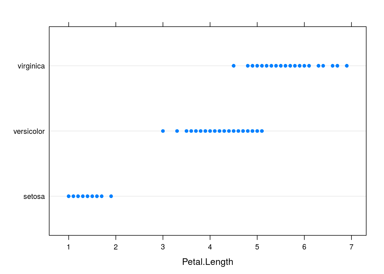
# Lattice comparative boxplot, which resembles the base R comparative
# boxplot in style
bwplot(Species ~ Petal.Length, data = iris)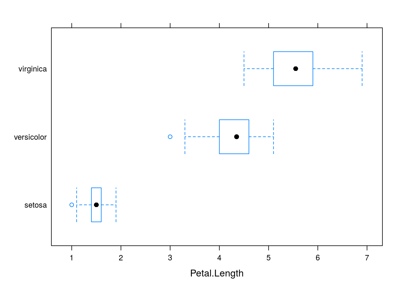
# For the Cars93 data set, let's look at price depending on the type of car
# and the origin of the car
dotplot(Price ~ Type | Origin, data = Cars93)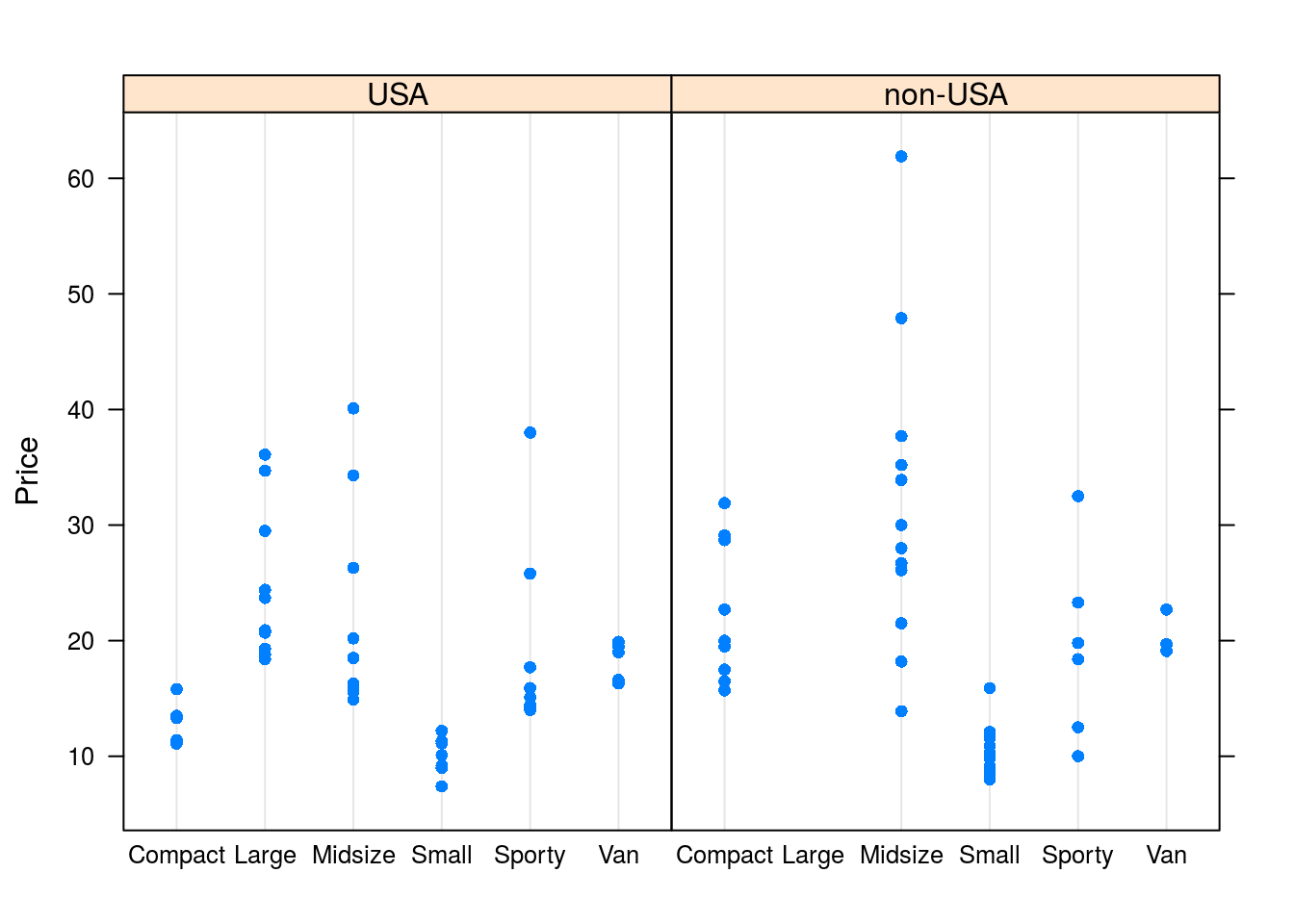
bwplot(Price ~ Type | Origin, data = Cars93)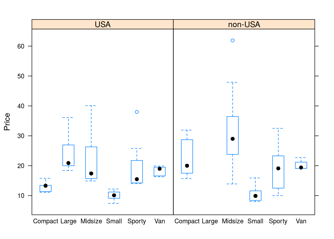
# We can also make histograms and density plots, though since these do not
# lend well to comparison, we must leave the left side of the formula blank.
histogram(~Price | Origin, data = Cars93)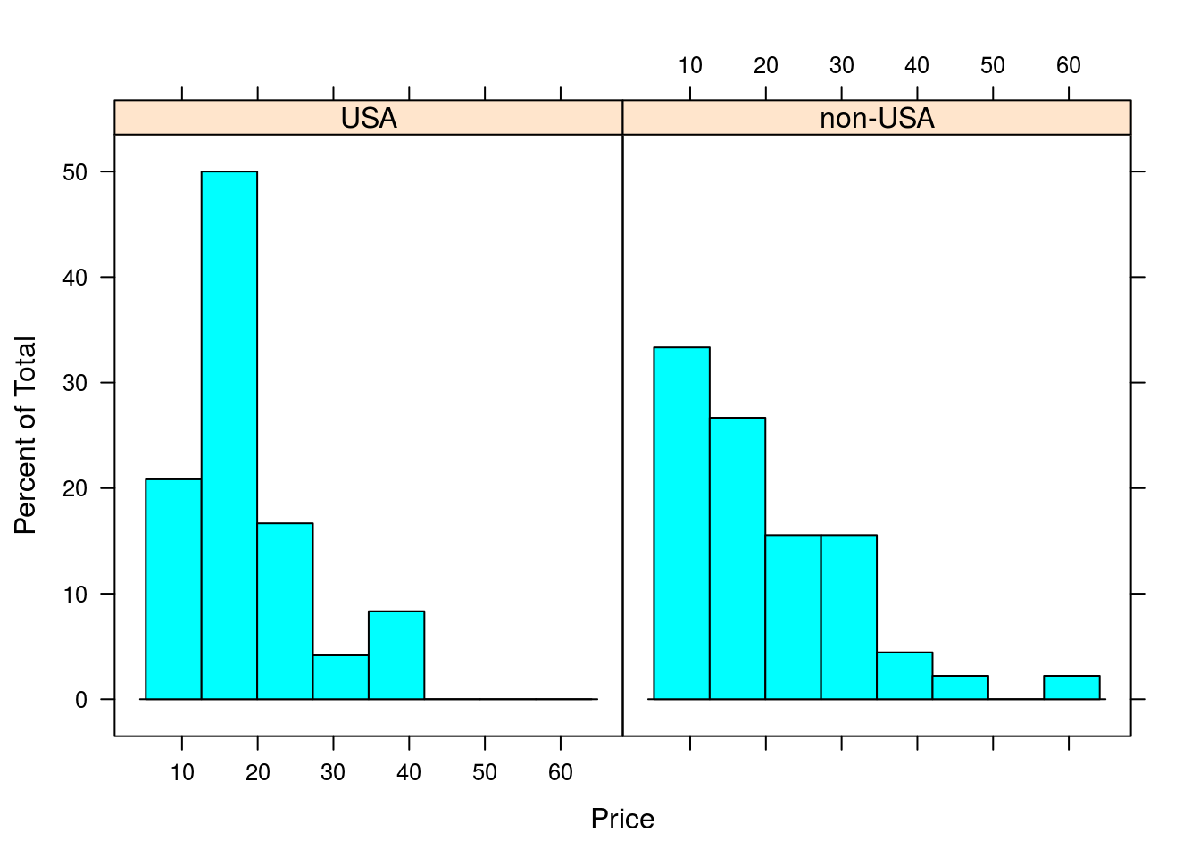
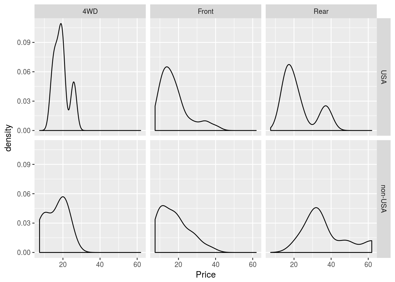
densityplot(~Price | Origin, data = Cars93)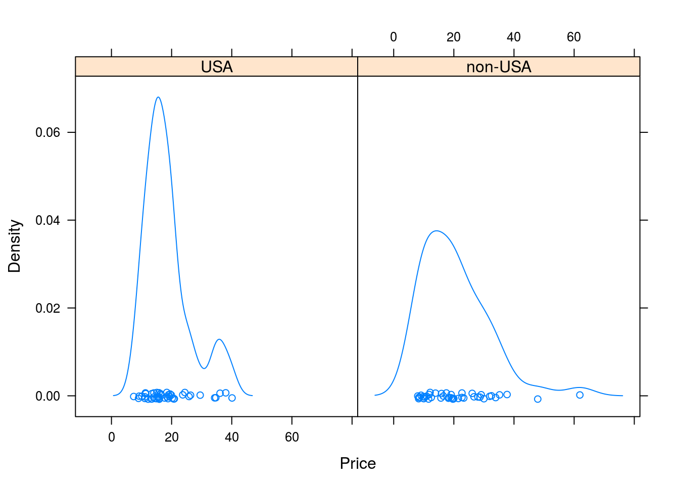
ggplot2 Plotting
A more recent plotting system than either base R’s plotting functions or lattice is ggplot2, by Hadley Wickham. Again, ggplot2 builds on existing graphical systems in R (specifically, grid, just like lattice), but graphics are built using what one may call a mini-language based on Wilkinson’s The Grammar of Graphics. This means that one does not learn ggplot2 without additionally learning graphical theory; the two are intertwined here. While it takes some effort to learn ggplot2, perhaps more so than lattice, once learned, it allows for complex yet visually appealing graphics to be created in a natural way. (ggplot2 is my preferred system for creating graphics, and the one I used to make the graphics in this report.)
ggplot2 has two primary functions for creating graphics,qplot() and ggplot(). qplot() is intended for making quick plots in a manner similar to plot() in base R, though it’s not a generic plotting function like plot(). ggplot() is more involved than qplot(), requiring that data be stored in a data frame in order for it to be plotted. That said, ggplot() is the go-to plotting function for more involved plots. I will cover both of these functions here.
qplot()
The first two arguments passed to qplot() are the data to be plotted. For example, I can make a scatterplot with qplot() as follows:
library(ggplot2)
qplot(iris$Sepal.Length, iris$Sepal.Width)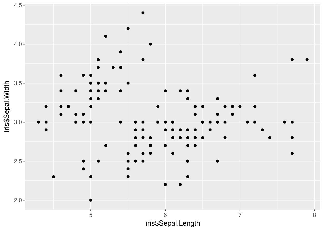
# The $ notation gets annoying after a while. Thankfully, we have a data
# argument to clean things up.
It’s easier to add complexity to this plot. Additionally, qplot() will add a legend automatically (as opposed to the headache of manually adding a legend in base R plotting). Below I color each point based on species, and also change the shape of the point again based on species.
qplot(iris$Sepal.Length, iris$Sepal.Width, color = iris$Species, shape = iris$Species)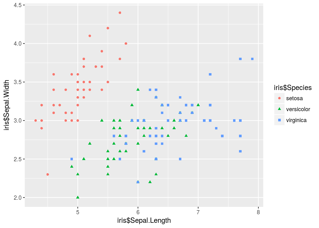
If I want to make a different plot, I need to change the geom, the visual channel through which information is communicated, as shown below when making a histogram, density plot, or comparative box plot.
# The $ notation gets annoying after a while. Thankfully, we have a data
# argument to clean things up.
qplot(Petal.Length, data = iris, geom = "histogram")
## `stat_bin()` using `bins = 30`. Pick better value with `binwidth`.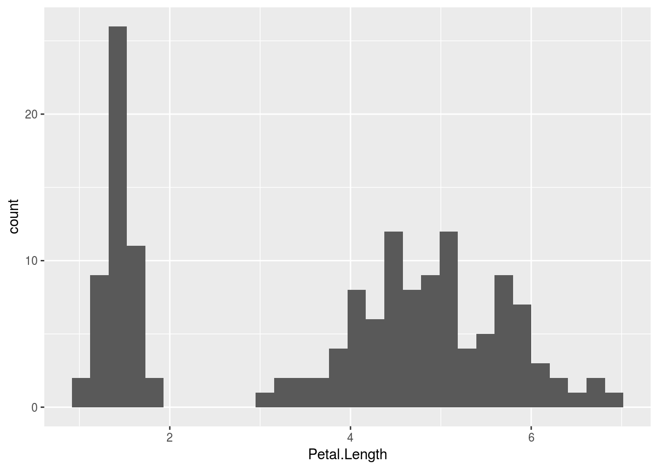
qplot(Petal.Length, data = iris, geom = "density")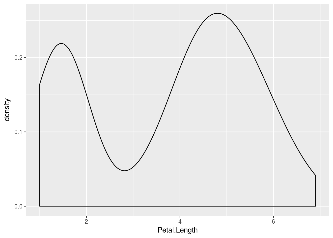
# If I only want one box, I could do so with the following;, where group
# goes first (I made a dummy grou, '')
qplot("", Petal.Length, data = iris, geom = "boxplot")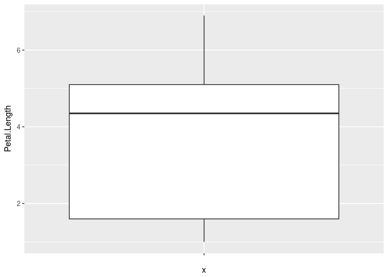
# If I want a comparative boxplot, I would do so by specifying population
# first, data second
qplot(Species, Petal.Length, data = iris, geom = "boxplot")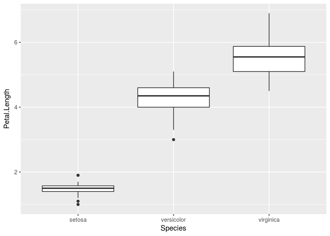
ggplot2 allows graphics to be themed. Color and shape choices are made automatically by default (though they can be changed), and the decision is made based on the current theme being used. Using different themes may lead to different choices in, say, color, being made. This is advantageous since one can worry about how information is being communicated without necessarily worrying about some of the specifics (e.g., we can tell R to communicate groups by color without thinking about what colors are being used).
The default theme used by both qplot() and ggplot() is theme_grey(). Other themes are included in ggplot2. The package ggthemes includes more themes (often based on graphics created in publications such as The Economist, The Wall Street Journal, other software packages such as Microsoft Excel, or emulating particular famous authors such as Edward Tufte), and it is possible for you to create your own original theme. You can change a theme by “adding” it to a graphic. (ggplot2 overloads the + operator to have a particular meaning when “adding” things to a gg- or ggplot-class object).
# Unlike with base R plots or lattice graphics, we can store plots made with
# ggplot in objects, as I demonstrate below:
p <- qplot(Sepal.Length, Sepal.Width, data = iris, color = Species, shape = Species)
# We can view the plot either with print(p) or by calling the object
# directly (i.e. just p).  The default theme_grey() theme
print(p)
# Other themes:
p + theme_bw()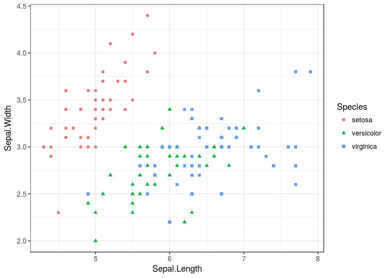
p + theme_classic()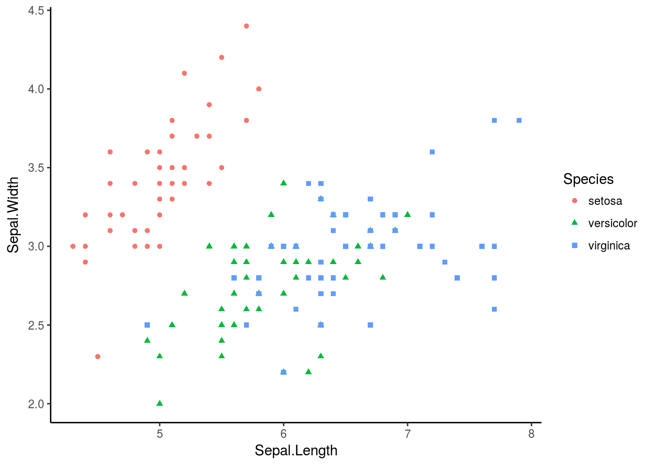
p + theme_dark()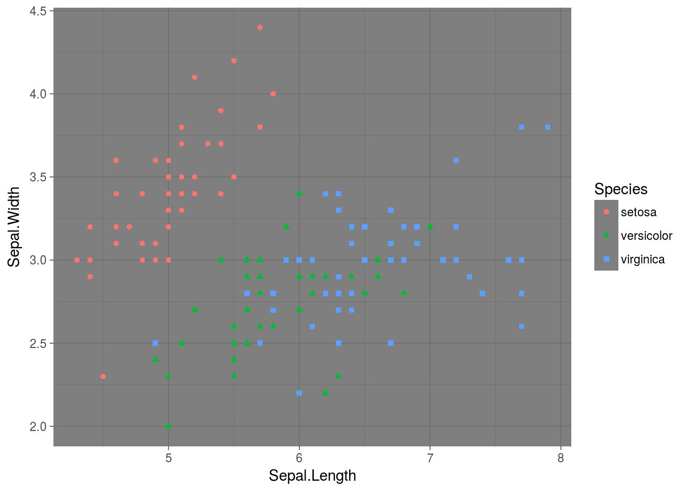
p + theme_minimal()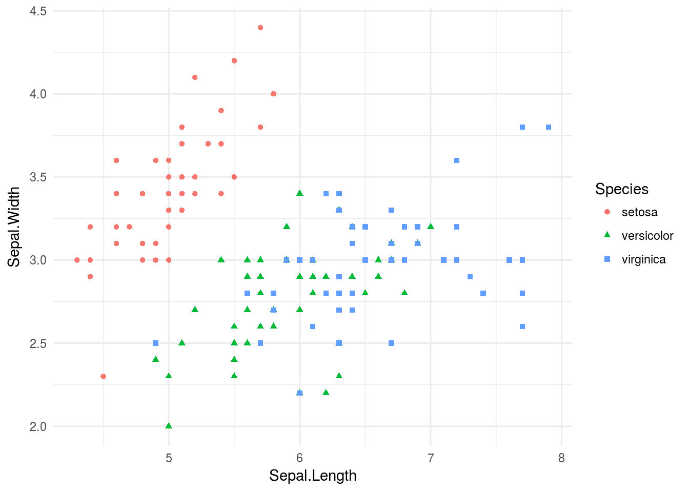
p + theme_void()
ggplot()
ggplot() is the main function of ggplot2, with qplot() being merely a simplified version of ggplot(). Unlike qplot(), which can accept data in the form of vectors, data passed to ggplot() must be a data frame! This restriction allows ggplot() to create graphics in a consistent way (you can even design a graphic on one data set, then simply swap that data set out with another and have the graphic still work.)
Three important building blocks for building graphics using ggplot() (aside from theme elements, like specific colors used, labels, or titles) are aesthetics, geoms, and stats. Aesthetics, controlled by the aes() function, determine the visual channels through which information is transmitted (position, color, shape, etc.). Geoms determine how visual information is rendered; in other words, it translates aesthetics into graphics. A few functions, such as geom_point(), geom_line(), and many others, “add” geoms to a graphic. Finally, stats allow data summaries, such as histograms or density plots, to be created and then drawn, and come in the form of functions such as stat_summary(), stat_quantile(), and many others.
Let’s visualize the iris data set, this time using ggplot().
# Notice that I layer on geoms with +, which has been overloaded to work appropriately for ggplot2 objects
p <- ggplot(iris) +   # Create the basic plot object
  geom_point(aes(x = Petal.Length, y = Petal.Width, shape = Species, color = Species)) +   # Create a dot plot with sepal lenght being x, petal width y, and species both shape and color
  xlab("Petal Length") +  # Add axis labels
  ylab("Petal Width") +
  ggtitle("Petal Length and Petal Width of Iris Flowers")
# Let's see the result!
print(p)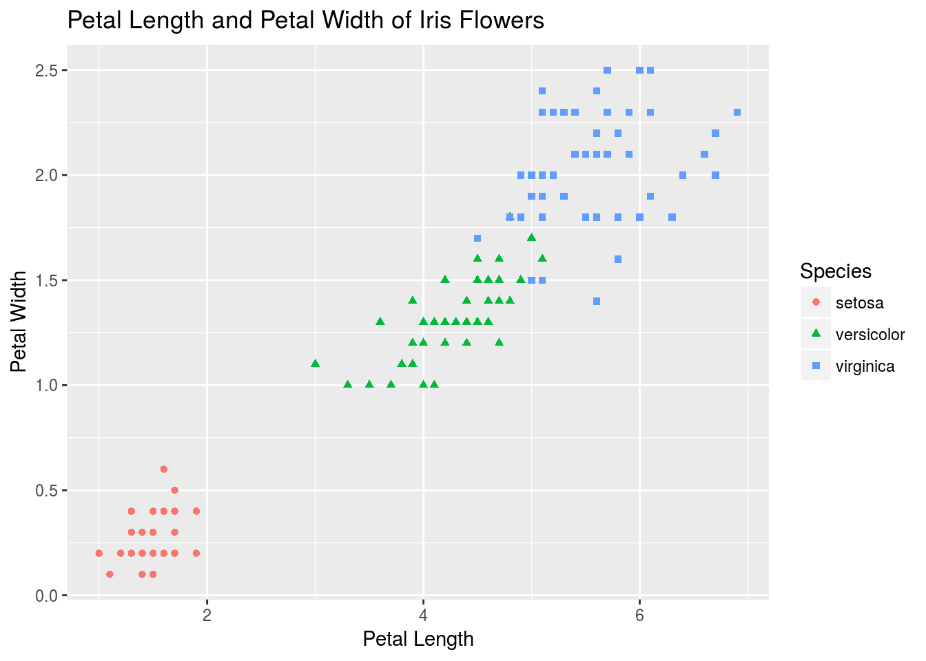
# Let's add a stat that creates a 2D density plot
p + stat_density2d(aes(x = Petal.Length, y = Petal.Width, group = Species, color = Species))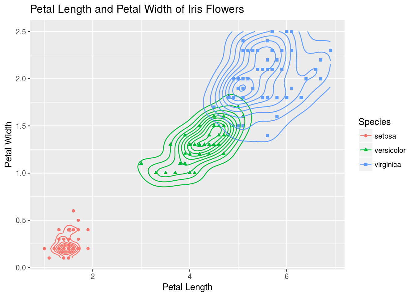
# Now let's look just at iris sepal length. We initialize a basic object and swap out geoms to look at different plots.
# First, create the basic object:
q <- ggplot(iris, aes(y = Sepal.Length, x = Species, color = Species)) +
  xlab("Species") +
  ylab("Sepal Length") +
  ggtitle("Comparison of Sepal Length Among Iris Flowers")
# I first look at a boxplot
q + geom_boxplot()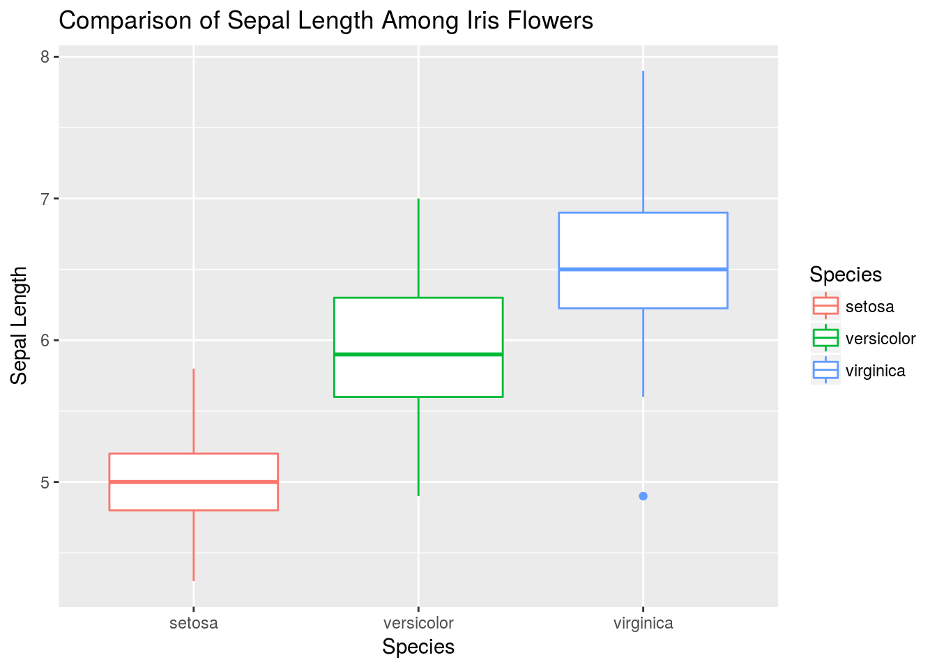
# An alternative to the boxplot is the violin plot
q + geom_violin(aes(fill = Species))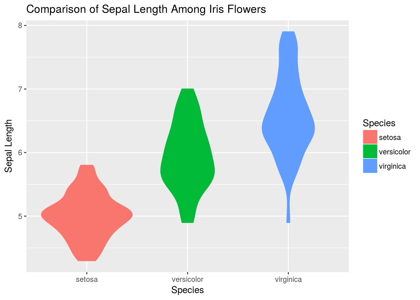
# Or we can plot jittered data
q + geom_jitter(width = .25)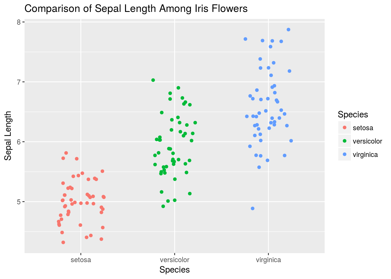
# Here is a more complex, layered graphic
q + geom_violin(alpha = .6) +
  geom_jitter(width = .25, alpha = .4) +
  stat_summary(size = 1, fun.data = median_hilow)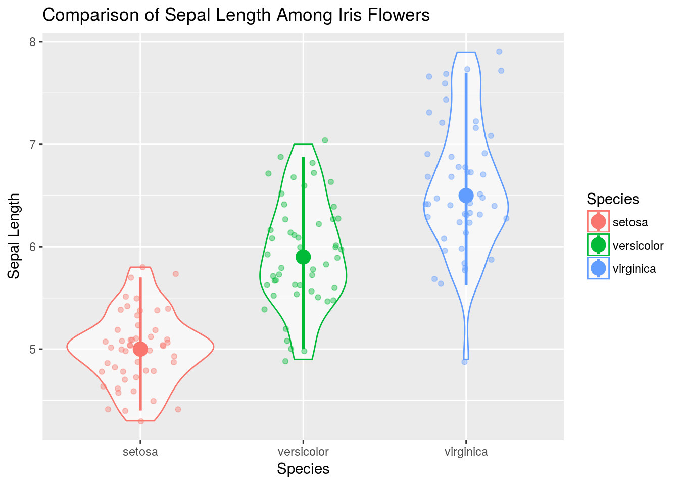
Graphics that would be very difficult to make in base R or even lattice are almost effortless in ggplot2!
Like lattice, ggplot2 allows for splitting plots based on a variable. This is called faceting, and is controlled primarily by the facet_grid() function, added to a plot like any other function in ggplot2. face_grid(y ~ x) will break plots up according to the categorical variables x and y, where each row represents a different value for x and each column a different value for y. If you don’t wish to facet according to two variables, replace either x or y with a ., like . ~ y. I demonstrate faceting first on iris, then on Cars93.
# Create a plot as normal
ggplot(iris, aes(x = Sepal.Length, y = Sepal.Width, color = Species)) + geom_point() +
    # Create different plots for different species
facet_grid(. ~ Species)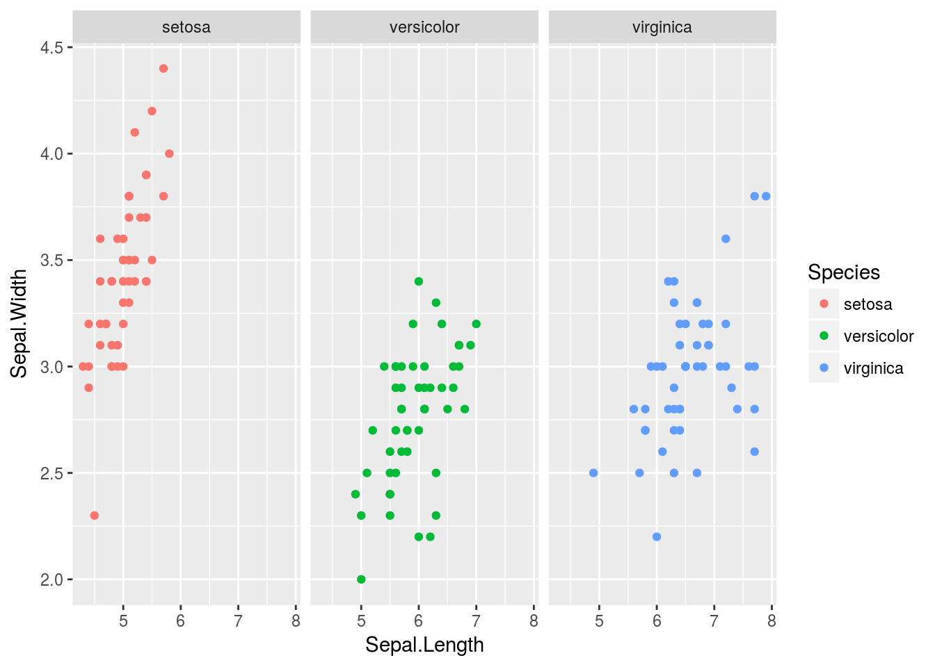
# Create a facet grid for price of cars depending on origin and drive train
p1 <- ggplot(Cars93, aes(x = Price))
p1 + geom_histogram() + facet_grid(Origin ~ DriveTrain)
## `stat_bin()` using `bins = 30`. Pick better value with `binwidth`.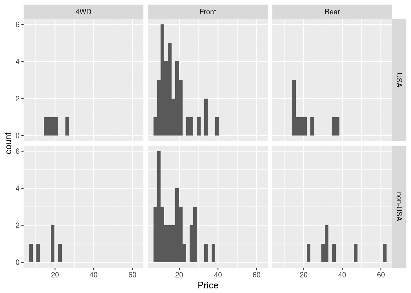
# We could try other plots as well
p1 + geom_dotplot() + facet_grid(Origin ~ DriveTrain)
## `stat_bindot()` using `bins = 30`. Pick better value with `binwidth`.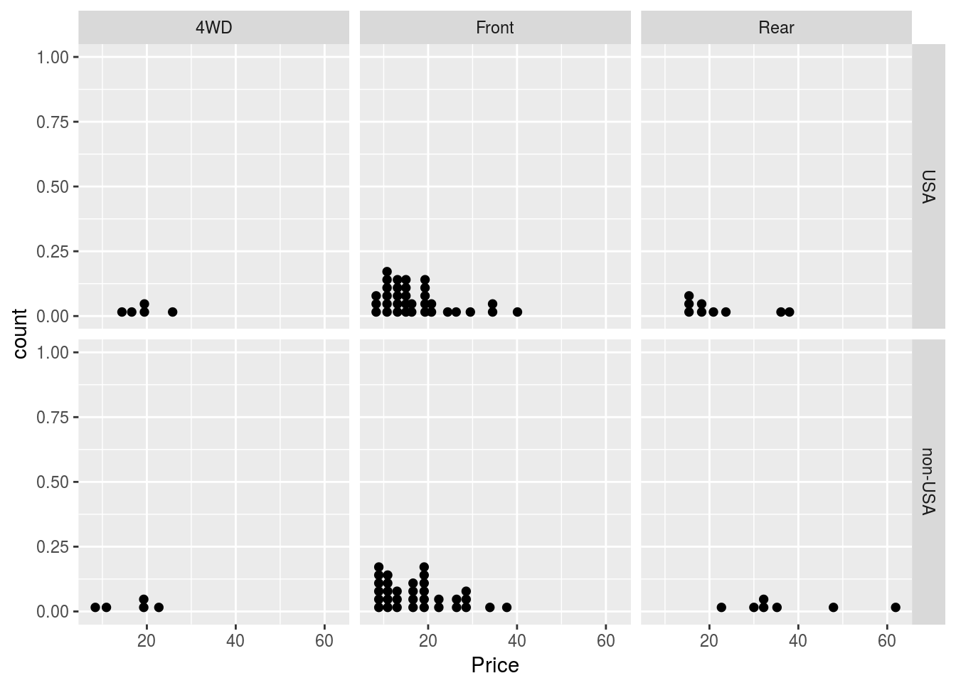
p1 + geom_density() + facet_grid(Origin ~ DriveTrain)