Lecture 6
lattice Plotting
One of the first packages made to make plotting in R easier was the lattice package, which is now included with standard R installations. lattice aims to make creating graphics for multivariate data easier, and relies on R’s formula notation to do so.
We can create a basic scatterplot in lattice using xyplot(y ~ x, data = d), where y is the y-variable, x the x-variable, and d the data frame containing the data.
library(lattice)
xyplot(Sepal.Width ~ Sepal.Length, data = iris)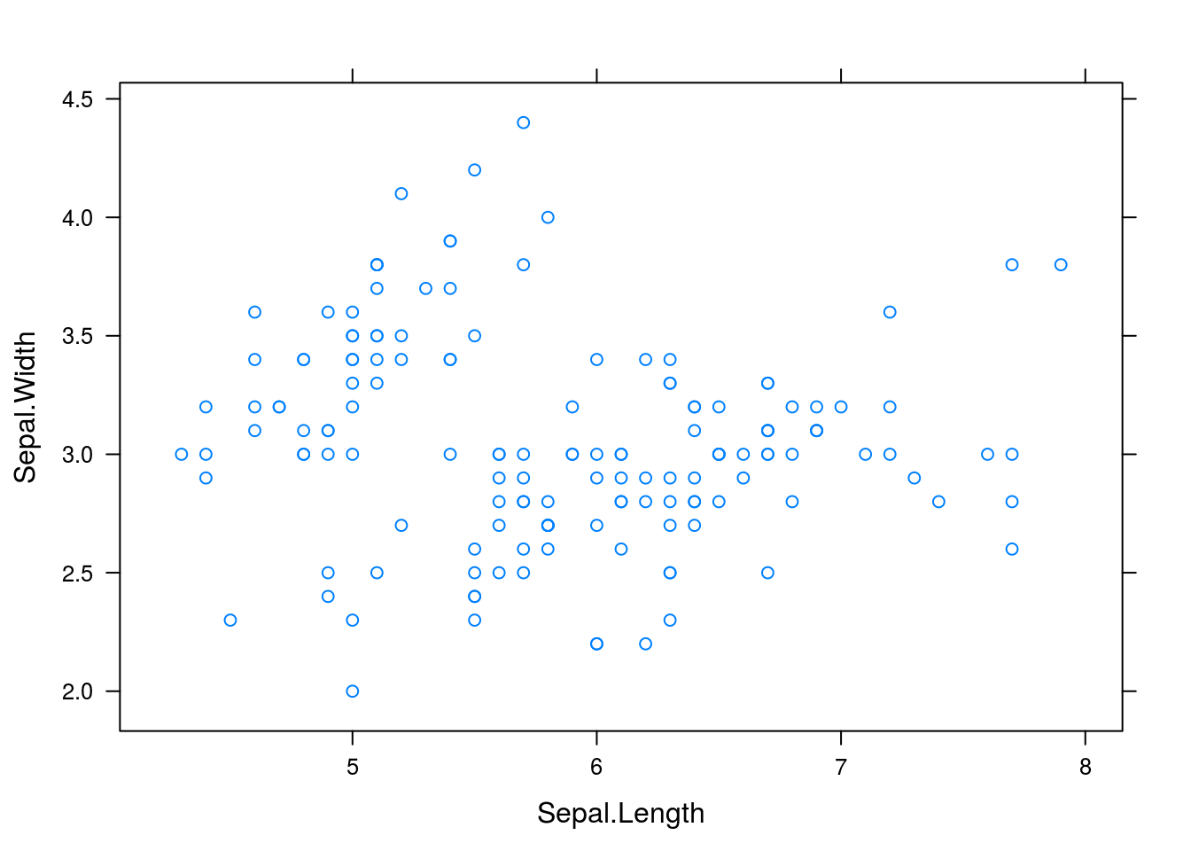
What if we wish to create multiple plots, breaking up the plots by different categorical variables? We can do so with xyplot(y ~ x | c, data = d), where all is as before but c is a categorical variable with which we break up the plots.
xyplot(Sepal.Width ~ Sepal.Length | Species, data = iris)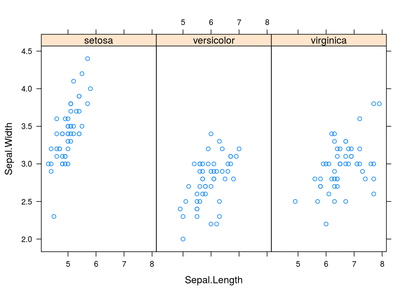
# Compare to the solution with base RThe aim of lattice is to create complex graphics using a single function call. Thus we can create other interesting graphics in lattice that we could make in base R. Some examples are shown below.
library(MASS)
# Lattice comparative dotplot of iris petal length
dotplot(Species ~ Petal.Length, data = iris)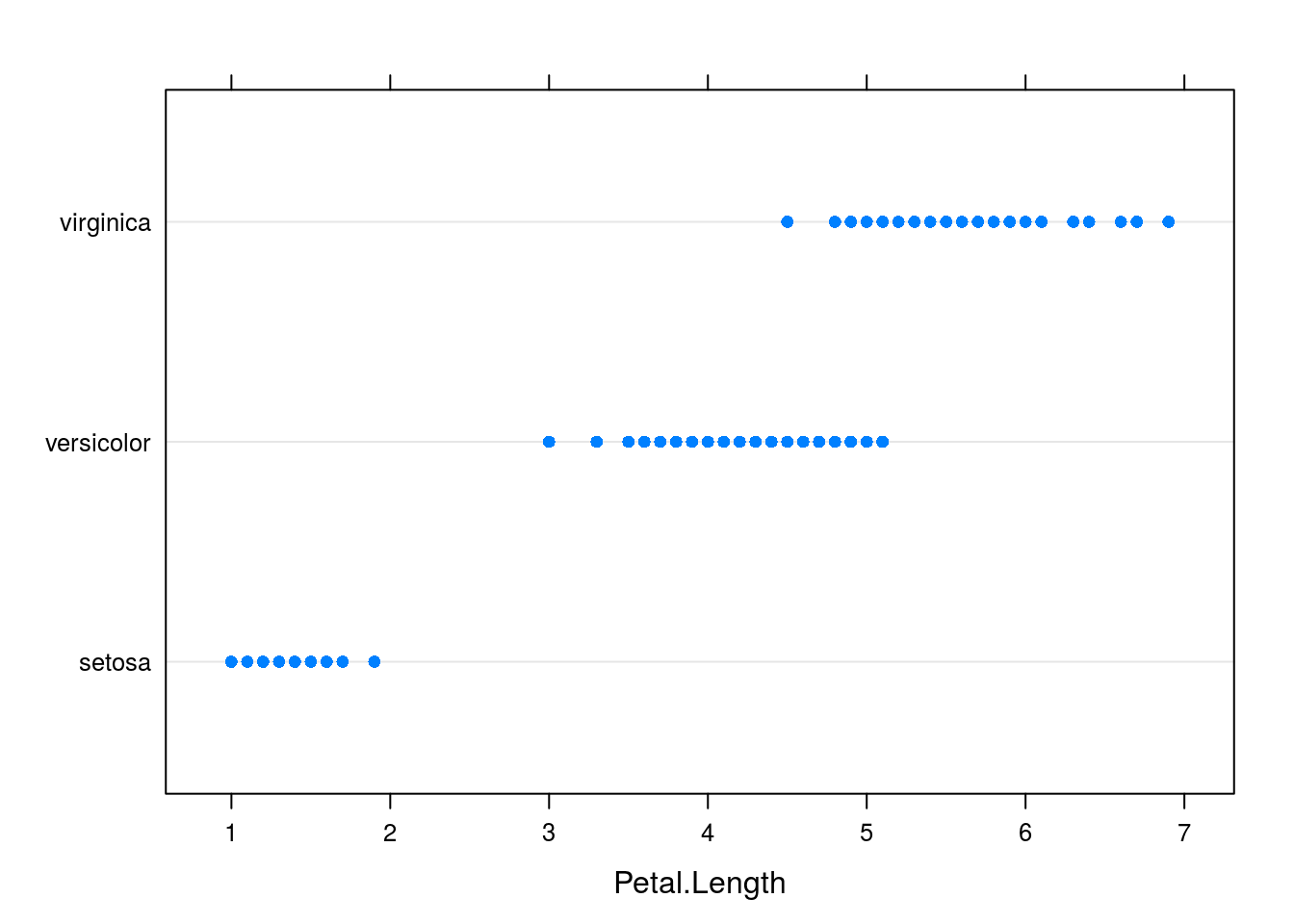
# Lattice comparative boxplot, which resembles the base R comparative
# boxplot in style
bwplot(Species ~ Petal.Length, data = iris)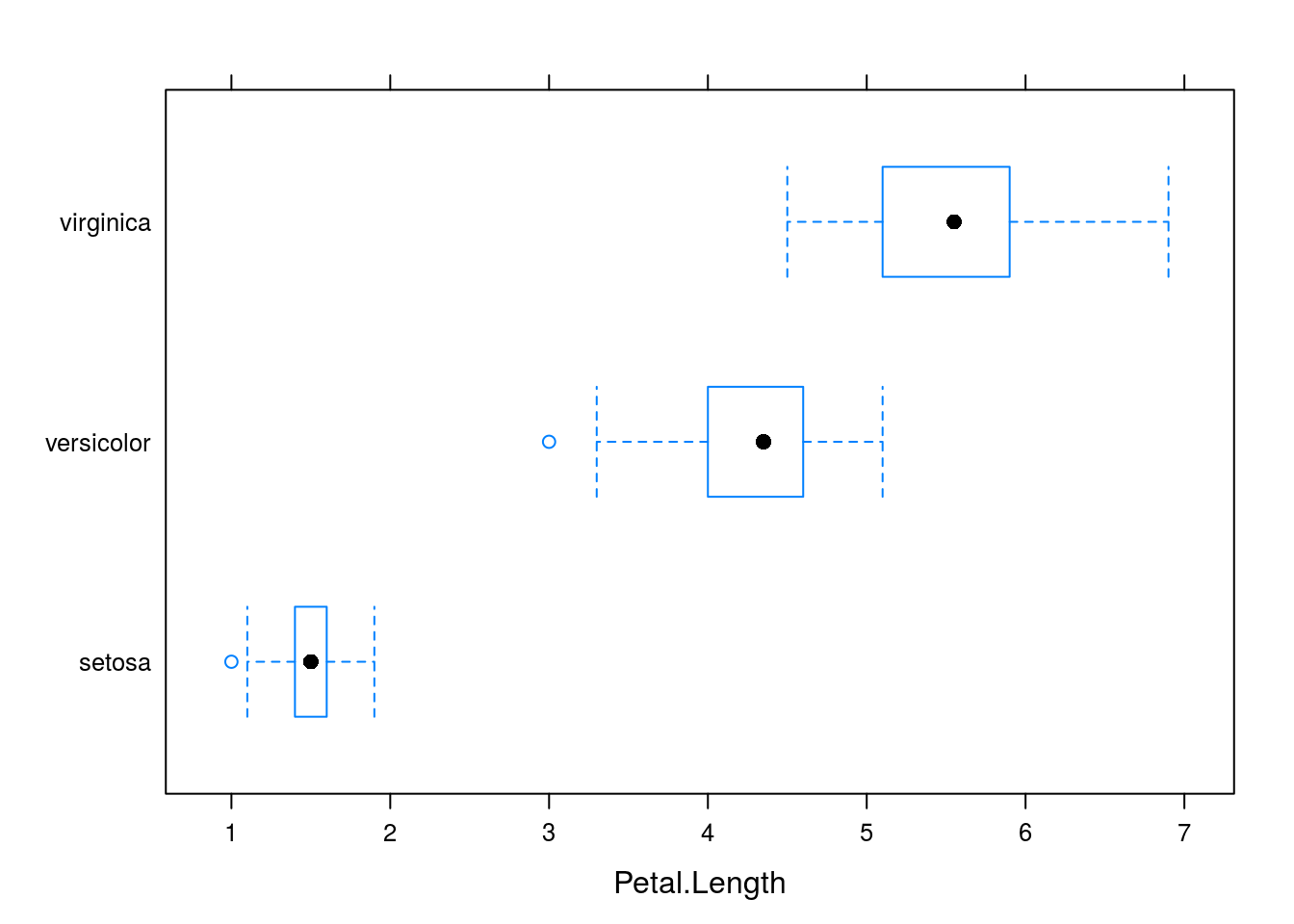
# For the Cars93 data set, let's look at price depending on the type of car
# and the origin of the car
dotplot(Price ~ Type | Origin, data = Cars93)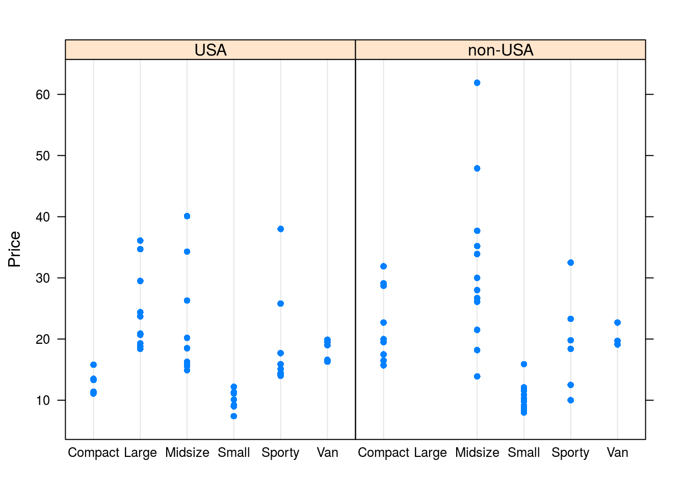
bwplot(Price ~ Type | Origin, data = Cars93)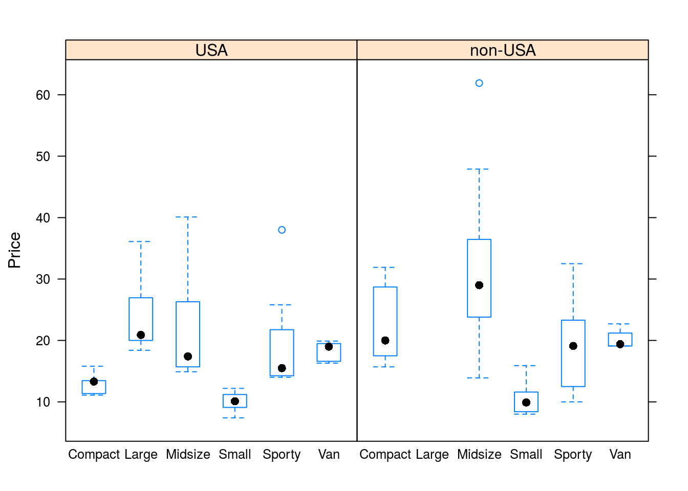
# We can also make histograms and density plots, though since these do not
# lend well to comparison, we must leave the left side of the formula blank.
histogram(~Price | Origin, data = Cars93)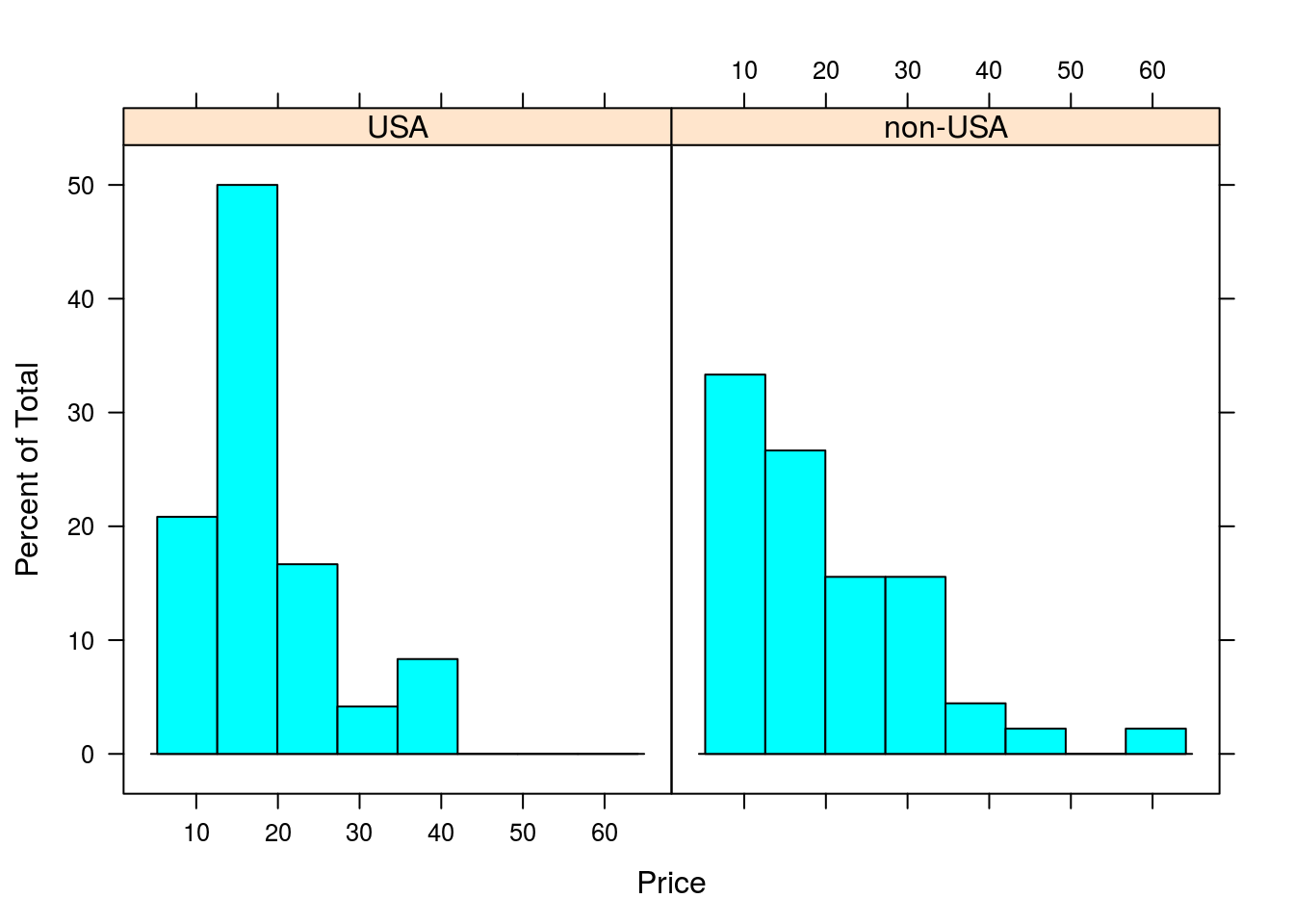
densityplot(~Price | Origin, data = Cars93)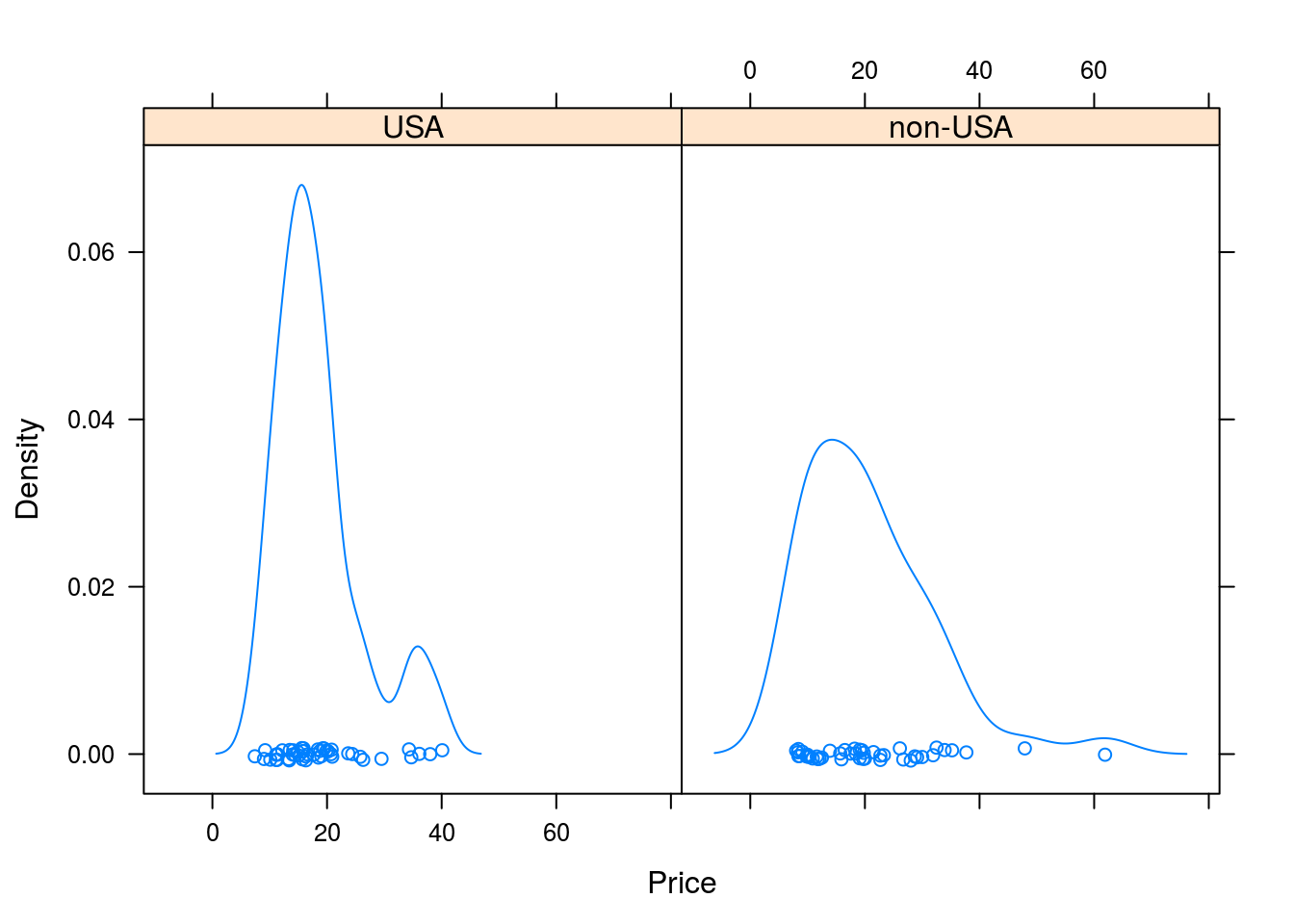
ggplot2 Plotting
A more recent plotting system than either base R’s plotting functions or lattice is ggplot2, by Hadley Wickham. Again, ggplot2 builds on existing graphical systems in R (specifically, grid, just like lattice), but graphics are built using what one may call a mini-language based on Wilkinson’s The Grammar of Graphics. This means that one does not learn ggplot2 without additionally learning graphical theory; the two are intertwined here. While it takes some effort to learn ggplot2, perhaps more so than lattice, once learned, it allows for complex yet visually appealing graphics to be created in a natural way. (ggplot2 is my preferred system for creating graphics, and the one I used to make the graphics in this report.)
ggplot2 has two primary functions for creating graphics,qplot() and ggplot(). qplot() is intended for making quick plots in a manner similar to plot() in base R, though it’s not a generic plotting function like plot(). ggplot() is more involved than qplot(), requiring that data be stored in a data frame in order for it to be plotted. That said, ggplot() is the go-to plotting function for more involved plots. I will cover both of these functions here.
qplot()
The first two arguments passed to qplot() are the data to be plotted. For example, I can make a scatterplot with qplot() as follows:
library(ggplot2)
qplot(iris$Sepal.Length, iris$Sepal.Width)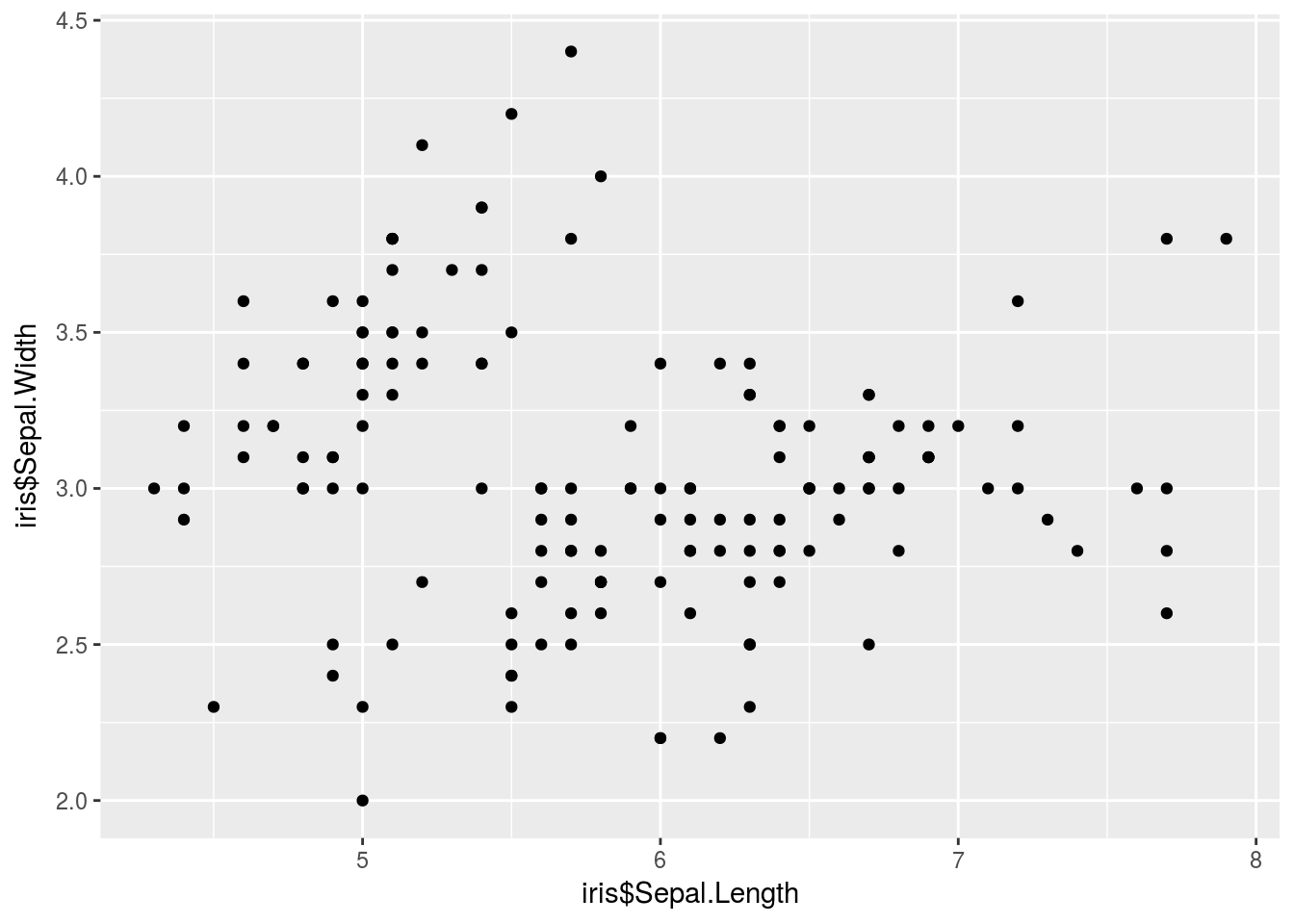
# The $ notation gets annoying after a while. Thankfully, we have a data
# argument to clean things up.
It’s easier to add complexity to this plot. Additionally, qplot() will add a legend automatically (as opposed to the headache of manually adding a legend in base R plotting). Below I color each point based on species, and also change the shape of the point again based on species.
qplot(iris$Sepal.Length, iris$Sepal.Width, color = iris$Species, shape = iris$Species)
If I want to make a different plot, I need to change the geom, the visual channel through which information is communicated, as shown below when making a histogram, density plot, or comparative box plot.
# The $ notation gets annoying after a while. Thankfully, we have a data
# argument to clean things up.
qplot(Petal.Length, data = iris, geom = "histogram")
## `stat_bin()` using `bins = 30`. Pick better value with `binwidth`.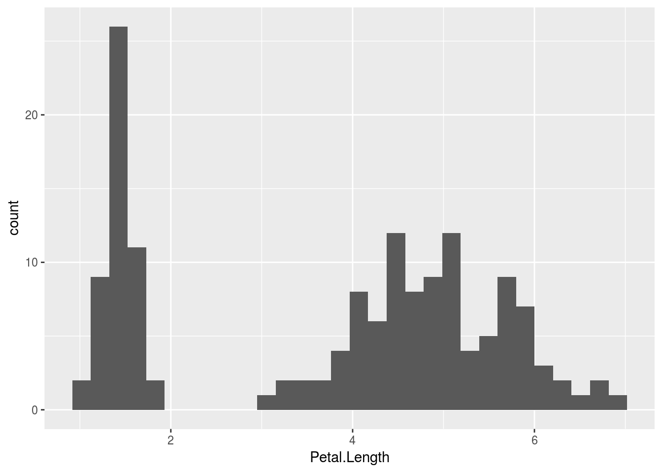
qplot(Petal.Length, data = iris, geom = "density")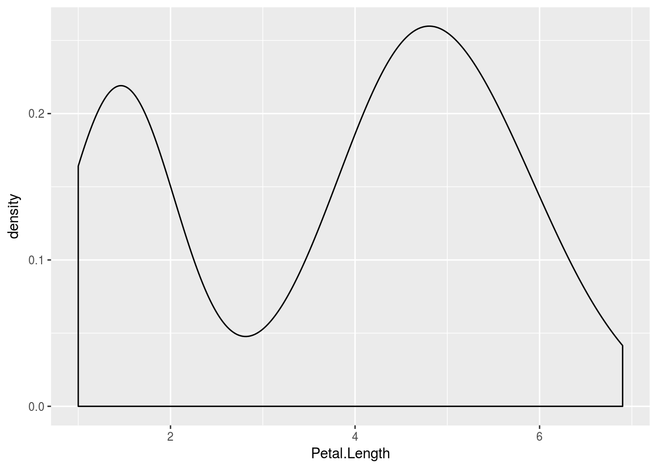
# If I only want one box, I could do so with the following;, where group
# goes first (I made a dummy grou, '')
qplot("", Petal.Length, data = iris, geom = "boxplot")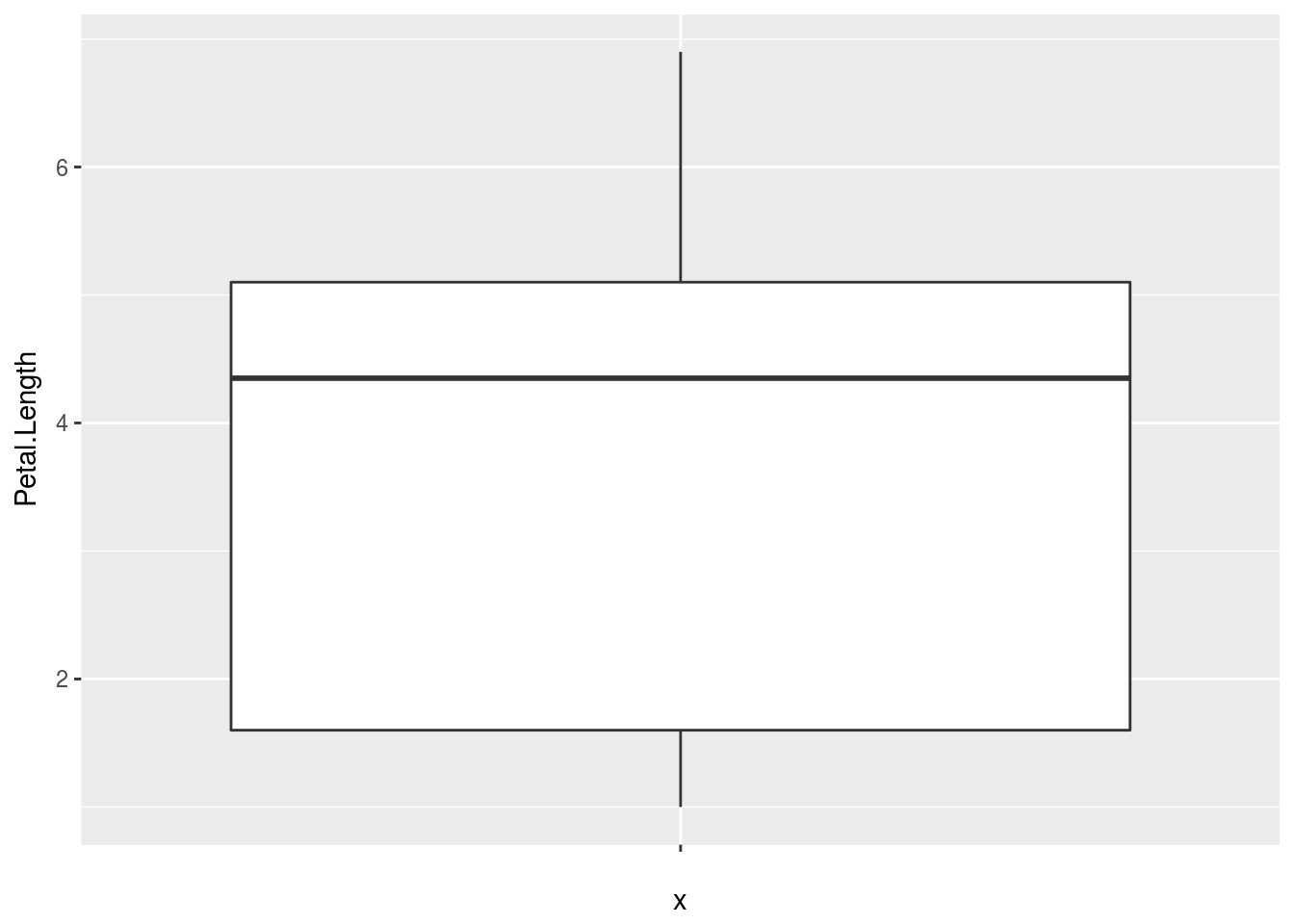
# If I want a comparative boxplot, I would do so by specifying population
# first, data second
qplot(Species, Petal.Length, data = iris, geom = "boxplot")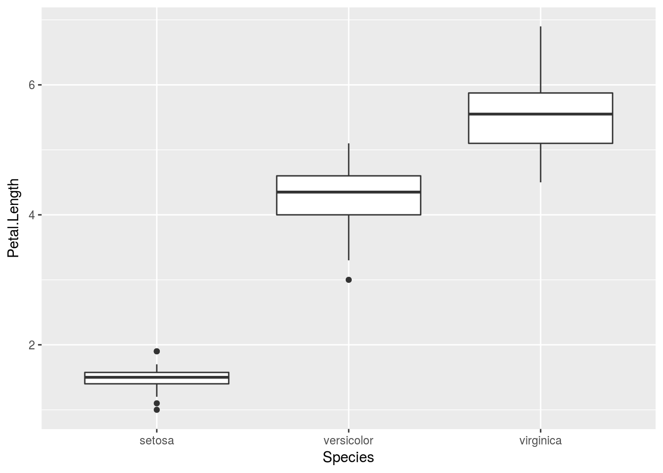
ggplot2 allows graphics to be themed. Color and shape choices are made automatically by default (though they can be changed), and the decision is made based on the current theme being used. Using different themes may lead to different choices in, say, color, being made. This is advantageous since one can worry about how information is being communicated without necessarily worrying about some of the specifics (e.g., we can tell R to communicate groups by color without thinking about what colors are being used).
The default theme used by both qplot() and ggplot() is theme_grey(). Other themes are included in ggplot2. The package ggthemes includes more themes (often based on graphics created in publications such as The Economist, The Wall Street Journal, other software packages such as Microsoft Excel, or emulating particular famous authors such as Edward Tufte), and it is possible for you to create your own original theme. You can change a theme by “adding” it to a graphic. (ggplot2 overloads the + operator to have a particular meaning when “adding” things to a gg- or ggplot-class object).
# Unlike with base R plots or lattice graphics, we can store plots made with
# ggplot in objects, as I demonstrate below:
p <- qplot(Sepal.Length, Sepal.Width, data = iris, color = Species, shape = Species)
# We can view the plot either with print(p) or by calling the object
# directly (i.e. just p).  The default theme_grey() theme
print(p)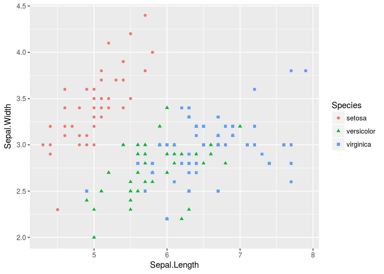
# Other themes:
p + theme_bw()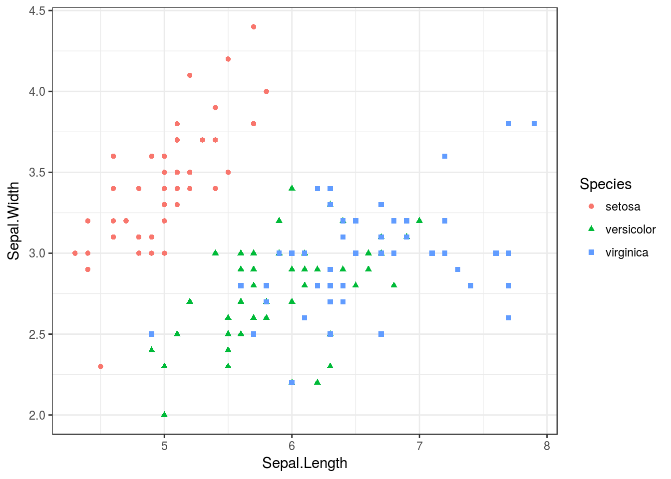
p + theme_classic()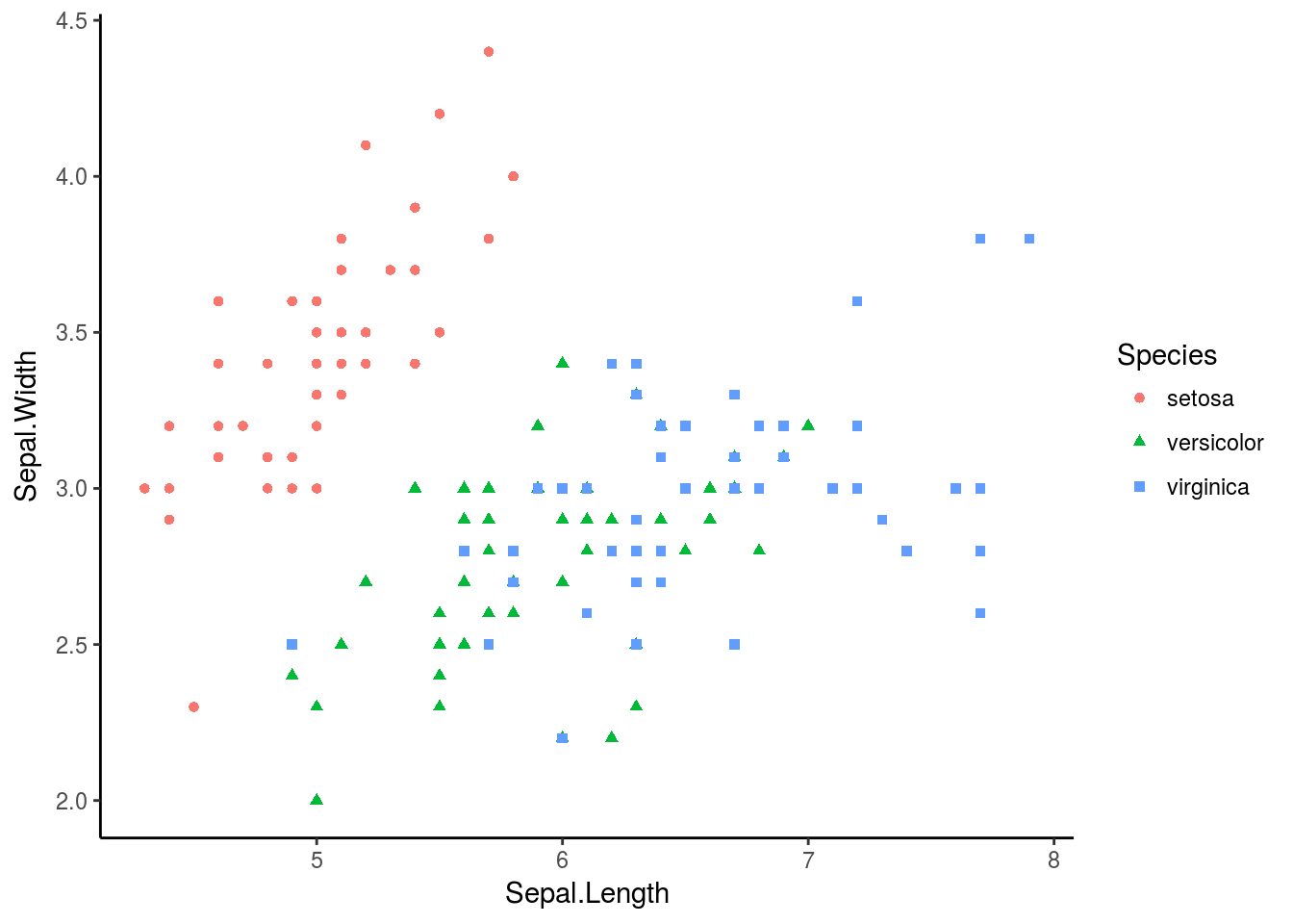
p + theme_dark()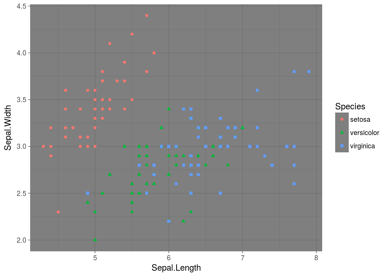
p + theme_minimal()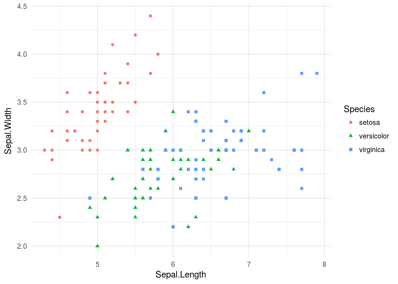
p + theme_void()
ggplot()
ggplot() is the main function of ggplot2, with qplot() being merely a simplified version of ggplot(). Unlike qplot(), which can accept data in the form of vectors, data passed to ggplot() must be a data frame! This restriction allows ggplot() to create graphics in a consistent way (you can even design a graphic on one data set, then simply swap that data set out with another and have the graphic still work.)
Three important building blocks for building graphics using ggplot() (aside from theme elements, like specific colors used, labels, or titles) are aesthetics, geoms, and stats. Aesthetics, controlled by the aes() function, determine the visual channels through which information is transmitted (position, color, shape, etc.). Geoms determine how visual information is rendered; in other words, it translates aesthetics into graphics. A few functions, such as geom_point(), geom_line(), and many others, “add” geoms to a graphic. Finally, stats allow data summaries, such as histograms or density plots, to be created and then drawn, and come in the form of functions such as stat_summary(), stat_quantile(), and many others.
Let’s visualize the iris data set, this time using ggplot().
# Notice that I layer on geoms with +, which has been overloaded to work appropriately for ggplot2 objects
p <- ggplot(iris) +   # Create the basic plot object
  geom_point(aes(x = Petal.Length, y = Petal.Width, shape = Species, color = Species)) +   # Create a dot plot with sepal lenght being x, petal width y, and species both shape and color
  xlab("Petal Length") +  # Add axis labels
  ylab("Petal Width") +
  ggtitle("Petal Length and Petal Width of Iris Flowers")
# Let's see the result!
print(p)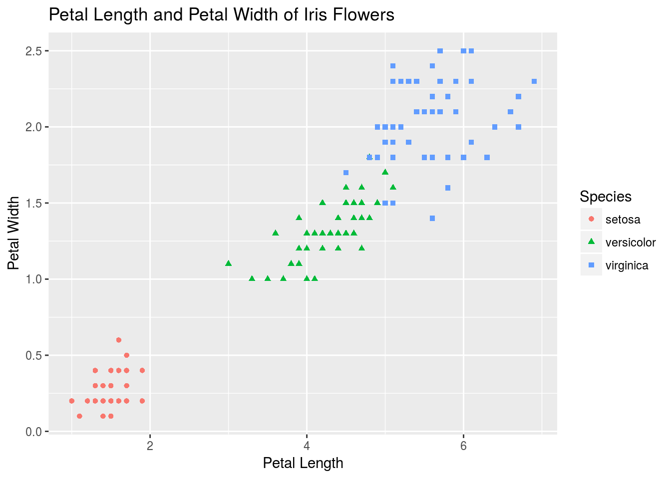
# Let's add a stat that creates a 2D density plot
p + stat_density2d(aes(x = Petal.Length, y = Petal.Width, group = Species, color = Species))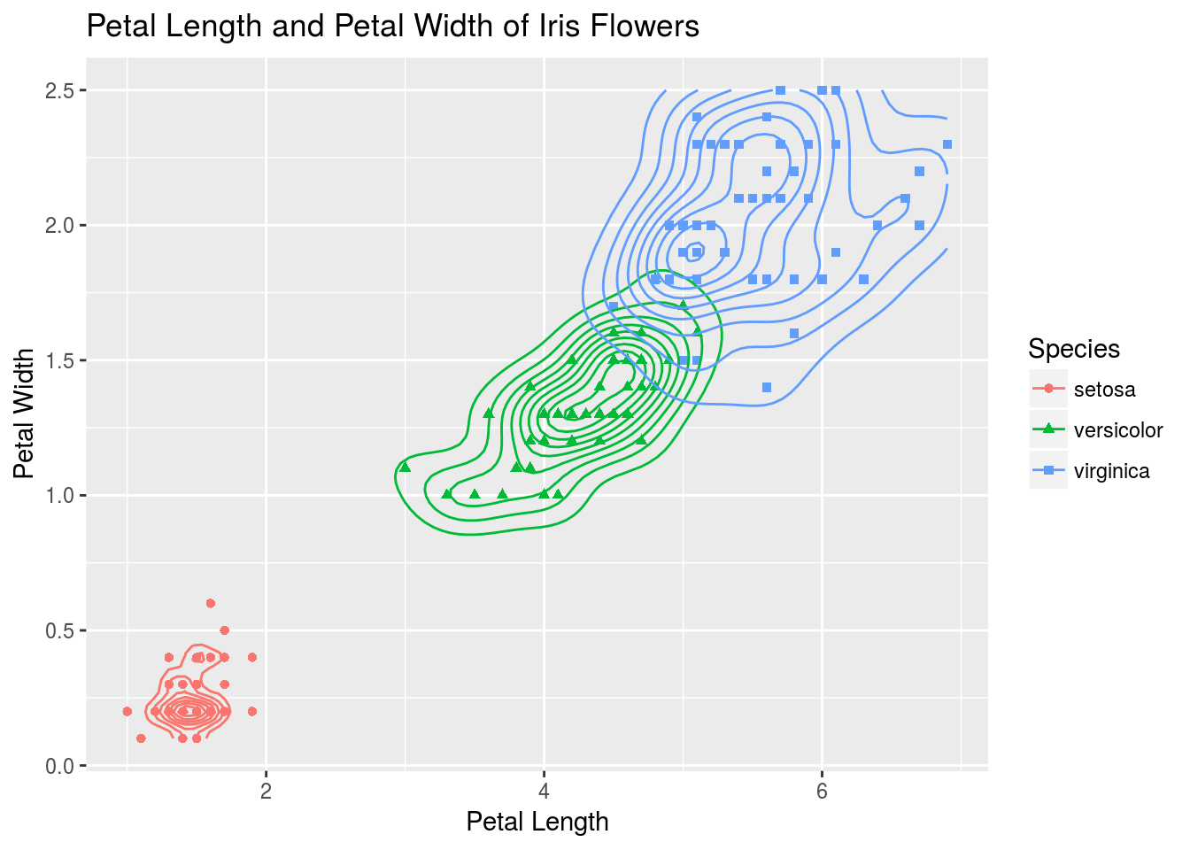
# Now let's look just at iris sepal length. We initialize a basic object and swap out geoms to look at different plots.
# First, create the basic object:
q <- ggplot(iris, aes(y = Sepal.Length, x = Species, color = Species)) +
  xlab("Species") +
  ylab("Sepal Length") +
  ggtitle("Comparison of Sepal Length Among Iris Flowers")
# I first look at a boxplot
q + geom_boxplot()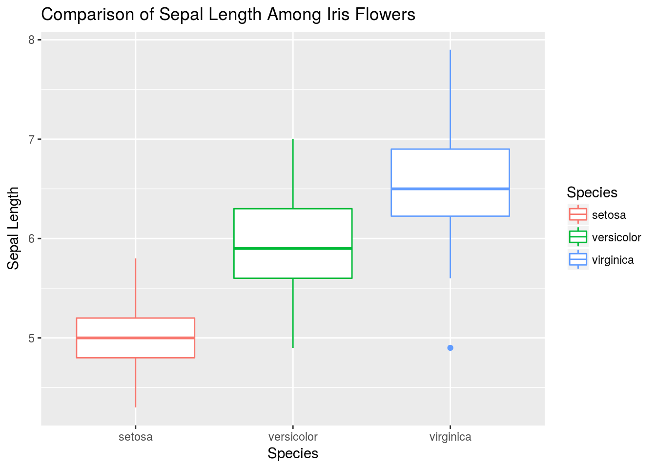
# An alternative to the boxplot is the violin plot
q + geom_violin(aes(fill = Species))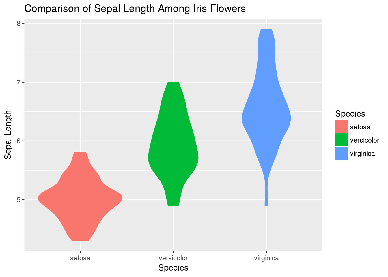
# Or we can plot jittered data
q + geom_jitter(width = .25)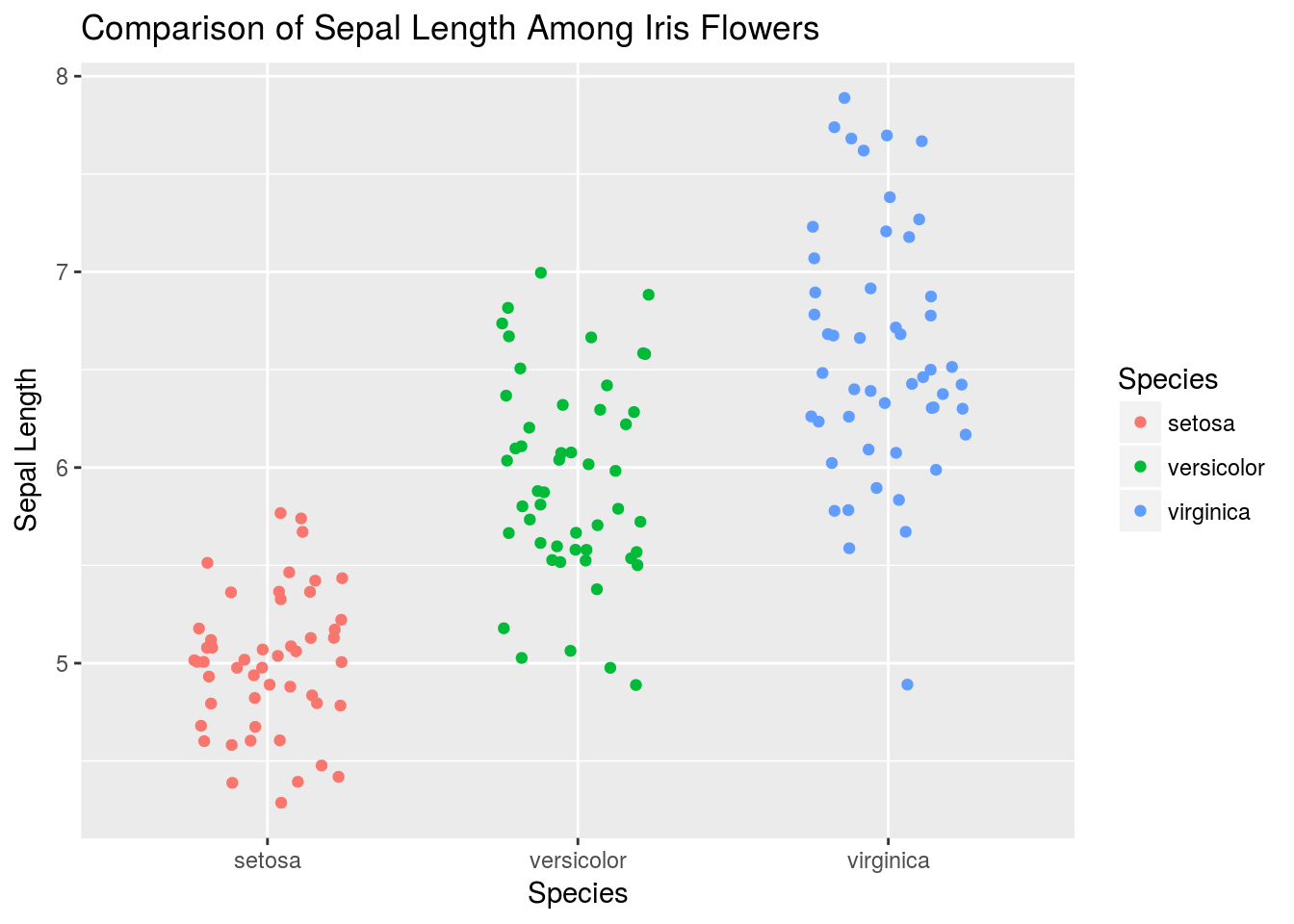
# Here is a more complex, layered graphic
q + geom_violin(alpha = .6) +
  geom_jitter(width = .25, alpha = .4) +
  stat_summary(size = 1, fun.data = median_hilow)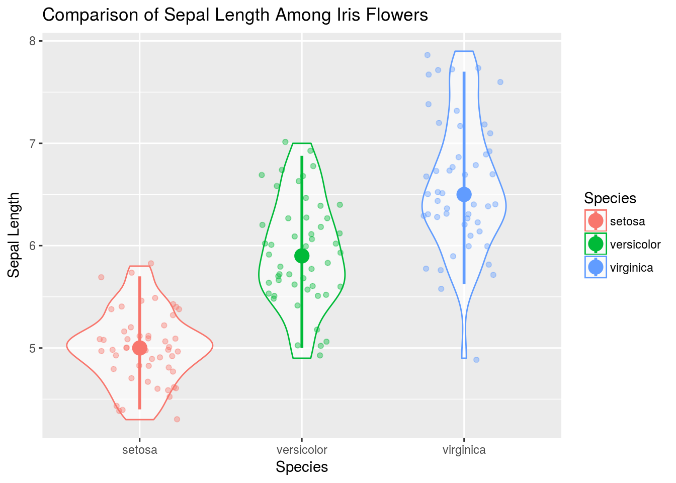
Graphics that would be very difficult to make in base R or even lattice are almost effortless in ggplot2!
Like lattice, ggplot2 allows for splitting plots based on a variable. This is called faceting, and is controlled primarily by the facet_grid() function, added to a plot like any other function in ggplot2. face_grid(y ~ x) will break plots up according to the categorical variables x and y, where each row represents a different value for x and each column a different value for y. If you don’t wish to facet according to two variables, replace either x or y with a ., like . ~ y. I demonstrate faceting first on iris, then on Cars93.
# Create a plot as normal
ggplot(iris, aes(x = Sepal.Length, y = Sepal.Width, color = Species)) + geom_point() +
    # Create different plots for different species
facet_grid(. ~ Species)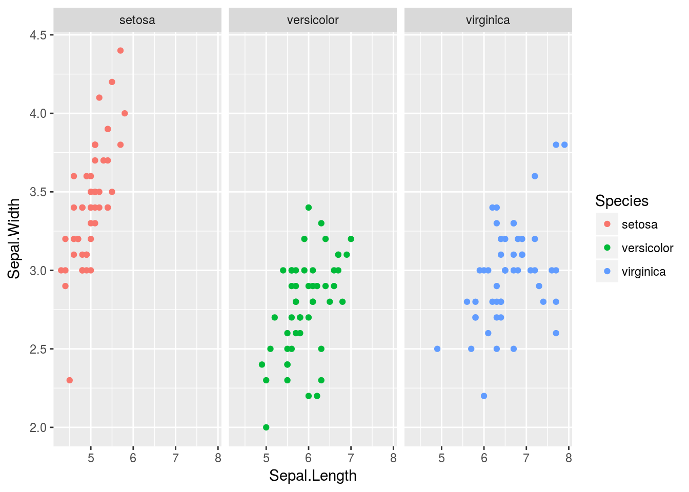
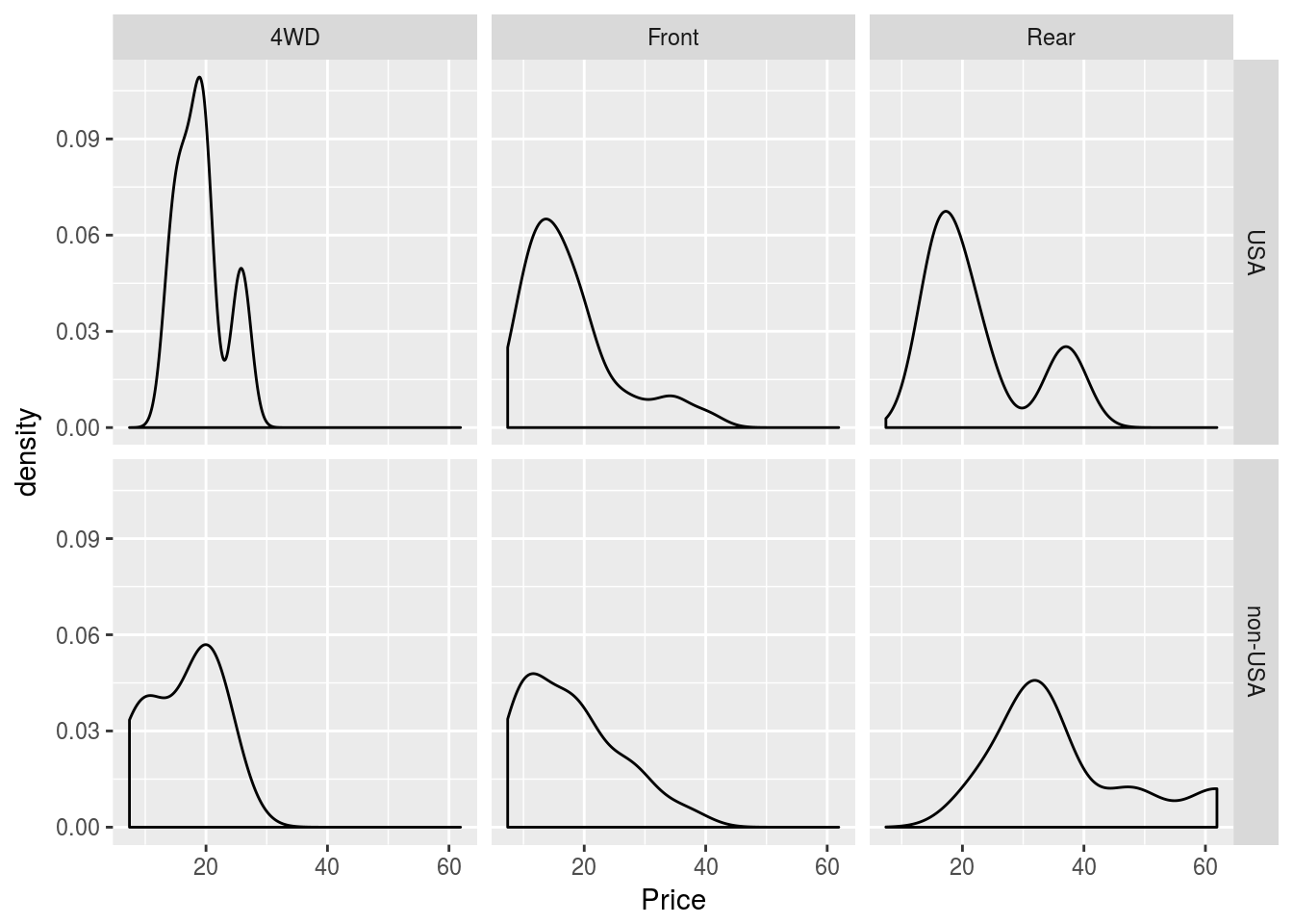
# Create a facet grid for price of cars depending on origin and drive train
p1 <- ggplot(Cars93, aes(x = Price))
p1 + geom_histogram() + facet_grid(Origin ~ DriveTrain)
## `stat_bin()` using `bins = 30`. Pick better value with `binwidth`.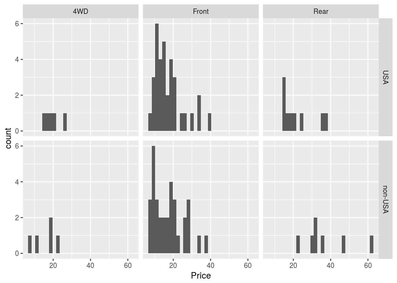
# We could try other plots as well
p1 + geom_dotplot() + facet_grid(Origin ~ DriveTrain)
## `stat_bindot()` using `bins = 30`. Pick better value with `binwidth`.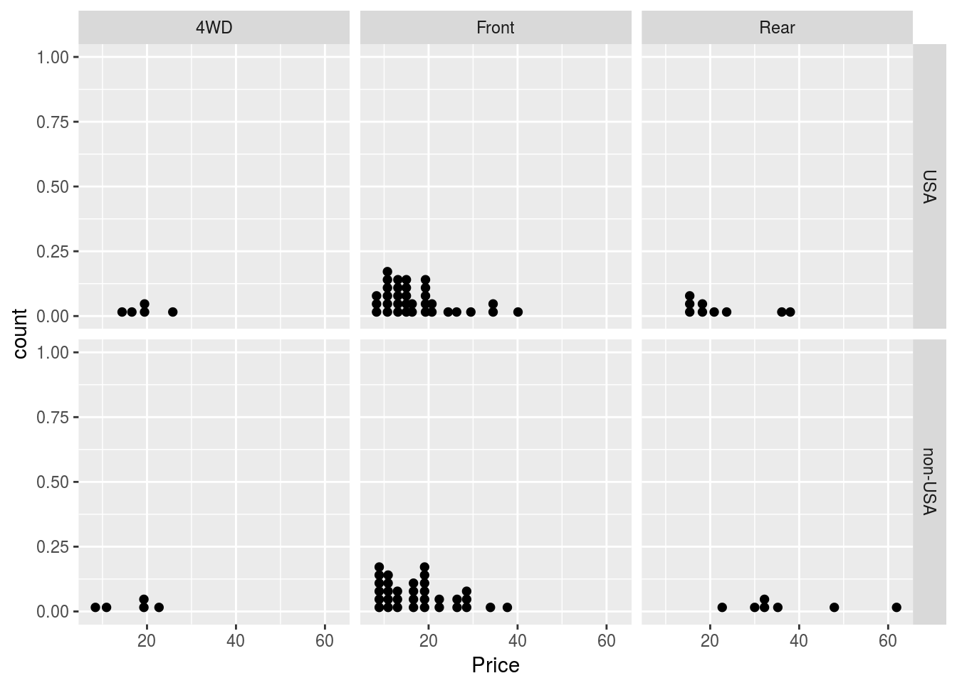
p1 + geom_density() + facet_grid(Origin ~ DriveTrain)