Lecture 11
Inferential Statistics via Computational Methods
The objective of inferential statistics is to describe population parameters using samples. In the lecture, we will study extensively inferential statistics when constructed from a probabilistic model, and in the lab we will see how to use R to perform analysis based on these methods. Prior to that, though, we explore techniques based on computational methods such as simulation and bootstrapping. Not only do computational methods provide a good first step for thinking about later methods, they are also very useful when one does not have a probability model available for inference, perhaps because such a model would be very difficult to construct.
Simulation
Let \(X_i\) be a Normal random variable with mean 100 and standard deviation 16, so \(X_i \sim N(100, 16^2)\). We know that if \(X_i\) are random variables, the sample mean \(\overline{X} = \frac{1}{n}\sum_{i = 1}^{n} X_i\) is also a random variable. What distribution does \(\overline{X}\) follow? While we can compute this distribution exactly, here we show how it could be simulated.
We could simulate a single sample mean for a sample of size 10 with the following code:
set.seed(6222016)
rand_dat <- rnorm(10, mean = 100, sd = 16)
mean(rand_dat)
## [1] 101.0052Obviously 101.00519 is not 100, which we know to be the true mean of the data, nor should we expect that to ever happen. But is it “close” to the true mean? It’s hard to say; we would need to know how much variability is possible.
We would like to generate a number of sample means for data coming from the distirbution in question. An initial approach may involve a for loop, which is not the best approach when using R. Another approach may involve sapply(), like so:
sim_means <- sapply(1:100, function(throwaway) mean(rnorm(10, mean = 100, sd = 16)))While better than a for loop, this solution uses sapply() in a way it was not designed for. We have to create a variable with a parameter that is unused by the function, and also pass a vector with a length corresponding to the number of simulated values we want, when in truth it’s not the vector we want but the length of the vector. A better solution would be to use the replicate() function. The call replicate(n, expr) will repeat the expression expr n times, and return a vector containing the results. I show an example for simulated means below:
sim_means <- replicate(100, mean(rnorm(10, mean = 100, sd = 16)))
sim_means
## [1] 108.35565 100.66750 108.19234 95.89265 101.20817 105.76444 104.89860
## [8] 104.22216 102.06229 94.31038 99.55700 94.44461 102.06794 89.95609
## [15] 101.17615 100.63431 95.18799 104.70427 107.69503 104.04101 107.86346
## [22] 103.06723 97.43702 102.05654 96.08053 101.36263 103.91291 96.41028
## [29] 96.81695 102.50987 104.38500 99.17687 97.74994 92.30596 99.26339
## [36] 101.67710 102.39232 105.79338 106.72293 99.22185 95.99618 98.91788
## [43] 101.01230 96.25258 91.20321 104.81500 96.05610 106.60535 93.97403
## [50] 103.89452 107.67794 105.31947 99.81982 99.84518 98.65894 93.04366
## [57] 99.36829 97.92127 105.95773 93.25400 97.91482 100.05437 93.78229
## [64] 105.21112 97.93044 100.19164 95.70649 97.18679 93.44727 101.54060
## [71] 98.67888 103.98927 95.20378 101.56096 108.71335 105.40760 105.08654
## [78] 102.58549 95.86958 97.53956 92.42496 103.78224 102.66197 93.44900
## [85] 98.92777 97.65882 96.09172 108.16021 100.97451 97.53069 98.50505
## [92] 102.83923 91.39683 98.91011 102.07212 99.36859 100.66825 102.34920
## [99] 99.55977 105.28871Looking at the simulated means, we see a lot of variability, with 53% of the means being more than 3 away from the true mean. The only way to reduce this variability would be to increase the sample size.
sim_means2 <- replicate(100, mean(rnorm(20, mean = 100, sd = 16)))
sim_means2
## [1] 99.69189 95.21360 105.52372 104.45792 93.52940 91.62906 105.26088
## [8] 100.36841 105.73402 102.46795 99.09634 98.09586 103.41291 102.24939
## [15] 95.19029 97.46231 101.84167 106.39167 99.76708 96.41046 94.57369
## [22] 100.30044 107.70845 105.03082 103.03096 96.89259 101.63428 106.77924
## [29] 93.78310 99.20373 99.21529 96.04547 100.02290 100.23826 98.78401
## [36] 96.60201 97.90106 95.12226 98.53885 101.81787 107.67086 102.87544
## [43] 102.54591 100.30953 104.98270 99.21484 96.38804 100.71951 100.54088
## [50] 96.36608 102.28295 103.48824 104.53096 100.48312 97.77604 100.40682
## [57] 99.59780 95.34798 97.79904 94.79671 103.44435 103.94647 101.33339
## [64] 98.72290 98.94278 102.88865 97.95571 98.96574 101.67445 98.99390
## [71] 101.10229 100.38276 100.99239 102.65524 106.64794 95.42338 103.30498
## [78] 104.93425 108.15721 99.01630 96.63749 96.91546 101.56492 104.53852
## [85] 99.35392 97.48784 98.20285 92.61517 106.96066 100.54894 100.45520
## [92] 99.29380 99.20205 104.19171 103.59921 97.42151 95.17621 106.17301
## [99] 98.95303 106.53663Now, only 46% of the simulated means are more than 5 away from the true mean. If we repeat this for ever increasing sample sizes, we can see the distribution of the sample means concentrating around the true mean.
sim_means3 <- replicate(100, mean(rnorm(50, mean = 100, sd = 16)))
sim_means4 <- replicate(100, mean(rnorm(100, mean = 100, sd = 16)))
boxplot(list("n10" = sim_means, "n20" = sim_means2, "n50" = sim_means3, "n100" = sim_means4))
abline(h = 100, col = "blue")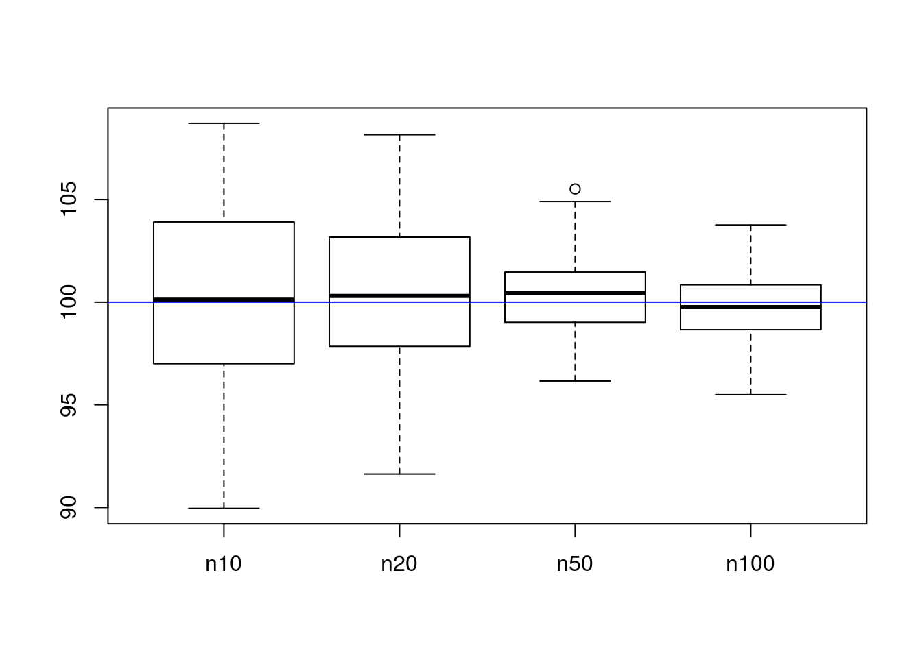
As can be seen in the chart, larger sample sizes have smaller variability around the true mean. This is what we want; we want estimators for the mean to be both accurate (they center around the correct result, not elsewhere) and precise (they are consistently near the correct answer). The term for the first property is unbiasedness, where \(\mathbb{E}\left[X\right] = \mu\), and the term for the second property is minimum variance.
Recall that for the Normal distribution, the mean is also the median. This suggests the sample median as an alternative to the sample mean for estimating the same parameter. How do the two compare? Let’s simulate them and find out!
library(ggplot2)

# Simulate sample medians
sim_medians <- replicate(100, median(rnorm(10, mean = 100, sd = 16)))
sim_medians2 <- replicate(100, median(rnorm(20, mean = 100, sd = 16)))
sim_medians3 <- replicate(100, median(rnorm(50, mean = 100, sd = 16)))
sim_medians4 <- replicate(100, median(rnorm(100, mean = 100, sd = 16)))

# Make a data frame to contain the data for the sake of easier plotting
dat <- data.frame(stat = c(sim_means, sim_medians, sim_means2, sim_medians2, sim_means3, sim_medians3, sim_means4, sim_medians4),
                  type = rep(c("mean", "median"), times = 4, each = 20),
                  n = as.factor(rep(c(10, 20, 50, 100), each = 2 * 20)))
head(dat)
## stat type n
## 1 108.35565 mean 10
## 2 100.66750 mean 10
## 3 108.19234 mean 10
## 4 95.89265 mean 10
## 5 101.20817 mean 10
## 6 105.76444 mean 10# Using ggplot2 to make the graphic comparing distributions
ggplot(dat, aes(y = stat, x = type, color = type, fill = type)) +
geom_hline(yintercept = 100, color = "blue", alpha = .5) + # Horizontal line for true center
geom_violin(width = .5, alpha = .3) + # Violin plot
stat_summary(fun.data = "median_hilow") + # A statistical summary, showing median and 5th/95th percentiles
facet_grid(. ~ n) + # Split based on sample size
theme_bw() + # Sometimes I don't like the grey theme
ggtitle("Comparison of distribution of simulated sample means and medians")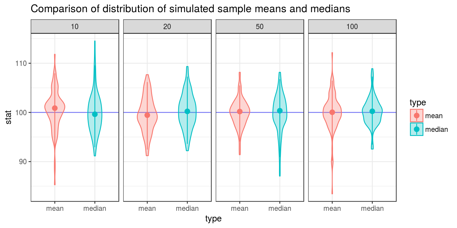
From the above graphic, one can see that the sample median has more variance than the sample median, and is thus not minimum variance. The sample mean is a more reliable way to estimate unknown \(\mu\) than the sample median.
These analyses suggest that when trying to estimate the value of a parameter, we should follow these principals:
- We should use unbiased estimators. If this is not possible, we should use estimators that are at least consistent (that is, the bias approaches 0 as the sample size grows large).
- We should use estimators that vary as little as possible. This in turn implies that we should use as large a sample size as possible when estimating unknown parameters.
Clearly, \(\overline{X}\) is a random variable. With that said, what is its distribution? We could explore the possibility that \(\overline{X}\) is Normally distributed by looking at a Q-Q plot, which compares sample quantiles to theoretical quantiles if a random variable were to follow some particular distribution. If we wanted to see if \(\overline{X}\) were Normally distributed, we could use the qnorm() function to create a Q-Q plot comparing the distribution of \(\overline{X}\) to the Normal distribution. The call qqnorm(x) create a Q-Q plot comparing the distribution of x to the Normal distribution. I next create such a plot.
qqnorm(sim_means4)
# A line, for comparison
qqline(sim_means4)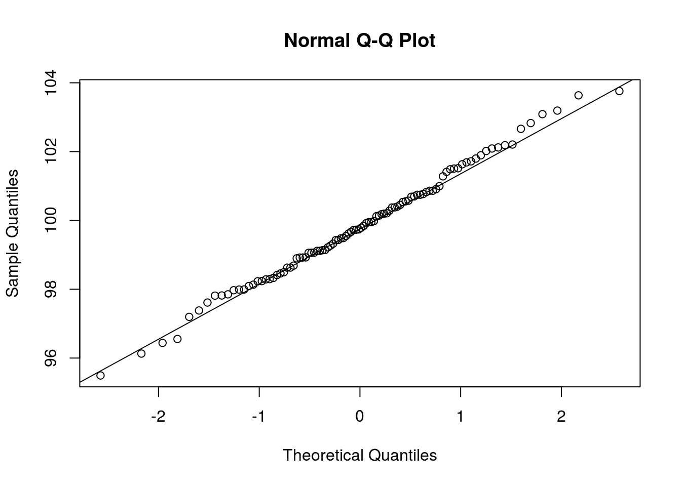
If the points in the plot fit closely to a straight line, then the distributions are similar. In this case, it seems that the Normal distribution fits the data well (as it should).
Simulation is frequently used for estimating probabilities that are otherwise difficult to compute by hand. The idea is to simulate the phenomena under question and how often the event in question happened in the simulated data. If done correctly, the sample proportion should approach the true probability as more simulations are done. Here, I demonstrate by estimating for each of the sample sizes investigated, the probability of being “close” to the true mean, both for the sample mean and the sample median (these probabilities are no necessarily difficult to compute by hand, and you can investigate for yourself using the results of the Central Limit Theorem whether the estimated probabilities are close to the true probabilities).
library(reshape)
dat_list <- list("mean" = list(
  # Compute probability of being "close" for sample means
  "10" = mean(abs(sim_means - 100) < 1), "20" = mean(abs(sim_means2 - 100) < 1), "50" = mean(abs(sim_means3 - 100) < 1), "100" = mean(abs(sim_means4 - 100) < 1)),
  # Probabilities of being "close" for sample medians
  "median" = list("10" = mean(abs(sim_medians - 100) < 1), "20" = mean(abs(sim_medians2 - 100) < 1), "50" = mean(abs(sim_medians3 - 100) < 1), "100" = mean(abs(sim_medians4 - 100) < 1)))
# Convert this list into a workable data frame. Here I use the melt function in reshape, which will create a data frame where one column is the values stored in the list, and the others represent the values of the tiers.
nice_df <- melt(dat_list)
# Data cleanup
names(nice_df) <- c("Probability", "Size", "Statistic")
nice_df$Size <- factor(nice_df$Size, levels = c("10", "20", "50", "100"))
# The actual probabilities
nice_df
## Probability Size Statistic
## 1 0.15 10 mean
## 2 0.24 20 mean
## 3 0.40 50 mean
## 4 0.49 100 mean
## 5 0.11 10 median
## 6 0.22 20 median
## 7 0.21 50 median
## 8 0.37 100 median# A plot of the probabilities
ggplot(nice_df, aes(y = Probability, x = Statistic)) +
# Instead of plotting points, I simply plot what the probability is, as a point.
geom_text(aes(label = paste0(Probability * 100, "%"))) +
facet_grid(. ~ Size) +
theme_bw()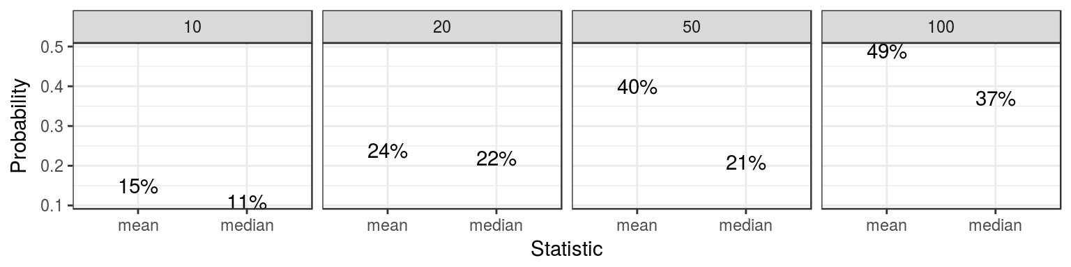
The above information suggests that the sample mean tends to be closer than the sample median to the true mean. This can be proven mathematically, but the simulation approach is much easier, although not nearly as precise.
We could also use sample quantiles to estimate true quantiles for a statistic, and thus get some sense as to where the true parameter may lie. I demonstrate in the code block below.
quant_list = list("mean" = list("10" = as.list(quantile(sim_means, c(.05, .95))), "20" = as.list(quantile(sim_means2, c(.05, .95))), "50" = as.list(quantile(sim_means3, c(.05, .95))), "100" = as.list(quantile(sim_means4, c(.05, .95)))), "median" = list("10" = as.list(quantile(sim_medians, c(.05, .95))), "20" = as.list(quantile(sim_medians2, c(.05, .95))), "50" = as.list(quantile(sim_medians3, c(.05, .95))), "100" = as.list(quantile(sim_medians4, c(.05, .95)))))
quant_df <- cast(melt(quant_list), L1 + L2 ~ L3)
names(quant_df) <- c("Statistic", "Size", "Lower", "Upper")
quant_df$Size <- factor(quant_df$Size, levels = c("10", "20", "50", "100"))

quant_df
## Statistic Size Lower Upper
## 1 mean 10 93.01272 107.7034
## 2 mean 100 97.37297 102.6705
## 3 mean 20 94.78556 106.6545
## 4 mean 50 97.43711 103.6452
## 5 median 10 89.42588 108.9288
## 6 median 100 96.60708 102.9936
## 7 median 20 94.47622 107.2607
## 8 median 50 95.24452 104.3953ggplot(quant_df) +
geom_segment(aes(x = Lower, xend = Upper, y = Statistic, yend = Statistic), size = 1.2) +
facet_grid(Size ~ .) +
xlab(NULL)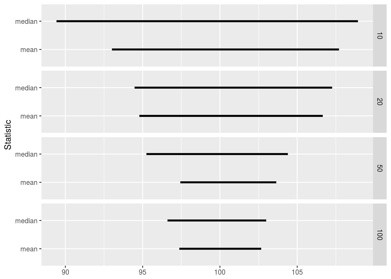
We can see that in all cases the true mean lies between the \(5^{\text{th}}\) and \(95^{\text{th}}\) quantiles, and that the sample mean has a narrower range than the sample median, thus giving a more precise description as to where the true mean lies.
Significance Testing
Statistical inference’s raison d’etre is detecting signal from noise. More precisely, statistical inference is used to determine if there is enough evidence to detect an effect or determine the location of a parameter in the presence of “noise”, or random effects.
Suppose a researcher is trying to determine if a new drug under study lowers blood pressure. The researcher randomly assigns study participants to control and treatment groups. He stores his results in R vectors like so:
control <- c(124, 155, 120, 116)
treatment <- c(120, 108, 132, 112)
Is there a difference beteen control and treatment? Let’s check.
mean(treatment) - mean(control)## [1] -10.75A difference of -10.75 looks promising, but there is lots of variation in the data. Is a difference of -10.75 large enough to conclude there is a difference?
Suppose not. Let’s assume that the treatment had no effect, and the observed difference is due only to the random assignment to control and treatment groups. If that were the case, other random assignment schemes would have differences just as or even more extreme than the one observed.
Let’s investigate this possibility. We will use the combn() function to find all possible combinations of assigning individuals to the treatment group, with the rest going to the control group. combn(vec, n) will find all ways to choose n elements from vec, storing the result in a matrix with each column representing one possible combination. We will assume that we will be pooling the control and treatment groups into a single vector with 8 elements.
# Find all ways to choose the four indices that will represent a new random
# assignment to the treatment group. This is all we need to know to
# determine who is assigned to both control and treatment.
assn <- combn(1:(length(control) + length(treatment)), 4)
# Look at the result
assn[, 1:4]
## [,1] [,2] [,3] [,4]
## [1,] 1 1 1 1
## [2,] 2 2 2 2
## [3,] 3 3 3 3
## [4,] 4 5 6 7# How many combinations are possible?
ncol(assn)## [1] 70Now, let’s actually investigate the difference and determine if it is “large”.
# Lump all data into a single vector
blood_pressure <- c(control, treatment)
blood_pressure
## [1] 124 155 120 116 120 108 132 112# To demonstrate the idea of this analysis, let's consider just one new
# assignment of control and treatment, using the 4th column of assn. The new
# assignment is in ind.
ind <- assn[, 4]
# If blood_pressure[ind] is the treatment group, blood_pressure[-ind] is the
# control group.
blood_pressure[ind]## [1] 124 155 120 132blood_pressure[-ind]## [1] 116 120 108 112# What is the new difference?
mean(blood_pressure[ind]) - mean(blood_pressure[-ind])## [1] 18.75# Now, let's do this for all possible combinations, using apply
diffs <- apply(assn, 2, function(ind) {
mean(blood_pressure[ind]) - mean(blood_pressure[-ind])
})Now we can decide how “unusual” our initial difference between treatment and control of -10.75 is. Since we are trying to determine if the treatment reduces blood pressure, we decide that if this particular assignment is unusually negative, there would be evidence that the treatment works. So we see how many assignments have means more negative than the one seen.
sum(diffs < mean(treatment) - mean(control))## [1] 11mean(diffs < mean(treatment) - mean(control))## [1] 0.1571429It seems that 0.16% of assigments to control and treatment result in differences more “extreme” than the one observed. This is not convincing evidence that the difference we saw reflects any significant effect from the new drug; there is too much noise in the data to reach such a conclusion.
Let’s consider another problem. In the ToothGrowth data set, we can see the results of an experiment where different supplements were used to examine the tooth growth of guinea pigs. Is there a difference?
Let’s first see what the difference is.
# Find the means
supp_means <- aggregate(len ~ supp, data = ToothGrowth, mean)
supp_means
## supp len
## 1 OJ 20.66333
## 2 VC 16.96333# The difference in means (VC - OJ)
diff(supp_means$len)## [1] -3.7There is a difference; it appears that the supplement VC (vitamin C in absorbic acid) has smaller tooth growth than the supplement OJ (orange juice). But is this evidence significant?
In this case, our earlier trick will not work. There are 60 observations in ToothGrowth, 30 of which are for the group OJ. This means that there are \({60 \choose 30} =\) choose(60, 30) \(= 118,264,581,564,861,152\) possible random assignments to the two groups. R will surely choke on that much computation, so we must use a new approach.
Rather than examine all possible permutations, let’s randomly select permutations and see how often in our random sample we get results more extreme than what was observed. The principle is the same as what was done before, but it’s probabilistic rather than exhaustive.
# Let's randomly assign to VC supplement just once for proof of concept;
# each sample has 30 observations, so we will randomly select 30 to be the
# new VC group
ind <- sample(1:60, size = 30)
with(ToothGrowth, mean(len[ind]) - mean(len[-ind]))
## [1] 0.7066667# We will now do this many times
sim_diffs <- replicate(2000, {
ind <- sample(1:60, size = 30)
with(ToothGrowth, mean(len[ind]) - mean(len[-ind]))
})
# Proportion with bigger difference
mean(sim_diffs < diff(supp_means$len))## [1] 0.03253.25% of means are “more extreme” than what was observed, which seems convincing evidence that VC is, on average, less than OJ.