Last updates:
Tue Aug 20 06:56:12 2013 ...
Fri Aug 23 10:50:32 2013 ...
Sat Aug 24 09:17:40 2013 ...
Wed Aug 28 19:29:38 2013 ...
Thu Aug 29 15:43:38 2013 ...
Fri Aug 30 15:49:52 2013 ...
Sat Sep 21 16:44:37 2013 ...
Wed Sep 25 12:26:50 2013 ...
Mon May 4 09:26:43 2015 ...
Thu Sep 17 06:18:45 2015 ...
Fri Nov 13 15:34:42 2015 ...
Mon Feb 6 07:17:53 2017 ...
Tue Mar 21 10:51:49 2017 ...
Thu Mar 23 11:15:32 2017 ...
Tue Mar 28 18:43:27 2017 ...
Wed Mar 29 06:26:45 2017 ...
Wed Jan 10 07:40:34 2018 ...
Sat Oct 5 09:16:17 2019 ...
Fri Feb 18 09:35:49 2022
![]()
Years of assisting students with polishing their theses and dissertations show that certain kinds of problems, in grammar, markup, and typography, appear repeatedly. This document collects a number of them and shows how they can be repaired. Each topic is in a separate independent section, and the sections can therefore be read selectively, and in arbitrary order.
Despite the title, most of the topics in this document are entirely independent of the minutiae of local thesis regulations, and are applicable to general technical writing.
The University of Utah is reviewing its thesis formatting requirements for LaTeX document preparation in early 2018, and it is possible that more flexibility in formatting, running page headers, and hyperlinking will be permitted. There will then be new style files that supply thesis-specific front-matter formatting, but otherwise, use the standard LaTeX book document class, possibly augmented by a few additional styles chosen from the thousands of available ones to provide additional support for complex typesetting requirements. Visit the Web sites http://www.math.utah.edu/pub/uumath-thesis/ and http://www.math.utah.edu/pub/uuthesis/ for details.

Your writing says a great deal about you and your intellectual abilities: it can determine whether you get a job, or a business contract, or a grant, or a paper accepted, or a book published. Few people write well in the beginning, but with practice, most can dramatically improve their writing skills, and thereby enhance their careers. Most people with graduate-level education will spend much of their future careers writing documents, so it is a skill that deserves hard work, and great care.
With a good typesetting system, such as (La)TeX, good writing can fill beautifully typeset pages, and give you great pride in your work.
The famous American printer, publisher, author, scientist, and diplomat, Benjamin Franklin, wrote in the 1738 edition of Poor Richard:
If you would not be forgotten as soon as you are dead and rotten, either write Things worth reading, or do Things worth the writing.
Prose Writing has been of great Use to me in my Life, and has been a principal cause of my Advancement.
To assist in effective writing and typesetting, it is helpful to have quick access to
Dictionaries are easy to find, and any large one is likely to be satisfactory. There are several online, such as One Look , and the Century Dictionary Online , published in 1914. Web searches should readily find others. From within the campus network, you also have access to the venerable Oxford English Dictionary, which is the largest and most respected source of definitions and etymologies (word histories) for the English language.
The best general handbook on writing for American English is the famous Chicago Manual of Style . There are several other widely used general handbooks, including
For technical writing, especially in science and engineering, Dupré's Bugs in Writing is quite unlike any of the others, and extremely useful. The book draws on its author's years of experience as an editor at a major scientific publisher. It has many short, and independent, chapters that each tackle a particular writing problem, showing how, and how not, to express yourself, and why.
One large thesaurus is Rodale, Urdang, and LaRoche's The Synonym Finder. Another is Roget's thesaurus of English words and phrases . You may be able to find online versions of some of the older thesauri, such as the Gutenberg Project's digitization of Roget's thesaurus .
There are many books and other publications that have been written about Donald Knuth's TeX and Metafont systems for typesetting and font design, and Leslie Lamport's LaTeX document-markup system that sits on top of TeX. All of the known ones have been collected in a single bibliography, texbook3.bib . There are also related bibliographies font.bib , type.bib , and typeset.bib .
The basic reference for plain TeX is The TeXbook , the first of a five-volume series Computers and Typesetting. However, most authors do not need, and should not be using, the low-level commands provided by the TeX engine. Instead, they should find it much better to write in terms of higher-level concepts provided by LaTeX: document classes, style packages, chapters, sections, subsections, subsubsections, paragraphs, subparagraphs, subsubparagraphs, appendices, equations, figures, tables, verbatim displays, tables of contents, lists of figures, lists of tables, bibliographies, glossaries, indexes, and so on. It is then the job of various style files to turn those high-level classifications into particular visual patterns on printed pages and computer displays.
The primary rule for LaTeX document markup is this:
Mark up text according to what it is, not how it looks!
If you find yourself inserting explicit spacing commands in a LaTeX document, such as \hspace{...}, \vspace{...}, \kern, \newline, \break, \nobreak, \pagebreak, \noindent, \clearpage, \cleardoublepage, and so on, then you are probably going seriously astray. If you really are trying to change the typeset appearance of something, then perhaps you should consider writing a small private style package that provides higher-level commands and environments to implement your design.
If your document is going to be printed and issued by a professional publisher of books and/or journals, you will find them very unhappy with your submission if you use anything but standard LaTeX markup. They already have low-cost business procedures for handling standard markup; anything different costs them time and money, and is likely to introduce errors into your published document.
The basic manual for LaTeX is Lamport's LaTeX: a Document Preparation System: User's Guide and Reference Manual . It is a small volume that provides everything you need to know about document markup. Since it was written, however, a huge number of packages have been written for document classes and styles, and in order to find them, and learn how to use them, you are well served by the additional volumes of the companion series that are written by an outstanding team of experts in LaTeX, typography, typesetting, and document design:
If you prefer to have a single volume that covers basic LaTeX, plus some of the more important packages, then the best choice is Kopka and Daly's Guide to LaTeX: Tools and Techniques for Computer Typesetting.
If your document contains a lot of mathematics, then you should definitely acquire one more book by an expert in mathematics and mathematical typography: Grätzer's More Math into LaTeX, the fifth edition of a book that first appeared in 1993.
The Web site http://www.math.utah.edu/pub/uuthesis/ contains the University of Utah's thesis class and style files, for both the now-obsolete LaTeX 2.09 version, and the new (since 1994!) LaTeX 2e version, along with a sample thesis in each format that shows in particular how the Utah-thesis-specific front matter is handled. The styles support theses and dissertations at the bachelor's, master's, and doctoral levels.
At the University of Utah, you should definitely use the uuthesis system for your final degree document, because it has undergone two decades of wide use, and handles many of the university's style requirements.
Download a copy of the package, unpack it, and use the sample 2e top-level LaTeX file as a start for your own document (but rename it something relevant to you!). Edit the dependency lines in the Makefile to reflect your LaTeX and figure files, so that you can correctly, and reliably, typeset your document just by typing the make command. Run make check to apply several different kinds of checks to your document. Specific checks can be selected by particular names that are easily found in the Makefile.
In TeX and LaTeX, except in verbatim modes, comments begin at a percent sign and run to end of line, and contrary to what most books about TeX and LaTeX report, TeX's comment consumption then includes all leading space on the next line. Understanding that behavior is critical for correct coding of macro arguments, and writing macros in style files. Failure to account for it can produce surprises from unwanted output space.
Except in verbatim modes, TeX (and thus, LaTeX) collapse any number of consecutive spaces into a single space. A newline is treated somewhat differently: it is usually treated as a space, but if the next line is empty, or contains only whitespace before its newline, then a paragraph break, equivalent to the \par command, is assumed instead. Those conventions prove extremely convenient for users, who can then mostly ignore spacing in the input. You could feed the entire plain-text body of a detective novel into TeX, and get a nicely typeset book, missing only its front matter.
Consider, for example, these figure captions:
\caption{
    Graph of national debt growth.
}

\caption
{
    Graph of national debt growth.
}
Space after the macro \caption is harmless, because TeX always consumes space after a control word: a backslash followed by one or more letters. By contrast, when TeX encounters a control sequence (a backslash followed by a single nonletter), it stops command-collection immediately, so any following space is preserved. The braced caption argument then contains [space]Graph ... growth.[space] The trailing space is probably harmless, because it is likely to be discarded by actions of internal macros in the expansion of \caption. However, that leading space is preserved, so the caption is typeset slightly to the right of where it should be. Such errors are often missed during proofing, but are likely to be visually annoying to sharp-eyed editors and readers.
Here are three ways to supply the caption without the unwanted leading space:
\caption
{%
    Graph of national debt growth.
}

\caption{%
    Graph of national debt growth.
}

\caption{Graph of national debt growth.}
In the first two examples, the percent that immediately follows the open brace begins a comment that gobbles all space before the word Graph. In the third, which is likely how most LaTeX users would write the caption, leading space is absent from the braced argument.
Bracing styles in computer-programming languages often become hotly debated religious issues. The author of this document belongs to the theological sect that holds that short braced groups may appear on a single line, as in {some stuff}, but multiline groups must be displayed with the open and close braces vertically aligned in the same column, with the braced body further indented, usually by 2 to 4 spaces. The layout of the first example follows that practice, which makes it much easier to detect the misaligned, or missing, braces that cause TeX extreme annoyance, and produce diagnostics that, sadly, fail to disclose the location of the mismatched brace.
The chkdelim utility discussed elsewhere in this document can easily find and report such errors.
TeX, like many computer-programming languages, works in terms of characters, words, and lines, and its low-level read function returns a single line. In practice, that means that TeX has an input buffer whose size is fixed at compile time. If an input line is longer than the buffer size, TeX complains like this:
! Unable to read an entire line---bufsize=3000.
Please ask a wizard to enlarge me.
The actual buffer size depends on how TeX was compiled, and may differ from installation to installation. A test of the TeX Live 2015 release shows that its TeX program handles lines up to 200,000 characters (about 50 typeset pages) before quitting with a complaint.
People who use word processors are often accustomed to typing until end of paragraph before inserting a newline that indicates a paragraph break. The word-processor display wraps such long input across multiple lines, so it not evident that anything is amiss.
Such bad habits are hard to break, so if you create (La)TeX input with a text editor, break your input into lines of a comfortable length (40 to 60 characters), or else, if your editor supports it, turn on its auto-fill mode with a suitable length limit so that the editor does the line breaking for you.
If you are confronted with (La)TeX files with excessively long lines, you may be able to selectively reformat them with the help of your text editor's fill-region command, or with an external program, such as the Unix fmt utility, or this author's much fancier, and TeX-aware, texpretty program for prettyprinting input files for various flavors of TeX.
Besides the buffer-size limit, the other reason that you should keep your input lines short is that TeX's error diagnostics report line numbers, not character offsets from the start of the file. If you have a 2000-character input line with a syntax error in it, it may be nearly impossible for you to locate and repair that error.
A document author spends much more time in front of an input screen than in (proof)reading the typeset output. It is therefore extremely important to make that input easy to read, yet regrettably, most authors seem to produce atrocious and inscrutable input files.
When you prepare text-formatter input files, it will repay you handsomely if you make the input text reflect its logical structure. For LaTeX, that means keeping lines short, indenting the bodies of \begin{xxx}...\end{xxx} environments, aligning tabular and array cells horizontally and vertically, and using spacing liberally in math mode, which is likely to contain the most complex input.
This document is written entirely in grammatically validated HTML, making liberal use of cascading-style-sheet specifications, sectioning and paragraphing, fonts, and color. If you are viewing it now in a Web browser, feel free to peek at the raw HTML with your browser's View Source option, typically bound to the Ctl-U key. You will find it almost as readable as the output formatted text produced by your browser.
One of the commonest mistakes that beginning authors make is having consecutive sectional headings without intervening prose. This input fragment provides an example of such a faulty document:
\chapter{DNA studies of {\em Escherichia coli}}

\section{The experimental setup}

\subsection{Sample preparation}

We purchased genetically pure samples of {\em E. coli} from Bayer
Bacteriological Boffins, Ltd., and \ldots{}
That is both incorrect writing, and incorrect typography. Each sectioning command must be followed by at least a sentence or two of prose that expands on the section heading, and provides a lead-in for the next heading. Typographically, adjacent sectioning commands produce incorrect spacing, because they usually insert stretchable vertical space both above and below the heading, with the result that the spacing between successive headings is roughly twice as big as it is elsewhere in the document where intervening text is supplied.
Even worse, that extra vertical space might permit a page break, leaving a lonely section heading at the bottom of the page. The LaTeX heading macros are defined with a strong penalty for a page break between the heading and the next line of prose, but they may also specify a bonus for a page break before the heading.
Another reason for demanding prose between sectional headings is that technical documents are usually hierarchically structured. A reader might well skim just the paragraphs at the start of each chapter before deciding whether to descend into the sections, subsections, subsubsections, paragraphs, and subparagraphs that follow in order to learn more detail. Thus, those introductory paragraphs are critical guides to content for such readers.
The same reader might then read the final section of each chapter, in the hope that it provides a cogent summary of what you have written in that chapter. Other places that readers look to find information quickly are the front-matter sections, notably the table of contents and lists of figures and tables, and the back matter, with the bibliography and the index. Technical documents are complex, and they deserve both good bibliographies, and comprehensive indexes, to guide the reader to other related publications, and to make it easy to find material in the document.
If your document contains lots of acronyms, technical phrases, and special mathematical notation, consider writing an appendix, or a front-matter section, that defines your special notation in one convenient place.
As a technical author, you must always remember that, while you might be one of the world's leading experts in your field, most of your readers are unlikely to possess your expertise. Your job as an author is to help them develop that knowledge when it interests them to do so.
Languages differ in capitalization practices, from heavy (German, where all nouns are capitalized), to medium (English and Dutch, where only proper nouns, and proper adjectives, are capitalized), to light (Romance languages, with lowercased proper adjectives). Here are some examples:
German:
    Über einen die Erzeugung und Verwandlung des
    Lichtes betreffenden heuristischen Gesichtspunkt

English:
    On the production and transformation of light from a
    heuristic viewpoint

English:
    In Newtonian mechanics, Abelian groups, and Cartesian geometry, ...

Dutch:
    In de mechanica van Newton, Abelian groepen en Cartesiaanse geometrie, ...

German:
    In der newtonschen Mechanik, abelschen Gruppen und kartesischen Geometrie, ...

Danish:
    I Newtons mekanik, abelske grupper og kartesiske geometri, ...

Norwegian:
    I Newtons mekanikk, abelske grupper og kartesiske geometri, ...

Swedish:
    I Newtons mekanik, abelska grupper och kartesiska geometri, ...

French:
    Dans la mécanique newtonienne, groupes abéliens, et la géométrie cartésienne, ...

Italian:
    Nella meccanica newtoniana, gruppi abeliania e geometria cartesiana, ...

Portuguese:
    Na mecânica newtoniana, grupos abelianos e geometria cartesiana, ...

Romanian:
    În mecanica newtoniană, grupuri abeliene, şi geometrie cartezian, ...

Spanish:
    En la mecánica newtoniana, grupos abelianos y geometría cartesiana, ...

Russian:
    В ньютоновской механике, абелевых группы и декартовой геометрии,
Some readers find it irksome when proper nouns are downcased in adjectival phrases, especially when the writer is inconsistent: why have Einsteinian theory, followed by abelian group, boolean algebra, Brownian movement, and cartesian geometry? Albert Einstein (1879–1955), Niels Hendrik Abel (1802–1829), George Boole (1815–1864), Robert Brown (1773–1858), and René Descartes (1596–1650) were distinguished scientists and mathematicians who don't deserve to be downcased in English adjectives. The practice in other languages seems to be more democratic, even if they prefer lowercase letters.
If you find yourself needing adjectives derived from proper nouns, be guided by consistency, existing practice in your field, and honoring those whose work you reference.
A common writing error is inadvertent doubling of adjacent
words, such as in the
the house. Such errors are
extraordinarily difficult to spot in proofreading, but
a computer program makes them easy to find. The
dw
utility is one such program. Some text editors also
have commands to find doubled words. However,
doublings are not always erroneous: “Hah hah
hah, she laughed”, “the Sun Sun Fire
server”, and “that that is, is, that that
is not, is not”, are all correct.
Mismatched delimiters (braces, square and angle brackets, parentheses, and quotation marks) are even harder to spot in input files and typeset output than doubled words are. Some text editors provide visual highlighting of matching delimiters, so that when the cursor is on a close or open brace, the matching open or close brace has a different appearance than normal. Typing a close delimiter may cause the cursor to bounce briefly back to the matching open delimiter, if it is visible on the current screen.
The chkdelim utility has proved to be of great convenience, and has command-line options that specialize its operation to the markup of various text formatters, including TeX and BibTeX.
In an era of electronic document production and readily available software tools, there is no excuse for presenting your reader with a document containing spelling errors. It is your job as an author to remove all such mistakes before your document is given to others.
If you are writing straightforward nontechnical prose in a single language, such as a detective novel, then the built-in spell checking of many text editors and word processors may be adequate.
The emacs editor has several features that make spell checking easy. With the cursor after a word of uncertain spelling, type M-$ to check that single word. Run M-x flyspell-mode to toggle dynamic checking on and off in the current buffer. Mark a region of text, and then run M-x flyspell-region to check just that block. The built-in manual describes other ways to do the job.
With technical text, such as that found in university and college writing in engineering, medicine, and science, and with multilingual text that is common in many areas of academia, life is more difficult. Without introducing specialized markup that identifies the language of each text fragment, spell-checking multilingual documents (including single-language documents that contain names of people from different human language groups) is difficult.
One way to deal with the problem that has been found to be practical over several decades of use is having document-specific exception lists: words that are not in standard dictionaries, but are nevertheless known to be correct. A good spell-check program allows user-supplied exception lists that augment its built-in dictionaries and rules. The first time you run the checker, it produces a long list of exceptions: words that are not matched by its internal lists and rules, and therefore might be misspelled. You then go through that list carefully, identify the true errors, fix them in your document, and then rerun the checker. Being a fallible human, you may have to do that more than once. What remains then is a file containing a list of correctly spelled words, one per line, that are unknown to your checker. Now you can supply that file as an exception list on the next run of the checker, and this time, it only reports new errors that have been found. You then correct the errors, and repeat the process until you have a new short list of correctly spelled words that you can now add to the original exception list.
Once you have done that process a few times, and provided that you are a reasonable typist, the reported list of exceptions on each check run is small, and easily dealt with. Importantly, other documents that you write in the same subject area can probably start with the same exception list, and then gradually evolve their own document-specific lists.
In order to avoid diagnosing document markup commands as spelling exceptions, it is a good idea to strip them from a copy of your document with a suitable filter. For TeX and LaTeX documents, such a command sequence might look like one of these, depending on which spell checker you use:
$ detex chap1.tex | spell         +thesis.sok > chap1.ser

$ detex chap1.tex | ispell   -l -p thesis.sok > chap1.ser

$ detex chap1.tex | hunspell -l -p thesis.sok > chap1.ser

$ detex chap1.tex | myspell       +thesis.sok > chap1.ser

# NOT recommended (because output often contains input dictionary words):
$ detex chap1.tex | aspell list -p thesis.sok > chap1.ser
The design and programming of the fourth of those spell checkers are documented in the book Classic Shell Scripting . That book also discusses historical spell checkers, and how languages other than English can be supported. It also compares the tiny myspell program with the much larger, and much more complex, alternatives.
The document-specific exception list is kept, in sorted order, in the file thesis.sok, where the extension stands for spelling okay. The newly found exceptions from chap1.tex are output to the companion file chap1.ser, where the extension means possible spelling errors.
The traditional Unix spell program requires its dictionaries to be sorted. Long after that program was designed, Unix was internationalized so that sort order depends on the values of the environment variables LANG, LC_ALL, and LC_COLLATE. For correct operation of spell, the value of those variables must be C, corresponding to the traditional ASCII order when the C language was designed in the early 1970s. Unfortunately, many systems now set one of them, usually LANG, to something else, such as en_US.UTF-8. That change breaks the spell checker. The solution is a temporary environment change when two word lists are merged to update the exception list. This author wrote the script MERGE-SER to do that job for one or more exception lists given on the command line.
Some versions of detex have additional options: in the Mathematics Department, we would usually add options -m -n -s to mark math-mode, citations, and cross-references by a special bracketed word, ignore \input and \include commands, and control accent reduction.
It is obviously tedious and error prone to type such commands, especially when you are likely to do so many times as your document evolves. They are best recorded in a Unix Makefile, as is done for the uuthesis system.
All of the above steps rely on your ability to distinguish correct words from misspelled words in the reported exception lists. If you cannot do so, you may need the help of another human, and also, a good dictionary. Such help is particularly likely to be needed if you are writing in a language other than your native tongue.
There are a great many minor typographical errors that are possible, yet do not elicit a diagnostic from LaTeX or TeX. Two handy programs, chktex and lacheck, apply a large number of heuristic checks to LaTeX documents to try to find common errors. The second is generally more useful than the first, in that it reports fewer false positives.
For BibTeX files, the bibcheck utility makes many heuristic checks. Once BibTeX data have been loaded into an SQL database, as briefly mentioned in the section on Bibliographies and bibliography styles , it becomes easy to build up a large set of further heuristic checks that can then be easily applied to either the entire bibliographic corpus, or to the entries from a single BibTeX file, helping to prevent old errors from creeping back in, as well as detecting systematic errors that occur in many places. The bibliography archives at Utah undergo such checks often.
Additional helpful utilities for BibTeX files include bibclean , bibjoin , biblabel and citesub , biborder , bibparse , bibsql , bibsort , and cattobib .
Spoken language, especially in some communities, is often riddled with grammatical errors and colloquialisms. Unless you are writing dialect in a novel, such errors have no place in a published document, and you should try hard to weed them out.
Here are some examples of problem verb conjugations:
The lie / lay verb confusion is particularly prevalent in American speech, so be especially attentive if you use those verbs. Here are some examples of the right and wrong ways to use them:
Rover, lay down!                        % WRONG
Rover, lie down!                        % correct

He was laying on the sofa.              % WRONG
He was lying on the sofa.               % correct

He lied to the judge.                   % correct
He was lying to the judge.              % correct

Lying under oath is called perjury.     % correct

The hen lays eggs.                      % correct
The hen laid two eggs yesterday.        % correct

The pirate was hung from the gallows.   % WRONG
The pirate was hanged from the gallows. % correct
The pirate hung from the gallows.       % correct (describes the condition of his corpse)

Bats hang under the eaves.              % correct

The jacket hangs on the coat rack.      % correct
The jacket is hanging on the coat rack. % correct
The jacket was hung on the coat rack.   % correct
The English language has probably borrowed more words from more foreign languages than any other on Planet Earth. Words of foreign origin pose special problems when it comes to adjusting them for singular and plural use. Certain Latin words are widely used in scientific and technical text in both forms, and the accepted convention is to preserve their Latin forms:
Other examples include compendium, honorarium, millennium, moratorium, planetarium, premium, sanatorium, stadium, symposium, trivium, and so on. Some are pluralized by the Latin change -ium to -ia, while others usually get the English suffix s: premiums, not premia.
Take special care to write the data are clear not the data is clear, and the media are free, not the media is free.
Possessives in English are normally indicated by the suffix 's, or if the word ends with s, by ', as in Cathy's car and Dolores' dump truck. However, contractions that are common in spoken language represent the omitted letter(s) with an apostrophe: isn't means is not. The most common confusion between those two distinct uses of the apostrophe is the pair it's (for it is) versus its (belonging to it).
As a general rule, in technical writing, avoid contractions altogether. Any remaining words that end with 's are then necessarily possessives, and you can readily find them with a text editor or search utilities like Unix grep, and verify their correct use. Here is an example:
$ grep -n "'s" *.ltx *.tex *.sty
If you run that command inside the emacs editor, you can jump quickly to the locations of the search string in your files, and repair any that are faulty.
The University of Utah thesis requirements demand that in-line references to figures and tables must precede those floating typographical objects. By contrast, LaTeX tries to improve reader convenience by placing floats near the point of reference, which might be on the same page, but above the reference. You can prevent that by placing floats only at page bottoms, or on separate pages containing only floats. The [b] and [p] options that immediately follow \begin{figure} and \begin{table} do the job.
Because TeX's line-breaking algorithm operates globally within each paragraph, even a tiny change to input text can alter output line and page breaks, and change float positions. Thus, you should never spend time tuning figure placement until your document is finally done.
As an example, several years ago I assisted a colleague with that job on a large and complex book that took 14 years to write. We began with the first page, and worked our way through the entire book, adjusting figure and table placement. We ultimately succeeded in getting almost every floating object to appear on the same double-page spread as its first reference, which is a great help for the book's many readers.
Although it is not common practice for theses and dissertations to contain an index, technical books almost always do. Omission of an index reflects limitations of the older technology of typewriter days, and the makeindex and xindy programs available in almost every TeX and LaTeX installation make the job relatively easy, and reliable. Index preparation for a thesis is therefore good practice for your future professional writing activities, and should be encouraged. Indeed, it would not be unreasonable to add to the thesis handbook a regulation that requires an index.
The University of Utah thesis requirements recommend use of either numbered or named bibliographic citations, with reference list items formatted in a style that is common in publications in your field.
If you have only a few references, you might create both citations and reference list entries by hand, but that is generally a bad idea. Instead, remember that reference data are reusable, and sharable, data, so it makes sense to prepare them in a publisher-independent open format that allows them to be automatically extracted and reformatted into any of numerous bibliographic styles.
BibTeX, available in every (La)TeX installation, makes the input job easy — you just need to `fill-in-the-blanks' in suitable BibTeX entry templates that good text editors can generate with a few keystrokes. The several BibTeX utilities mentioned earlier in this document can help ensure correctness of markup, and a uniform input appearance that makes reading BibTeX files easy. If the data are reformatted correctly for one style, you can have considerable confidence that they will also be handled properly in all other available styles. An extensive BibTeX tutorial should be helpful in understanding how to mark up your reference data.
There are two large, clean, and consistent, collections of data in BibTeX format that are freely available: the TeX User Group bibliography archive and the BibNet Project archive. They cover broad areas of computer science, numerical and applied mathematics, mathematical physics, quantum chemistry, and history of science. On machines in the Department of Mathematics and the Department of Physics & Astronomy, their entries are easily found with the free-form bibsearch utility, and the bibsql SQL search utility. You can peruse individual BibTeX files with your favorite Web browser or text editor. You can also freely mirror all, or any part, of the collections, and make the chosen data available on your own machine in either, or both, of those search utilities.
Long experience with the two bibliography archives mentioned in the section Bibliographies and bibliography styles show the desirability of standardizing how BibTeX citation labels are made. This author has developed a huge suite of tools for dealing with BibTeX data, among them, tools for automatic generation of labels, either by standalone computer programs, biblabel and citesub , or by commands within the powerful emacs text editor that allow label generation with just two keystrokes.
The label-generation rule is simple enough that computer software and humans can both do it reasonably easily and consistently: take the family name of the first author or editor, add a colon, the publication year, another colon, and up to three uppercase letters formed from the leading important words in the title, ignoring math modes, numbers, and articles and prepositions in the title language. If the resulting label exactly matches an existing label in the same BibTeX file, disambiguate them by appending lowercase letters a, b, ..., z, aa, ab, ..., az, ba, bb, ..., bz, .... For example, consider the BibTeX entry fragment for the paper that introduced Special Relativity:
  author =       "Albert Einstein",
  title =        "{Zur Elektrodynamik bewegter K{\"o}rper}. ({German})
                 [{On} the electrodynamics of moving bodies]",
  year =         "1905",
Its citation label is then Einstein:1905:EBK, because Zur is a German preposition. That approach has been found to work well in a combined bibliography corpus that contains more than a million entries, and because of that experience, has been adopted by a few publishers. The primary reason for label collisions is monthly journal-column titles that begin with the same phrase every issue. Label collisions between authors in different BibTeX files have been rare, and are easily handled manually.
It is important that the label contains a four-digit year, rather than a two-digit century year: the archives cover publications spanning more than 600 years, and some people, like Albert Einstein, have publications a century apart: even though he died in 1955, his works continue to be republished. Also, in the 1990s, the world economy suffered a loss of between US$600B and US$1T because of the infamous Y2K problem wherein two-digit century dates in software, data files, and databases had to be found and replaced by proper dates before the beginning of the year 2000, to avoid massive failures in accounting and other software systems. We must learn from that experience.
Make a point of recording in your BibTeX entry any Digital Object Identifier (DOI) data for the publication. While most BibTeX styles do not recognize such data, some of the newer ones do, and it is helpful to both readers and publishers to have such data recorded in reference lists, because it provides a permanent and unambiguous link to the original publication, a link that even survives sales of journals and publishers to other publishers.
Nominally, a DOI begins 10.nnnn/, where nnnn is a four- or five-digit value that identifies a publisher. The redirecting of that value to the document at the publisher Web site is handled by the DOI service at https://doi.org/. To facilitate that redirection, always record the DOI in URL form:
DOI = "https://doi.org/10.4153/CJM-2013-033-5",
The BibTeX styles that recognize DOI fields remove the Web site address, and record the value in the formatted reference list entry like this:
DOI:10.4153/CJM-2013-033-5.
The precise formatting of the DOI is under control of a user-definable macro, \showDOI, so you can redefine it in your LaTeX document to change the DOI appearance in the reference list, like this:
\newcommand{\showDOI}[1]{doi:{\large\em #1}}
...
doi:10.4153/CJM-2013-033-5
The DOI Web site strongly recommends that DOI values appear at the end of each reference list entry, and the BibTeX styles follow that practice. That makes DOIs easy for readers to spot, and a uniform prefix of DOI: makes it easy for computer software to extract them.
In those rare cases where spaces occur in DOI values, represent them in hexadecimal as %20, so as to avoid unwanted line breaks that cause confusion about where the DOI ends.
Sometimes DOI values are excessively long, or contain characters that are problematic for use in TeX macros. An alternate service from the DOI organization at http://shortdoi.org provides a reliable way to obtain a short form that is as persistent as the original DOI value. For example, when given the long DOI 10.1002/(SICI)1097-461X(1996)57:1<3::AID-QUA1>3.0.CO;2-1, that service reports
shortDOI®
Your request was processed. The previously created shortcut for
10.1002/(SICI)1097-461X(1996)57:1<3::AID-QUA1>3.0.CO;2-1 is the
handle:

    10/b8sr3k

The shortcut HTTP URI is:

    http://doi.org/b8sr3k

This shortcut will return the same results as
    https://doi.org/10.1002/(SICI)1097-461X(1996)57:1<3::AID-QUA1>3.0.CO;2-1,
and
    doi:10/b8sr3k
can be used in place of
    doi:10.1002/(SICI)1097-461X(1996)57:1<3::AID-QUA1>3.0.CO;2-1.
There are similar services for URLs, though possibly not reliable long into the future: http://bitly.com/ and http://tinyurl.com/.
For our long DOI, they return http://bit.ly/2mH3Zl3 and http://tinyurl.com/k4y4pz7, respectively.
Many publishers now have freely searchable online databases for their journals and books, and for a growing number of them, it is possible with a simple menu selection to save the search results in any of several bibliographic forms.
If one of those choices is BibTeX, then most of the work of preparing bibliography entries is already done. However, this author has quite often seen errors and omissions in publisher-provided BibTeX data, so careful examination, and corrections, are needed. Also, because the original publisher data rarely distinguishes proper nouns in titles, protective braces must be supplied manually around such title words.
Aside from databases that can provide search output in BibTeX form, there are two useful Web resources that can assist in getting BibTeX entries with little human work.
The Web site http://www.doi2bib.org/ allows you to supply a Digital Object Identifier (DOI), and get a (sometimes rough) BibTeX entry in return. Supplying the value 10.4153/CJM-2013-033-5 returned this result:
@article{Szpruch2013,
  doi = {10.4153/cjm-2013-033-5},
  url = {https://doi.org/10.4153/CJM-2013-033-5},
  year  = {2013},
  month = {oct},
  publisher = {Canadian Mathematical Society},
  volume = {67},
  number = {1},
  pages = {214--240},
  author = {Dani Szpruch},
  title = {Symmetric Genuine Spherical Whittaker Functions on
    {\textdollar}{\textbackslash}overline$\lbrace${GSp}{\_}$\lbrace$2n$\rbrace$(F)$\rbrace${\textdollar}},
  journal = {Canad. J. Math.}
}
After cleaning up the botched math, adding a bibdate value, brace-protecting title words, correcting the erroneous year (2015, not 2013), prettyprinting the entry, standardizing the citation label, and filtering with the journal program, the polished entry looks like this:
@String{j-CAN-J-MATH = "Canadian Journal of Mathematics =
                        Journal canadien de math{\'e}matiques"}

@Article{Szpruch:2015:SGS,
  author =       "Dani Szpruch",
  title =        "Symmetric Genuine Spherical {Whittaker} Functions on
                 {$ \overline{{\rm GSp}_{2n}(F)} $}",
  journal =      j-CAN-J-MATH,
  volume =       "67",
  number =       "1",
  pages =        "214--240",
  month =        oct,
  year =         "2015",
  CODEN =        "CJMAAB",
  DOI =          "https://doi.org/10.4153/cjm-2013-033-5",
  ISSN =         "0008-414X",
  ISSN-L =       "0008-414X",
  bibdate =      "Sat May 2 10:12:54 2015",
  bibsource =    "http://www.doi2bib.org/",
  fjournal =     "Canadian Journal of Mathematics = Journal canadien de
                 math{\'e}matiques",
  journal-URL =  "http://cms.math.ca/cjm/",
}
The year confusion in that entry is caused by a gap between online publication, and printed-paper publication, and is likely to be a common problem as more publishers move to immediate publication-on-acceptance of journal articles.
The American Mathematical Society (AMS) provides the MREF service, free to everyone, at http://www.ams.org/mref/ . MREF lets you supply a formatted reference list entry that AMS software attempts to match with an existing database entry that is then output in BibTeX form. For our sample entry, the MREF service returns this value:
@article {MR3292701,
    AUTHOR = {Szpruch, Dani},
     TITLE = {Symmetric genuine spherical {W}hittaker functions on
              {$\overline{GSp\sb {2n}(F)}$}},
   JOURNAL = {Canad. J. Math.},
  FJOURNAL = {Canadian Journal of Mathematics. Journal Canadien de
              Math\'ematiques},
    VOLUME = {67},
      YEAR = {2015},
    NUMBER = {1},
     PAGES = {214--240},
      ISSN = {0008-414X},
   MRCLASS = {11F85},
  MRNUMBER = {3292701},
       DOI = {10.4153/CJM-2013-033-5},
       URL = {https://doi.org/10.4153/CJM-2013-033-5},
}
Notice the corrected mathematical markup in the title, and two additional fields in the entry: MRclass holds a space-separated list of Mathematical Reviews classification codes that more precisely identify the subject matter, and MRnumber is the document identifier number in the publisher database. Using that number in searches in the AMS MathSciNet database at http://www.ams.org/mathscinet/, or its mirror at http://ams.rice.edu/mathscinet/, can turn up additional information about the publication, including reviews, cross-references to subsequent corrections, and documents that cite it.
Electronic document and metadata representation make it possible for databases and publishers to supply such cross-linking automatically and reliably, without human error, and to update and augment those links into the indefinite future. That practice greatly enhances the value of the collection to researchers, just as search engines make the World Wide Web easily navigable.
As before, application of assorted bibliography tools could clean up the returned entry, and standardize its appearance:
@String{j-CAN-J-MATH = "Canadian Journal of Mathematics =
                        Journal canadien de math{\'e}matiques"}

@Article{Szpruch:2015:SGS,
  author =       "Dani Szpruch",
  title =        "Symmetric genuine spherical {Whittaker} functions on
                 {$ \overline {GSp \sb {2n}(F)} $}",
  journal =      j-CAN-J-MATH,
  volume =       "67",
  number =       "1",
  pages =        "214--240",
  year =         "2015",
  CODEN =        "CJMAAB",
  DOI =          "https://doi.org/10.4153/CJM-2013-033-5",
  ISSN =         "0008-414X",
  ISSN-L =       "0008-414X",
  MRclass =      "11F85",
  MRnumber =     "3292701",
  bibdate =      "Sat May 2 11:13:44 2015",
  bibsource =    "http://www.ams.org/mref/",
  URL =          "https://doi.org/10.4153/CJM-2013-033-5",
  fjournal =     "Canadian Journal of Mathematics. Journal Canadien de
                 Math\'ematiques",
  journal-URL =  "http://cms.math.ca/cjm/",
}
The useful online service at https://doi.org allows you to type, or paste, a Digital Object Identifier (DOI) into a search box, and then be directed to the document's Web site at its current owner's location. From there, you may be able to download, often for a fee, a PDF file of the document, and you may also be able to request document metadata in a variety of formats, possibly including BibTeX.
However, such sites have different designs, and it may be hard, or even impossible, to find reusable metadata without retyping it manually into a bibliographic input format.
We recently added a useful tool, doi-to-bibtex, that provides a command-line interface to the DOI service, and returns a BibTeX entry. Here are examples of its use:
$ doi-to-bibtex http://dx.doi.org/10.1002/scin.5591781125
or
$ doi-to-bibtex https://dx.doi.org/10.1002/scin.5591781125
or
$ doi-to-bibtex https://doi.org/10.1002/scin.5591781125
or
$ doi-to-bibtex http://doi.org/10.1002/scin.5591781125
or
$ doi-to-bibtex https://doi.org/10.1002/scin.5591781125
or
$ doi-to-bibtex 10.1002/scin.5591781125

%% DOI: 10.1002/scin.5591781125

@article{Einstein_2010,
        doi = {10.1002/scin.5591781125},
        url = {https://doi.org/10.1002%2Fscin.5591781125},
        year = 2010,
        month = {nov},
        publisher = {Wiley-Blackwell},
        volume = {178},
        number = {11},
        pages = {36--36},
        author = {Albert Einstein},
        title = {Comment: A skeptic of quantum theory explains his misgivings},
        journal = {Science News}
}
Data quality from such lookups varies considerably; check, correct, and extend, the returned entry as needed. It is a good idea also to replace the citation label with a new one in a standard format.
The Web prefix for DOIs at their introduction in 2000 was defined to be http://dx.doi.org/. The DOI agency changed that in 2017 to https://doi.org/, shortening the hostname, and selecting secure encrypted network transmission. The old form continues to work, so the change does not invalidate any existing URLs. In Fall 2017, all of the Utah bibliography archives were updated to use the new preferred Web prefix.
We briefly discuss the BiBTeX system in the section on Bibliographies and bibliography styles , but we now need to see how items in a bibliography or reference list are actually cited in the document text.
There are five common ways that literature can be cited in documents:
The first case of number lists in superscripts is common in the chemistry and physics literature, and is chosen because it is compact, and allows runs of consecutive numbers to be collapsed into ranges. However, it interferes seriously with line breaking when the number lists are long, and those lists may visually overlap with text on the previous line, reducing readability.
Computer-science literature commonly uses the second or third style, with bracketed lists of reference numbers or alphanumeric tags.
The fourth and fifth styles are common in the humanities. The fourth style has numerous variants in LaTeX, but the footnoted reference style may not be supported at all.
Although we do not show examples here, it is worth noting that the legal profession has quite different, and sometimes legally mandated, citation styles and reference-list formatting requirements. They can be used in LaTeX and BibTeX with the help of the jura* packages.
As long as you maintain the same general citation style, such as within one particular style in the list above, your document does not require changes. However, if you switch from, say, a numbered style to a named style, then you may have to rewrite the prose around your citations. The named styles provide additional citation macros so that you can write LaTeX input like this:
\citeN{Einstein:1905:EBK} showed that     % expands to Einstein (1905) showed that

In \citeyear{Einstein:1905:EBK},          % expands to In 1905, Einstein ...
Einstein showed that

Einstein \citeyearpar{Einstein:1905:EBK}  % expands to Einstein (1905) ...
showed that
There are many more citation variants; see the documentation of the authordate*, chicago, harvard, natbib, and xchicago styles. However, once you use them, you may be unable to switch bibliography styles without revising your citations and your prose.
By contrast, for the simpler bibliography styles supported by the original implementations of LaTeX and BibTeX, namely, abbrv, alpha, plain, and unsrt, those extended cite-like macros are unavailable, and you have only one way to generate citations:
Einstein \cite{Einstein:1905:EBK} showed  % expands to Einstein [23]
                                          % or Einstein (Ein05a)
You should therefore choose a suitable bibliography style for your document before you begin writing, and then stick with it.
Most LaTeX documents with bibliographies should contain an input fragment like this:
\bibliographystyle{plain}               % maybe replace plain by another .bst style-file name

%% Use only ONE of these:
\bibliography{\jobname}                 % if LaTeX and BibTeX use a common file basename
\bibliography{master}                   % if LaTeX and BibTeX do not have a common file basename
\bibliography{master,einstein,fparith}  % if multiple BibTeX files must be searched
The BibTeX files need not reside in the same directory as the LaTeX files, because BibTeX uses the value of the BIBINPUTS environment variable that specifies a list of directories to search for any referenced .bib files. That is a very useful feature, because it allows you to maintain a single set of BibTeX files in one, or a few directories, without having to replicate them everywhere that they are used. Thus, your shell startup files might contain lines like these to tell BibTeX that it should look first in the current directory, then in each of two other directories under your home directory:
sh / bash / dash / ksh / zsh syntax:
    BIBINPUTS=.:$HOME/thesis:$HOME/bib      % colon separators in Unix
    export BIBINPUTS

csh / tcsh syntax:
    setenv BIBINPUTS .:$HOME/thesis:$HOME/bib
BibTeX also uses the BSTINPUTS environment variable to get a delimited list of directories in which to find its .bst (bibliography style) files. However, it is rare for users to have personal copies of those files, so that variable is seldom set.
The document class file normally chooses a suitable header for the bibliography section, but you can change that header by redefining the \refname macro before the \bibliography{...} command needs to use it.
\renewcommand {\refname} {Further reading}
\renewcommand {\refname} {List of references}
\renewcommand {\refname} {Literaturverzeichnis}      % German header
\renewcommand {\refname} {Litteraturf{\"o}rteckning} % Swedish header
Some authors prefer to select the bibliography style in the preamble, perhaps just after the \documentclass command. Others like to keep it together with the command that actually typesets the bibliography.
If you have many references, and you use a numeric citation style, consider adding this command in your document preamble:
\usepackage{cite}
Once it has been loaded, lists of numbered citations are sorted, and collapsed into ranges where possible. You can gain additional control with a square-bracketed options on the command: for details, see the cite.pdf file available all TeX Live distributions, usually in the directory path texmf-dist/doc/latex/cite inside the installation tree.
If you reference multiple publications at a single point, you should normally use only a single citation macro:
The famous \booktitle{Computers and Typesetting} books
\cite{%
          Knuth:1986:TB,%
          Knuth:1986:TP,%
          Knuth:1986:MB,%
          Knuth:1986:MP,%
          Knuth:1986:CMT%
     }
are Donald Knuth's \emph{magnum opus} in that area.
It is a serious design flaw of older implementations of the \cite{...} macro that it does not permit spaces in its argument. The TeX comment feature here gobbles all spaces inside the braces, allowing input that is more readable, and more easily reordered, than is a long list written like this:
The famous \booktitle{Computers and Typesetting} books
\cite{Knuth:1986:TB,Knuth:1986:TP,Knuth:1986:MB,Knuth:1986:MP,Knuth:1986:CMT}
are Donald Knuth's \emph{magnum opus} in that area.
However, if you want to include a bracketed qualifier for a particular reference, you need multiple citation commands:
Knuth describes macros in
\cite[Chapter 20]{Knuth:1986:TB} and    % might expand to [17, Chapter 20]
\cite[Chapter 18]{Knuth:1986:MB}.       % might expand to [15, Chapter 18]
Please realize that your reference list or bibliography can be a valuable resource for your readers, provided that they can readily find things in it. If the entries are sorted by the family name of the first author or editor, as they are for three of the basic styles, entries are easy to find. However, if you use the unsrt style, then entries are numbered in order of citation in the text, and therefore are likely to be random and unpredictable in the bibliography. Although some journals use such deplorable citation-style practices, avoid them until you are forced to use them to get your paper accepted for publication.
In scientific documents, it is common for fragments of mathematical text to appear as parts of a sentence, as in if x < 0, then y > 3. Such use is normally problem free, unless the math fragment prevents good line breaking, or has ascending and descending text, such as subscripts and superscripts, that visibly interfere with text on adjacent lines. In particular, avoid multiple levels of subscripts and superscripts, and built-up fractions, in prose, because part of their text is likely to be unreadable both on the screen and on paper, unless magnification or high-resolution printing is available. Reserve the LaTeX $ \frac {num} {den} $ markup for display math. For inline math, write instead $ num / den $. If the denominator contains more than one term, parenthesize it to disambiguate: otherwise, if you write $ 1 / 2 \pi $, your reader cannot tell whether \pi belongs to the denominator or the numerator.
With many font families, digits in prose and in mathematics have identical glyphs. However, that is not always the case, and is definitely not so if the prose font uses nonlining, or old-style, digits, which have descenders on some of the digits. You can see examples of such digits on US pennies: one with a date of 1999 has three of them. It is then important to distinguish prose digits from math digits, as in this example:
In 1972, the physical constant was known only as $ C = 1.72(3) $.
By 1984, experiments improved that to $ C = 1.733(2) $.
By 2007, work by 19 different research groups improved its
accuracy to $ C = 1.731257(4) $.
Beginning LaTeX users often seem to be unaware that TeX ignores spaces in math mode, and write inscrutable space-free mathematics input. Because spaces are completely ignored, you can use them freely to make your input clear and readable.
Mathematics text that requires more than a half-dozen or so characters, or requires large operators like products and summations, or has more than two visual levels of character placement, should be typeset in display-math mode. The large type size and surrounding space makes it more readable, and sets it off from the surrounding prose as something special and notable. Here are some examples of display-math input:
$$
    f(x) = \sum_{n = 0}^\infty \frac {f^{(n)} (h)} {n!} (x - h)^n.
$$

\begin{displaymath}
    f(x) = \sum_{n = 0}^\infty \frac {f^{(n)} (h)} {n!} (x - h)^n.
\end{displaymath}

\[
    f(x) = \sum_{n = 0}^\infty \frac {f^{(n)} (h)} {n!} (x - h)^n.
\]
The $$ ... $$ form is plain TeX's markup, but LaTeX accepts it as identical to the displaymath environment, for which it provides the shorter, but perhaps less obvious, markup \[ ... \].
One recurring need in mathematical typesetting is display of aligned equations. Basic LaTeX supplies only the eqnarray environment for that purpose:
\begin{eqnarray}
    e(x + 2 h) & = & f(x + 4 h),     \\
    f(x - 2 h) & = & g(x - 4 h),     \\
    g(x)       & = & h(x / 3),       \\
    h(x)       & = & e(\ ? \ ).
\end{eqnarray}
That form produces numbered equations; use eqnarray* to suppress numbering.
Unfortunately, the implementation of eqnarray is defective, because the spacing around the aligned equals signs is wrong, and because it provides only a single alignment point in each line. Because that environment has been available since 1986, is documented in dozens of books, and is in use at millions of sites and even more documents, it cannot be fixed without breaking the stability that TeX and LaTeX are deservedly famous for.
Fortunately, there is the solution that requires only loading of another package, and slight changes in the markup:
\usepackage{amsmath}   % in top-level preamble [between \documentclass{} and \begin{document}]
...
\begin{align}
    e(x + 2 h) & = f(x + 4 h),     \\
    f(x - 2 h) & = g(x - 4 h),     \\
    g(x)       & = h(x / 3),       \\
    h(x)       & = e(\ ? \ ).
\end{align}
You can suppress numbering by changing the name to align*.
Besides improving spacing around the alignment point, align makes it possible to have any number of alignment points on a line:
\begin{align}
    e(x + 2 h) & = f(x + 4 h)   & f(4 x + h)  & = g(2 x + h),     \\
    f(x - 2 h) & = g(x - 4 h)   & g(4 x - h)  & = h(2 x - h),     \\
    g(x)       & = h(x / 3),                                      \\
    h(x)       & = e(\ ? \ ).
\end{align}
Multiple alignment points mean that it is now easy to annotate mathematical displays with aligned comments, just as programmers often do in conventional programming languages:
\newcommand{\mathcomment}[1]{\qquad \mbox {\footnotesize \textsl {#1}}}

\begin{align*}
    a_1 &= +1, & a_k &= -1,                 && \mathcomment{when $k > 1$,} \\
    b_0 &= 0,  & b_k &= 2(\nu + k - 1) / z, && \mathcomment{only if $k > 0$.}
\end{align*}
The definition of \mathcomment sets the comment text as a short prose fragment in box, preceded by two quads of space, in a small and distinct type style that allows more text, and avoids confusion with the mathematics in the display.
In coding mathematics in (La)TeX, it is important to remember that consecutive letters (with or without intervening space) are treated as multiplication: the letters are typeset in italics, with slightly more intercharacter space than in normal text. Thus, text that is really prose must be suitably encoded, usually as the argument to a macro such as \mathrm{...}, or \mbox{...}, or \textrm{...}, as we do in the private \mathcomment{...} macro of this section.
Occasionally, one encounters letters in mathematics that conventionally are not set in italics. One important example is group-theory names in mathematical physics. Code them in math mode like this:
\mathrm {SO}(n)
\mathrm {SU}(3)
\mathrm {SU}_3
\mathrm {O}(n)
\mathrm {U}_n
\mathfrak {sl}_N                        % needs \usepackage{amsfonts} in preamble
\mathfrak {sp}(4, \mathbb {C})          % needs \usepackage{amsfonts} in preamble
In most fonts, digits have identical widths, and thus, tabular displays of numbers, such as are common in mathematical tables, line up nicely. However, in some fonts, including those that have nonlining, or old-style, digits, the digit widths vary, and ruin the neatness of tables of numbers. The highly readable Fourier font family offers three ways to handle digits:
\usepackage                {fourier}    % lining fixed-width digits in prose and math
\usepackage[     oldstyle ]{fourier}    % nonlining digits in prose, lining digits in math
\usepackage[ fulloldstyle ]{fourier}    % nonlining variable-width digits in prose and math
If you pay careful attention to well-written mathematical text, it is soon clear that inline mathematics and display mathematics are generally accompanied by punctuation, just as if those bits of math text were replaced by prose. Thus, you should punctuate in a style like this:
\begin{equation*}
    a & = 1,      \\
    b & = 2,      \\
    c & = 3,      \\
    d & = 2 c     \\
      & = 3 b     \\
      & = 6 a.
\end{equation*}
Grätzer's book More Math into LaTeX, provides many more examples of correct punctuation of mathematics.
It is common practice in writing to transfer the multiplication operator into prose as a number suffix, but written as the letter x: She is 1.2x taller than her brother. That is typographically wrong: in TeX markup, write instead She is $1.2 \times$ taller than her brother.
In aircraft, automobiles, and furniture, the most-admired modern designs are usually characterized as clean and simple, and the same is true for typography when it comes to choosing between numbered and unnumbered styles. The design rule is straightforward:
If a typographical object is only part of the running exposition, and is not referenced elsewhere, then it should not carry an identifying number.
That holds true for
If you follow that practice, then when your reader occasionally encounters a number attached to a heading, figure, table, or equation, it catches her attention, and she makes a mental note that this is something that she will need again.
For unnumbered lists, use the itemize environment instead of the enumerate environment:
\begin{itemize}
    \item gnats,
    \item gnus, and
    \item other wild beasts.
\end{itemize}
The starred forms of LaTeX sectioning commands, and mathematical displays, suppress the numbering that otherwise appears there by default:
\section*{Quadratic equations}

The two roots of a polynomial of second degree,
$ A x^2 + B x + c = 0 $, are well known. They are
introduced in middle school as
%
\begin{equation*}
    x_\pm = ( -B \pm \sqrt{ B^2 - 4 A C } ) / ( 2 A ).
\end{equation*}
%
Despite its apparent simplicity, the formula
contains nasty numerical pitfalls that arise when
any of the constants on the right become either
large or small, or when the subtraction under the
square root suffers loss of leading digits.
Abbreviations are common in technical documents, yet they pose a barrier to those who might be less familiar with the field, and to those whose native language is not the one used in the documents.
Some abbreviations are so widely used in particular fields that many people have forgotten, or perhaps never learned, what they stand for. Here are some examples:
ACM     (Association for Computing Machinery)
ACS     (American Chemical Society)
AIP     (American Institute of Physics)
AMS     (American Chemical Society)
AMS     (American Mathematical Society)
APS     (American Physical Society)
ASTM    (American Society for Testing and Materials)
BMW     (Bayerische Motoren Werke)
c.a.d.  (c'est à dire (French) ≡ that is to say)
CERN    (Conseil Européen pour la Recherche Nucléaire (French) ≡ European Council for Nuclear Research)
CODEN   (Chemical Abstracts Code Number for a periodical)
DNA     (deoxyribonucleic acid)
DOI     (Digital Object Identifier)
dpi     (dots per inch)
DVI     (DeVice Independent page description)
dvs     (det vil sige (Danish) ≡ that is to say)
EPS     (Encapsulated PostScript)
GID     (Group Identifier in Unix)
HEP     (high-energy physics)
HIV     (Human immunodeficiency virus)
Hrsg    (Herausgeber (German) ≡ Editor)
i.i.d.  (independent and identically distributed)
IOP     (Institute of Physics)
IOS     (Cisco router/switch operating system, and many others)
ISBN    (International Standard Book Number)
ISO     (International Organization for Standardization)
ISSN    (International Standard Serial Number)
LIFO    (Last In, First Out)
LOL     (Laugh out loud)
MRI     (Magnetic resonance imaging)
MS      (Mass spectrometer)
MSRI    (Mathematical Sciences Research Institute)
PDF     (Portable Document Format)
PID     (Process Identifier in Unix)
PNG     (Portable Network Graphics)
PS      (Postscript and PostScript (trademark))
QCD     (quantum chromodynamics)
Q.E.D.  (Quod erat demonstrandum (Latin) ≡ which was to be shown)
QED     (quantum electrodynamics)
Quango  (quasi-autonomous nongovernmental organisation)
RNA     (ribonucleic acid)
RSVP    (répondez, s'il vous plaît (French) ≡ please reply)
SIAM    (Society for Industrial and Applied Mathematics)
UID     (User Identifier in Unix)
UNESCO  (United Nations Educational, Scientific, and Cultural Organization)
URL     (Uniform Resource Locator)
usw     (und so weiter (German) ≡ and so on)
You can help your reader by giving the expansions of abbreviations, as in those examples, on their first use in your document. You should also collect them in a separate Glossary or List of Abbreviations in the front matter, or include them in your document index, because technical documents are often read in unpredictable order, so your reader may never encounter the expansion.
However, it is rarely useful to introduce your own abbreviations in publications: keep them for private use in your notes.
Abbreviations that are almost as long as their expansions are pointless and confusing: consider the common use of Pt. for Part in library catalogs.
Modern style guides generally recommend that Latin abbreviations be set in roman (normal) type, instead of italic type, as once was the practice in written English. Thus, write e.g. (exempli gratia ≡ for example), et al. (et alii ≡ and others), etc. (et cetera ≡ and so on), i.e. (id est ≡ that is), and ibid. (ibidem ≡ in the same place), without either bold or italic markup, and use periods to indicate the abbreviated Latin words.
Grammarians appear to be divided on whether e.g. and i.e. are followed by a space or a comma. The majority seem to prefer the comma, so write ... in citrus fruits (e.g., lemons, limes, and oranges).
There is a lovely little three-million-seller book that illustrates the importance of proper punctuation, particularly the comma: Eats, Shoots, and Leaves . There is also a more recent book Making a point: the persnickety story of English punctuation . Poor use of punctuation hurts readability, and can even change the meaning entirely, as the first book's author explains about her title.
If your native language is not English, then you may be accustomed to different conventions for punctuation that are correct for your language, but are incorrect in English. For example, French typography puts thin spaces around colon, semicolon, question mark, and exclamation point, whereas English conventions eliminate spaces before such punctuation. Scandinavian languages put commas before phrases whose English translations would begin with that, as in this literal rendering of a correct Danish sentence: It is clear, that Niels Bohr understands quantum mechanics. In English, that comma must be removed.
In lists of items, comma usage varies: some write A, B, C, and D, and others write A, B, C and D. The distinction can be important: is the last list item the pair C and D, or the single item D?
The strongly preferred practice in many American and British style guides is for the comma to be the item separator, where it is called the Oxford comma, the series comma, or the serial comma.
In our sample list of four items, you should therefore write A, B, C, and D. If you mean for the final pair to be a single item, write A, B, and C and D, or reorder the list A, C and D, and B.
The conjunction and could also be or, as in A, B, C, or D and A, B, and C or D. However, in that last example, we have a parsing ambiguity, because it depends on the precedence of the words and and or. Parentheses can clear up the confusion: compare (A, B, and C) or D with A, B, and (C or D).
In lists, particularly lengthy ones, you can help your reader by imposing an obvious order on the items, usually alphabetical or numerical: Some African mammals are gazelles, giraffes, and gnus. The sample sizes in the four studies are 11, 21, 52, and 79. Sometimes, a hierarchical order might be better: Some high-level US political positions are President, Vice-President, Senate Majority Leader, and Ambassador.
If you enumerate list items so that you can later refer to a particular member, parenthesize the item labels: (a) apples, (b) grapefruit, (c) oranges, and (d) pomegranates. If there is numerical significance to the order, then label with roman or arabic numerals: Beverages are sold in three sizes: (1) small, (2) medium, and (3) large. Beverages are sold in three sizes: (i) small, (ii) medium, and (iii) large. You can then reference them like this: We stock more of cup size (2) than of (1) and (3). However, that additional level of indirection imposes a small mental burden on your reader: it would be better to later write we sell more medium cups than small and large cups, and report that giraffes are taller than gnus.
In enumerated-list labels, do not omit the open parentheses, because that would produce unwanted reports from useful tools like delimiter balance checkers, such as this author's chkdelim utility.
In computer science and mathematics, it is common to distinguish numerical ranges by whether endpoints are included or not:
x lies in (0,1).      % 0 < x < 1: an open interval
x lies in [0,1).      % 0 ≤ x < 1: a half-open interval
x lies in (0,1].      % 0 < x ≤ 1: a half-open interval
x lies in [0,1].      % 0 ≤ x ≤ 1: a closed interval
Such usage in input files generates unwanted noise from delimiter-balance checkers. The simple solution is to hide the brackets and parentheses inside macros:
\newcommand{\OO}[2]{(#1,#2)}
\newcommand{\OC}[2]{(#1,#2]}
\newcommand{\CO}[2]{[#1,#2)}
\newcommand{\CC}[2]{[#1,#2]}
...
x lies in \OO{0}{1}.      % 0 < x < 1: an open interval
x lies in \CO{0}{1}.      % 0 ≤ x < 1: a half-open interval
x lies in \OC{0}{1}.      % 0 < x ≤ 1: a half-open interval
x lies in \CC{0}{1}.      % 0 ≤ x ≤ 1: a closed interval
We used two arguments, rather than just one, to allow distinctions inside the macro: you might, for example, choose to typeset them in a different font, or in different colors, or to index the endpoints.
The make utility is one of the greatest software tools ever written. It can be learned in a few minutes, and lets you leverage built-in and optionally, user-provided, rules for converting one kind of file to another, and record them as dependencies and rules in a Makefile. For example, the fragment
FIGFILES = fig1.png fig2.jpg fig3.tif fig4.pdf

TEXFILES = thesis.ltx chap1.tex chap2.tex chap3.tex

all:            thesis

thesis:         thesis.pdf

thesis.pdf:     $(TEXFILES) $(FIGFILES)
tells make that the targets (words to the left of the colons), which can be given as command-line arguments, depend on the names to the right of the colon, and must be remade if they are older than any of their dependencies. The first two lines are macro definitions, and their values to the right of the assignment operators get substituted where they are referenced as $(name), as in the last line. If any of the (La)TeX files or figure files is newer than the current thesis.pdf file, or that file does not exist at all, then it must be remade. Commands elsewhere in the Makefile would tell how to do that in general, or could be specified as tab-indented shell commands after the target line. Thus, the next part of the file might look like this:
thesis.pdf:     $(TEXFILES) $(FIGFILES)
        $(PDFLATEX) thesis.ltx
        $(BIBTEX)   thesis.ltx
        $(PDFLATEX) thesis.ltx
        $(BIBTEX)   thesis.ltx
        $(PDFLATEX) thesis.ltx
Those commands say that a correctly typeset version of the thesis is produced by running pdflatex, then bibtex, then those two again, and the first just one more time. That ensures that all citations are found, including ones produced by BibTeX entries themselves (e.g., to point to a subsequent erratum), and that all of the cross references, tables of contents, and lists of figures and tables, are consistent and up-to-date.
While you might do those steps manually a few times, you'll soon err, and then be puzzled by inconsistencies in your typeset document. It is much easier to just type make, and let it do the job correctly every time.
On modern computers (say, 2000+ vintage), TeX typesets at speeds of 500 to 1700 pages per second, so the penalty for multiple typesetting runs is insignificant.
The English language has a fair number of homophones — words that sound alike, but are spelled differently, and mean different things — and homonyms — words that sound alike and are spelled alike, but have different meanings. This author has frequently found himself making errors in this area: his brain thinks a word, but his fingers type one of its homophones. Computer programs cannot yet help here: the only remedy is rigorous and thorough proofreading, preferably by more than one human.
Examples of homophones include bow vs. bough, brake vs. break, cede vs. seed, LED vs. lead, read vs. reed, rough vs. ruff, so vs. sew vs. sow, and their vs. there.
Examples of homonyms include hunt (either a verb, or a noun, connected with pursuit of wild game), left (past tense of leave, or opposite of the direction or side right), and stalk (a verb, or a noun, involving pursuit, or else part of a plant). Homonyms are not normally a source of typographical error, but they can be a source of misunderstanding by the reader. Consider the meanings of this famous example: Fruit flies like a banana.
Avoid excessive or exaggerated use of qualifying adjectives: replace great big huge by large, exact same by same, and very small by small.
You can certainly write an entire dissertation without using the word very at all, but it probably appears many times in your current prose, from which it can, and should, be eliminated.
Use of the passive voice should be avoided. Instead, use the snappier, and usually shorter, active voice. Replace It was shown by Brown (1983) that ... by Brown (1983) showed that .... In that example, the active voice also emphasizes the person who did the work, increasing the credit due that person.
Do not make your readers do work that you should have done. It is the author's responsibility to write clearly, and to provide proper and complete references to prior work. Credit people by name: write Marie Curie has the distinction of being the first person to win two Nobel Prizes, for Physics in 1903, and Chemistry in 1911, instead of A French–Polish researcher won two Nobel Prizes.
That advice also applies to bibliographies! Make a point of supplying complete information about each entry, including a correct page range, volume and issue number, day, month, and year. Do not truncate author and editor lists, or replace personal names by initials. Supply full, rather than abbreviated, journal names in the BibTeX string abbreviations that are then used in @Article{...} entries. If a publisher insists on abbreviating journal names, you just need to follow your string definitions with a new set that overrides them with abbreviated names. For example, you might have input like this to preserve both old and new definitions:
@String{j-PHYS-REV              = "Physical Review"}
...
@String{j-PHYS-REV              = "Phys. Rev."}
Be particularly careful to avoid name ambiguity: Ann. Phys. might be the German Annalen der Physik, the French Annales de physique, or the English Annals of Physics. Some modern bibliography styles can handle CODEN and ISSN data for precise identification of periodicals, DOI and URL data for hypertext links to online content, and ISBN and ISBN-13 data for books. You can find much more information about those issues in the BibTeX tutorial .
There are at least three reliable sources of preferred abbreviations for journal names:
Here are some examples of complete bibliographic data in BibTeX form for each of the standard document types:
@String{pub-AIP                 = "American Institute of Physics"}
@String{pub-AIP:adr             = "Woodbury, NY, USA"}

@String{j-IJQC                  = "International Journal of Quantum Chemistry"}

@String{pub-HAYDEN              = "Hayden Books"}
@String{pub-HAYDEN:adr          = "Indianapolis, IN, USA"}

@String{pub-REIDEL              = "D. Reidel"}
@String{pub-REIDEL:adr          = "Dordrecht, The Netherlands; Boston, MA, USA;
                                  Lancaster, UK; Tokyo, Japan"}

@Article{Budyka:2011:CSD,
  author =       "Mikhayl F. Budyka and Ilia V. Oshkin",
  title =        "Comparative semiempirical and {DFT} study of
                 styrylnaphthalenes and styrylquinolines and their
                 photocyclization products",
  journal =      j-IJQC,
  volume =       "111",
  number =       "14",
  pages =        "3673--3680",
  day =          "15",
  month =        nov,
  year =         "2011",
  CODEN =        "IJQCB2",
  DOI =          "https://doi.org/10.1002/qua.22797",
  ISSN =         "0020-7608 (print), 1097-461X (electronic)",
  ISSN-L =       "0020-7608",
  bibdate =      "Sat Oct 1 15:40:12 MDT 2011",
  bibsource =    "http://onlinelibrary.wiley.com/journal/10.1002/(ISSN)1097-461X;
                 http://www.math.utah.edu/pub/tex/bib/ijqc2010.bib",
  acknowledgement = ack-nhfb,
  ajournal =     "Int. J. Quantum Chem.",
  fjournal =     "International Journal of Quantum Chemistry",
  onlinedate =   "26 Oct 2010",
}

@Book{Roberts:1992:UDG,
  author =       "Ralph Roberts and Mark Boyd",
  title =        "{UNIX} Desktop Guide to {Emacs}",
  publisher =    pub-HAYDEN,
  address =      pub-HAYDEN:adr,
  pages =        "xxiii + 504",
  year =         "1992",
  ISBN =         "0-672-30171-7",
  ISBN-13 =      "978-0-672-30171-1",
  LCCN =         "QA76.76.T49 R62 1992",
  bibdate =      "Sun Mar 6 17:32:25 1994",
  bibsource =    "http://www.math.utah.edu/pub/tex/bib/master.bib",
  price =        "US\$27.95",
  acknowledgement = ack-nhfb,
  libnote =      "Not in my library.",
}

@InProceedings{Devereux:2002:SEM,
  author =       "Michael Devereux",
  editor =       "Daniel P. Sheehan",
  booktitle =    "Quantum Limits to the Second Law: {First International
                 Conference on Quantum Limits to the Second Law. San
                 Diego, California (USA), 29--31 July 2002. AIP
                 Conference Proceedings}",
  title =        "{Szilard's Engine}: Measurement, Information, and
                 {Maxwell's Demon}",
  volume =       "643",
  publisher =    pub-AIP,
  address =      pub-AIP:adr,
  pages =        "279--284",
  month =        nov,
  year =         "2002",
  DOI =          "https://doi.org/10.1063/1.1523817",
  ISBN =         "0-7354-0098-9",
  ISBN-13 =      "978-0-7354-0098-6",
  bibdate =      "Wed Sep 14 19:11:44 2011",
  bibsource =    "http://www.math.utah.edu/pub/bibnet/authors/s/szilard-leo.bib",
  series =       "American Institute of Physics Conference Series",
  URL =          "http://adsabs.harvard.edu/abs/2002AIPC..643..279D",
  abstract =     "Using an isolated measurement process, we calculate
                 the effect measurement has on entropy for the
                 multi-cylinder Szilard engine. We find that the system
                 of cylinders possesses an entropy associated with
                 cylinder total energy states, and that it records
                 information transferred at measurement. Contrary to
                 other's results, we find that the apparatus loses
                 entropy due to measurement. The Second Law of
                 Thermodynamics may be preserved if Maxwell's demon
                 gains entropy moving the engine partition.",
  acknowledgement = ack-nhfb,
  keywords =     "Thermodynamics",
}

@Misc{Fermi:1950:NVS,
  author =       "Enrico Fermi",
  title =        "Neutron velocity selector",
  howpublished = "US Patent 2,524,379.",
  day =          "3",
  month =        oct,
  year =         "1950",
  bibdate =      "Mon Jun 18 16:32:21 2012",
  bibsource =    "http://www.math.utah.edu/pub/bibnet/authors/f/fermi-enrico.bib",
  note =         "US Patent Application 617,121 filed September 18,
                 1945.",
  abstract =     "The present invention relates to neutron velocity
                 selector apparatus and particularly to apparatus of
                 this type which utilizes a rotating shutter.",
  acknowledgement = ack-nhfb,
}

@PhdThesis{Bohr:1911:SME,
  author =       "Niels Henrik David Bohr",
  title =        "{Studier over Metallernes Elektrontheori}. ({Danish})
                 [{Studies} on the electron theory of metals]",
  type =         "Doktor disputats",
  school =       "K{\o}benhavns Universitet",
  address =      "K{\o}benhavn, Danmark",
  pages =        "120",
  year =         "1911",
  bibdate =      "Thu Apr 28 19:17:17 2011",
  bibsource =    "http://www.math.utah.edu/pub/bibnet/authors/b/bohr-niels.bib",
  note =         "Afhandling for den filosofiske doktorgrad. [Thesis for
                 the Doctor of Philosophy.]",
  URL =          "http://genealogy.math.ndsu.nodak.edu/id.php?id=105783;
                 http://www.nba.nbi.dk/bohr1911a.jpg;
                 http://www.nba.nbi.dk/bohr1911c.jpg",
  acknowledgement = ack-nhfb,
  advisor =      "Christian Christiansen",
  language =     "Danish",
  remark =       "Bohr was unsuccessful in getting an English
                 translation of this thesis published by Cambridge
                 University Press in 1911--1912; it was rejected because
                 of its length \cite[pp. 229--230]{Heilbron:1969:GBA}.",
}

@Proceedings{Mehra:1973:PCN,
  editor =       "Jagdish Mehra",
  booktitle =    "{The physicist's conception of nature: Symposium on the
                 Development of the Physicist's Conception of Nature in
                 the 20th century. Held at the International Centre for
                 Theoretical Physics, Miramare, Trieste, Italy, 18--25
                 September 1972}",
  title =        "{The physicist's conception of nature: Symposium on the
                 Development of the Physicist's Conception of Nature in
                 the 20th century. Held at the International Centre for
                 Theoretical Physics, Miramare, Trieste, Italy, 18--25
                 September 1972}",
  publisher =    pub-REIDEL,
  address =      pub-REIDEL:adr,
  pages =        "xxiii + 840",
  year =         "1973",
  ISBN =         "90-277-0345-0, 90-277-2536-5",
  ISBN-13 =      "978-90-277-0345-3, 978-90-277-2536-3",
  LCCN =         "QC173.96 .S95 1972",
  bibdate =      "Mon Aug 27 08:08:28 2012",
  bibsource =    "http://www.math.utah.edu/pub/bibnet/authors/d/dirac-p-a-m.bib;
                 http://www.math.utah.edu/pub/bibnet/authors/h/heisenberg-werner.bib;
                 http://www.math.utah.edu/pub/bibnet/authors/p/pauli-wolfgang.bib;
                 http://www.math.utah.edu/pub/bibnet/authors/w/wigner-eugene.bib;
                 z3950.loc.gov:7090/Voyager",
  acknowledgement = ack-nhfb,
  remark =       "Dedicated to Paul Adrien Maurice Dirac on the occasion
                 of his seventieth birthday.",
  subject =      "Quantum theory; Congresses; Physics; History;
                 Philosophy; Matter; Constitution",
}

@TechReport{Bethe:1949:PAN,
  author =       "Hans A. (Hans Albrecht) Bethe",
  title =        "The properties of atomic nuclei. {II}. {Range}-energy
                 curves, alpha-particles, protons, and mesons",
  number =       "BNL-T-7",
  institution =  "Brookhaven National Laboratory",
  address =      "Upton, NY, USA",
  pages =        "25",
  year =         "1949",
  LCCN =         "QC721 .B48",
  bibdate =      "Wed Jul 4 09:29:56 MDT 2012",
  bibsource =    "http://www.math.utah.edu/pub/bibnet/authors/b/bethe-hans.bib;
                 prodorbis.library.yale.edu:7090/voyager",
  series =       "U.S. Atomic Energy Commission",
  acknowledgement = ack-nhfb,
  author-dates = "Hans Albrecht Bethe (1906--2005)",
}
The dot (period, or full-stop) character in human writing systems is the most overloaded of all possible characters. It can mean end of sentence, end of abbreviation, decimal point, or in groups of three or more, an ellipsis, which itself may lie on the baseline, or be raised above it. In the Pascal, Modula, and Ada programming languages, two consecutive dots denote a range, as in the declarations var n: 0..10; a: array [1..20] of char;. Many human languages have accented characters that denote new alphabetic letters, or change the sound of a letter, and some of those languages also use the dot as an accent that may appear above or below a single character, or between two characters, as in the Catalan l·l pair. Accent dots may be doubled, as in the letters ä, ë, ï, ö, ü, and ÿ, some of which are used in Finnish, French, German, Hungarian, Russian, and Swedish. Hungarian also has variant accents where the double dots are stretched: ő and ű, represented in TeX by \H{o} and \H{u}. The ö character was once common in English, as in the words coöperate and coördinate, but such practices are now obsolete. In mathematical physics, dots above a letter mean derivatives with respect to time, and there can be as many as four consecutive dots; more than four are unlikely to fit. A similar-appearing character, •, is used as an operator in mathematics, and as a bullet marker beginning items in a displayed list. Those two are available in TeX math mode as \cdot and \bullet, and they have distinctly different sizes. TeX also has the \d command for a dot-below accent, \. for a dot-above accent, \ddot for generating a double-dot math accent, and \ddots for typesetting a diagonal of dots in matrix displays.
Correct typesetting of the dot depends on what it means, and TeX usually does a reasonable job by applying its built-in rules:
Those rules handle the majority of uses of dots, but in all other cases, (La)TeX needs help. Here are examples where additional input markup is essential:
She was born in the USA\@.        % \@ means that . ends a sentence, not an abbreviation

Hans Chr.\ Andersen wrote         % \<space> forces interword space
many lovely tales.

I like several fruits:
apples, pears, oranges, \ldots,
but dislike others:
apricots, kumquats,
prunes, \ldots.                   % \ldots (lowered dots) typeset an ellipsis
                                  % (in both text and math mode)

$ \int \int \cdots \int f(u, v, \ldots, z) \, du \, dv \cdots dz $
                                  % \cdots (centered dots) denote a math-mode raised ellipsis

Some fruits, e.g., lemons and     % comma after dot eliminates questions of spacing
oranges, have lots of vitamin C\@.

Some fruits, e.g.\ lemons and     % control-space means breakable interword space
oranges, have lots of vitamin C\@.
Be especially careful with ellipses: if you type ... in your input, TeX does not complain, but the dots are set too close together.
A good text editor can help avoid some of the pitfalls of the dot. This author's latex mode for the emacs editor automatically converts typed input like ... to \ldots{}, in the UK. to in the UK\@., and e.g. to either e.g.\ or to e.g., , depending on the value of a user-customizable style variable.
Typewriters, and consequently, most computer keyboards today, provide only a single hyphen-like character that serves as a hyphen, a minus sign, a range indicator, a short dash, a medium dash, and a long dash. The latter two are called an en-dash and an em-dash because they are about the width of the letters n and m.
Although the Unicode character set introduces separate glyphs for those six meanings, there is already ample evidence in Web documents that people who use them far too frequently pick the wrong one.
TeX has easy-to-remember conventions:
Here are some examples of their use in a (La)TeX document with a comment starting at a percent sign to indicate what is meant:
$ a = b - c $                              % hyphen in math mode here means binary minus operator

$ x = -\pi $                               % hyphen in math mode here means unary minus sign

Chess is played on a red-black board.      % hyphen means ordinary hyphen
He rides a bright-yellow bicycle.

She served in World War II (1939--1945).   % double hyphen means range dash (en-dash)
The conference was held 13--17 June 2011.
Today's temperature range is 25C--37C.

Bose--Einstein statistics.                 % double hyphen separates names of two scientists

The GM--Ford labor agreements.             % double hyphen separates two proper nouns
                                           % (here, corporations)

Einstein--Lennard-Jones potentials.        % two people: Albert Einstein and Sir John
                                           % Lennard-Jones

Einstein--Cayley--Hamilton theorem.        % three people: Albert Einstein, Sir Arthur Cayley,
                                           % and Sir William Rowan Hamilton

convection--diffusion process.             % adjectival nouns of opposite meaning
predator--prey balance.
predictor--corrector algorithm.

non--Einsteinian dynamics.                 % en-dash after non before capitalized word
non--Newtonian mechanics.

he said --- yes, he really did --- nyet!   % em-dash for break in thought
While em-dashes are often used without surrounding space, doing so loses one opportunity for line breaking. TeX can break lines after an em-dash, but not before. Surrounding them with spaces adds one more possibility, improves line breaking, and helps to set off the interjected phrase.
If you find the spaces objectionably large, you could replace them by thinspaces, word\,---\,word, but that has the problem that the thinspace has a fixed, rather than rubber, width, and line breaks can occur only after the em-dash.
A better solution might be to define your own command for an em-dash with a rubber thinspace that can be squeezed to zero width in extreme cases, and control whether line breaks are preferred before or after the em-dash:
\newcommand {\rubberspace} {\hskip 0.2em minus 0.2em}
\newcommand {\emdash}      {\rubberspace \linebreak[3]---\rubberspace \linebreak[1]}
Compound adjectival phrases are normally hyphenated, as several examples earler in this section illustrate. However, there is one case where the hyphen should be omitted: compounds containing an adverb ending in ly, used either before or after a noun. Thus, write widely read essay, not widely-read essay. Similarly, write multiply defined label, but fused multiply-add instruction. In the first case, multiply is an adverb accented on the first syllable, whereas in the second case, it is a noun accented on the last syllable.
In a related vein, write Einstein's works are often cited, not Einstein's works are often-cited.
TeX has an outstanding hyphenation algorithm that earned its developer, Frank Liang, a Stanford University doctorate. The LaTeX babel package extends TeX's hyphenation support to many other languages, and supplies correct hyphenation of multiple languages in the same document.
Authors of documents that consist primarily of nontechnical language can generally ignore hyphenation issues entirely, leaving the work to TeX. However, technical documents in English often contain foreign words, and specialized words that do not follow English hyphenation patterns. For those, you may sometimes need to help TeX by telling it how to hyphenate such words, if they appear in Overfull \hbox warnings in the TeX log file, or are observed to be hyphenated incorrectly. Thanks to its superior paragraph-level line-breaking algorithm, TeX produces fewer hyphenations than other text formatters and word processors do, so it seldom needs help.
While you are writing a (La)TeX document, it can be helpful to put this command into the preamble:
\overfullrule = 10cm
That causes TeX to display a long black rectangle at the end of each overfull line, making it easier to spot such problems during proofreading than it is to match log-file warnings with page numbers.
Many LaTeX document classes have a draft option
\documentclass[draft]{article}
\begin{document}
...
\end{document}
that defines the overfull-rule dimension, but usually to the narrow value of 5pt. I prefer my longer and more visible choice of 10cm, so I set it explicitly with an assignment.
The command \usepackage{microtype} in a document preamble works with pdflatex, lualatex, and xelatex. It introduces tiny changes in typography that improve line breaking, and often reduce hyphenations. It has many user-selectable options that allow even finer control. As an experiment, typeset your document twice, with and without that package, and rename the output PDF file between runs. Then use the diffpdf command on the two PDF files to see the differences.
If the words are free of accents and control sequences, then you can supply a list that tells TeX where the preferred hyphenation points are:
\hyphenation
{%
    Ber-lin
    Christ-all-er
    Croche-more
    Forsch-ungs-stelle
    Grand-i-net-ti
    Kadom-tsev
    Metro-po-lis
    Nu-mazu
    ONO-MA-TURGE
    Pra-veen
    Pretsch-ner
    To-kyo
    Tour-an-cheau
    Wave-let
    Williams-burg
}
The hyphenation list normally goes in the preamble, but need not: you could, for example, have separate lists in each chapter file.
Alternatively, if you have only an occasional place where hyphenation help is required, or the words contain accents or explicit hyphens, you can supply discretionary hyphens with the \- control sequence:
Large scientific publishers include
Ad{\-d}i{\-s}on-Wes{\-l}ey,
North-Hol\-land,
Spring\-er-Ver\-lag, and
Wiley--In\-ter\-sci\-ence.

... in the arg\-u\-ment-reduc\-tion phase.

Many programming languages support
float\-ing-point numbers.

The arith\-metic--geo\-met\-ric mean ...

Soziale Ver\-schr{\"a}nk\-ungen in modernen
Technisierungsprozessen.

The 33-character German word
\emph{Wiss\-en\-schafts\-ge\-schichts\-schreib\-ung}
means \emph{scientific historiography}.

The German phrase
\emph{Ver\-sorg\-ungs\-kreis\-l{\"a}ufe und Nahrungsregimes}
means \emph{Supply circuits and dietary regimen}.
However, don't bother to put in discretionary hyphens while you are writing: wait until your document is stable and near completion. Only then is it time to decide whether hyphenation help, or perhaps some minor rewording of a paragraph, is the right way to prevent an overfull line.
Hyphenation lists are global, and redefining a pattern replaces the old version. Thus, after
\hyphenation{wave-let}
\hyphenation{wavelet}
the word wavelet can no longer be hyphenated.
TeX has little understanding of the grammar of human languages, so you need to include both singular and plural forms in your hyphenation patterns, if both forms are likely to appear in your documents:
\hyphenation
{%
    wave-let           wave-lets              % English
    four-neau          four-neaux             % French: furnace
    for-sik-ring       for-sik-ring-er        % Danish: insurance
    Ver-sich-er-ung    Ver-sich-er-ung-en     % German: insurance
}
You can find more on hyphen, minus, and dashes, and on how compound adjectival phrases are hyphenated, in the section Dashes of various sizes
The (forward) slash character, /, is used to separate components in Unix pathnames, DOIs, and URLs, and related qualifying words in prose. Do not confuse it with the backslash character, \, which is used to begin character escape sequences in the Unix world and many of its programming languages, and as a component separator in the Microsoft DOS and Windows filesystems. Compare these examples:
# (forward) slash characters in pathnames
/etc/hosts
/usr/bin/gcc

# (forward) slash characters in DOIs and URLs
doi:10.1073/pnas.0305628101
doi:10.1088/0143-0807/26/6/S03
https://doi.org/10.1109/40.45824
http://www.math.utah.edu/pub/uuthesis/writing-tips.html

# (forward) slash characters in prose
The ANSI/IEEE 770X3.97-1983 Standard ...
Computer Organization: The Hardware/Software Interface
On laptop/desktop/mini/mainframe computers ....

# backslash characters in DOS and Windows pathnames
c:\Users\Jones\Documents\letter.docx
c:\Program Files\Adobe\Acrobat\bin\acroread.exe

# backslash characters as programming-language escape sequences
printf("Hello, world\tC programming is fun!\n");
echo "Hello, world\tShell script programming is fun!\n"

# backslash characters as command characters
In the \TeX{} and \LaTeX{} typesetting systems, \ldots{}.
In LaTeX documents, you can represent a slash by itself, but because backslash is the default TeX command character, you need to represent it in a typewriter font with \verb=\= or {\tt \char`\\} or \texttt{\char`\\} (backquote followed by two backslashes), or in math mode with the \backslash binary operator. Normal proportionally spaced text fonts do not have a backslash character, because it was only introduced in the ASCII character set in the early 1960s, hundreds of years after typesetting was already in existence.
In normal prose, it is better to replace the slash by the TeX command \slash, because that gives TeX another place for a possible line break. The previous examples should therefore be rewritten as
The ANSI\slash IEEE 770X3.97-1983 Standard
Computer Organization: The Hardware\slash Software Interface
On laptop\slash desktop\slash mini\slash mainframe computers
However, if the slash is part of a pathname, DOI, or URL, you should write it normally, but put that entire typographical object in the argument of a \path or \url macro, such as \path=/usr/bin/gcc=, \url=/usr/bin/gcc=, or \url{/usr/bin/gcc}, because those macros have been carefully defined to provide hyphenless linebreaking at certain special characters. If you use those macros, then you need a corresponding \usepackage{path} or \usepackage{url} in your LaTeX document preamble. The \url macro has the advantage that it supplies hypertext links in documents typeset with pdflatex, but the \path macro can also be used in plain TeX documents, provided that somewhere earlier, you issue a \input path.sty command.
We discuss ordinary spaces, and how TeX handles them, in the section TeX comments and unwanted space . Sometimes, you want more control over spaces, and TeX provides at least three ways of doing so:
Avoid ASCII horizontal tab characters (entered with the TAB key, or with Ctl-I) in (La)TeX input: they typeset as a single space, and do not cause the familiar align-to-column-8n+1 behavior in text-editor screen displays. The Unix expand utility can replace them by the expected number of spaces, and most text editors have options or commands to do similar conversions.
English-language typographical practice for prose avoids single initials at the beginning or end of a line, and avoids digits at the start of a line. Here are some examples where ties prevent such unwanted output:
Prof.~D.~E. Knuth wrote TeX
in 1978--1982.

We describe Feynman diagrams
in Chapter~3.                     % hard-coded sectional number is soon likely to be wrong

We describe Feynman diagrams in
Chapter~\ref{chap:feynman}.       % a symbolic name for the chapter solves the problem
One of the LaTeX heuristic syntax checkers suggests use of ties before citation macros, but that is just plain silly, because the citation is usually typeset as a delimited list that can certainly begin or end a line, and might anyway be rather long. Thus, write citations in the form Einstein \cite{Einstein:1905:EBK} discovered Special Relativity, and not as Einstein~\cite{Einstein:1905:EBK} ....
Never use consecutive ties to achieve horizontal spacing: the string ~~ should never be found in a well-written (La)TeX document. TeX, and the many LaTeX style files, are likely to be much better at typesetting than any human, and you can generally trust them to do their job.
If you want a bit of extra horizontal space, such as in a mathematics display, you could use the low-level TeX commands \quad or \qquad, which provide spaces of width 1em and 2em, respectively. Here is an example:
\begin{equation*}
    a = b \qquad \mbox{when $b > 0}.
\end{equation*}
If you need such annotation frequently, hide the details in a private macro, like this:
\usepackage{amsmath}   % in top-level preamble [between \documentclass{} and \begin{document}]
...
\newcommand{\mathcomment}[1]{\qquad \mbox{\footnotesize \textsl{#1}}}
\begin{equation*}
    a = b     \mathcomment{when $b > 0$}.
\end{equation*}
Our comment macro sets it in a small slanted font, which is rarely used in typesetting, to distinguish it visibly from the surrounding text.
Your typeset output looks neater if the comments line up, so horizontal spacing is not sufficient: you need vertical alignment support. Here is how to do that:
\begin{align*}
    a & = b             & \mathcomment{when $b > 0$},                              \\
    c & = a + b         & \mathcomment{when $a < -100$ and $b \geq 9$},            \\
    e & = a + b + f     & \mathcomment{when $\sqrt[3]{a + b} < 0$ or $f \leq 0$}.
\end{align*}

\begin{align*}
    a & = b             && \mathcomment{when $b > 0$},    \\
    c & = d             && \mathcomment{when $b \geq 9$}, \\
    e & = f             && \mathcomment{when $f < 0$}.
\end{align*}
The two displays differ in that the first has the comments aligned flush-right (that is, ragged-left) against the right margin, while the double-ampersand notation produces flush-left alignment, with the longest comment ending at the right margin. The second choice matches common practice for comments in computer programs.
Each ampersand in the alignment marks a vertical alignment point, and you can have as many of those as you need on each line.
\begin{align*}
    a & = b    &    c & = d    &    e & = f, \\
    g & = h    &    i & = j    &    k & = l, \\
    m & = n    &    o & = p    &    q & = r.
\end{align*}
Unless captions are short (less than the line width), you should supply both a short one and a long one, like this:
\caption[short form]{This is the long form that might even fill a paragraph or two.}
The bracketed short form goes in the list of figures or tables, and perhaps also in the running page header. The braced long form is used only at the location of the caption, and must contain complete sentences.
The University thesis requirements says that section headings longer than about 80% of the text width should be broken. If that situation applies to you, you can either choose a shorter heading, or insert a \\ command at a suitable point in the long form of the heading.
In English-language typography, captions go below figures, and above tables. Your document input should therefore look something like these examples:
\begin{figure}
    \showfig{mypicture}
    \caption[short caption]{The long caption describes the figure.}
\end{figure}

\begin{table}
    \caption[short caption]{The long caption describes the table.}
    \begin{center}
        \begin{tabular}[lrc]
            \textbf{species} & \textbf{weight} & \textbf{distribution}                 \\
            \hline
            gnat             &  0.01g          & worldwide                             \\
            gnu              &  500kg          & East and South Africa                 \\
            bison            & 1000kg          & North America \& northern Europe      \\
            \hline
        \end{tabular}
    \end{center}
\end{table}
We hide figure-formatting details inside a private macro, \showfig{...}, for reasons described in the Figure macros section.
Figures and tables should normally be centered. However, the LaTeX implementation of the center environment misbehaves if the object width exceeds the text width: it then left-adjusts the object. This author's widecenter package provides correct behavior, centering objects so that they spill equally into both margins. You can use it like this:
\usepackage{widecenter}   % in top-level preamble [between \documentclass{} and \begin{document}]
...
\begin{table}
    \caption[short caption]{The long caption describes the table.}
    \begin{widecenter}
       ... as before ...
    \end{widecenter}
\end{table}
As an alternative to the \begin{center} ... \end{center} wrapper environment, you can instead use the \centering command, like this:
\begin{table}
    \caption[short caption]{The long caption describes the table.}
    \centering
    \begin{tabular}[lrc]
        \textbf{species} & \textbf{weight} & \textbf{distribution}                 \\
        \hline
        gnat             &  0.01g          & worldwide                             \\
        gnu              &  500kg          & East and South Africa                 \\
        bison            & 1000kg          & North America \& northern Europe      \\
        \hline
    \end{tabular}
\end{table}
The difference between the two markup forms is that the center environment provides a bit of extra space above and below the data display, which is often desirable, whereas the \centering command omits extra vertical space.
If you need to reference figures or tables in your prose, use the LaTeX \label{...} and \ref{...} commands. The label must come after the \caption macro and its argument, because it is that macro that automatically advances the counter that is needed for the label. Thus, you should write input like this:
We summarize the results of our first experiment in
Table~\ref{tab:my-table}.

\begin{table}
    \caption[short caption]{The long caption describes the table.}%
    \label{tab:my-table}
    ... as before ...
\end{table}
A comment percent follows the caption in that example so that the label is bound to the caption without intervening space. It does not matter here, because the caption macro prevents a following page break. However, it is good practice to mark up all labels like that, with each label on a separate line. That way, you can easily create a list like this with each label preceded by the number of times that it has been defined (more than once is an error):
$ grep -h '^ *\\label' *.ltx *.tex | sed -e 's/^ *//' | sort | uniq -c | sort -k1,1n -k2,2
LaTeX allows multiple \caption{...} commands in a single figure or table environment. Each gets its own number, so the technique is useful when you want to guarantee that certain figures or tables always appear together. However, doing so makes the floating object taller, and increases the likelihood that it will be output later in the document than the individual parts would be. For theses and dissertations, you could instead use the [p] placement option on large figures and tables to request that they be held until they can be displayed on one or more pages that contain only floats.
When you first proofread your figures and tables, make sure that no text (apart from subscripts and superscripts) in them is smaller than the caption text. Many graphics-producing programs generate labeling and line widths that are much too small. We discuss solutions for some common programs in the section Figure generation.
It is a good idea to qualify labels with a short prefix that identifies the type of object that they label. That way, you are less likely to mix labels and object types by typing Figure~\ref{tab:results} when you meant Table~\ref{tab:results}.
To ensure consistency throughout your document, you should define suitable macros that hide the typesetting details. Here are samples for two kinds of objects:
\newcommand{\figlabel}[1]{\label{fig:#1}}
\newcommand{\tablabel}[1]{\label{tab:#1}}

\newcommand{\figref}[1]{Figure~\ref{fig:#1}}
\newcommand{\tabref}[1]{Table~\ref{tab:#1}}
If you later decide to emphasize the location of references in your prose, you can do so just by redefining the reference macros:
\newcommand{\figref}[1]{\textbf{Figure~\ref{fig:#1}}}
\newcommand{\tabref}[1]{\textbf{Table~\ref{tab:#1}}}
During development of your document, you can easily flag the locations of those references in a marginal note with a slight change to the macros. Here is how to change one of them:
\newcommand{\tablabel}[1]{\label{tab:#1}\marginpar{\fbox{\bf tab:#1}}}
For large documents, you can assist your readers by giving more precise location information with the help of the varioref package. Simply replace the standard \ref and \pageref macros with \vref and \vpageref. Your typeset text then contains phrases like this: in Figure 12.3 on page 179 and see Table 7.4 on the facing page. The package has several different qualifying phrases that it picks randomly, and if the referenced object is on the same page, it omits the page qualifier.
TeX was designed before there were good, and widely used, ways to represent figures (images, line drawings, graphs, and so on) in digital form. As a result, TeX knows nothing about modern image-file formats, like BMP, GIF, JPEG, PNG, and TIFF for photographic images, and PostScript, EPS, and PDF for more complex layouts with typography and possibly other images.
Instead, TeX provides only a low-level command, the \special{}, for writing almost-arbitrary text (subject only to the requirement of having balanced braces, if there are any) to its output file. Standard TeX's output file of typesetting instructions is called the .dvi (DeVice-Independent) file. Its enhanced companion, pdftex, produces instead a .pdf (Portable Document Format) file. In both cases, the output is a compact binary file with a rather complex format that takes special software to interpret, decode, and translate to device-specific instructions for particular output devices. It is the job of the backend translator to find the embedded arguments of the original \special{} commands, and if possible, do something sensible with the argument text, if it can be interpreted. If it cannot, the translator should simply ignore the \special{...} argument, possibly with a warning to the user.
It is worth noting that pdftex can do more than TeX itself, because it supports microtypographic enhancements, and allows access to PDF-representable features like background-transparency control, active hypertext links, audio and video insertions, and Web optimization. The latter is a feature of Adobe Acrobat Professional; the optimization rearranges PDF files so that all needed resources, notably fonts, are at the beginning of the file, allowing a remote PDF viewer to begin displaying the document before it has fully downloaded.
After PostScript printers became available in 1984, several different DVI driver programs were written to translate DVI instructions to PostScript, which is a powerful programming language for describing page content. If the \special command requests the display of a PostScript or Encapsulated PostScript (EPS) figure, it is usually a simple job for the DVI translator to include the contents of that file in the output PostScript stream, wrapped by suitable commands to save and restore the current graphics environment (font, color, page position, page scaling and rotation transformation, and so on).
When Adobe Systems derived PDF from PostScript in the 1990s, they removed all programmability, so that PDF is much weaker than PostScript at describing page contents. Because PDF has no loops, PDF pages cannot take unbounded, and unpredictable, time to rasterize. However, Adobe Systems took the opportunity to introduce some features that had been omitted from PostScript, such as reuse of graphical objects, support for newer bitmap image formats, data compression, hypertext links, and transparency control. They also made PDF files page-order independent: a PDF printer can rasterize pages in arbitrary order, and in parallel, and queue them for output on high-speed devices capable of printing 100 to 500 pages, or more, per minute. Such independence is crucial for volume production of books, magazines, and newspapers, and has made it possible for large city newpapers to become national newspapers, as the New York Times in the USA, the Toronto Globe & Mail in Canada, and the London Times in the UK have been able to do, because their PDF descriptions can be shipped overnight to many different printing plants for immediate printing and local delivery.
A consequence of the loss of programmability is that PDF documents cannot contain figures represented in PostScript or EPS. The pdftex program recognizes all of the above-mentioned image-file formats, plus PDF. Conversely, DVI translator programs for PostScript output cannot accept PDF or bitmap-image-file formats for included graphics.
That dichotomy is a pain for TeX and LaTeX users, who it would seem must choose either a DVI output world, or a PDF output world. Fortunately, for LaTeX users, that is decidely not the case. The graphicx package provides commands that can handle any of those formats, provided that the file extension is omitted. The user then just has to maintain two versions of each figure, one in PostScript or EPS, and the other in one of the other formats.
The various image-file formats generally contain information about the actual size and page location of the image. Internal commands in the graphicx package then read just enough of the image file to find its size, and communicate that to TeX so that it can make correct line-breaking and page-breaking decisions. A single user-level command provides the necessary interface. We usually want to show figures at a particular user-chosen size that may differ from their actual size, and we want to center the result, with perhaps one, two, or three images side by side, or perhaps on a 2-by-2 grid of four images. The messy details can be worked out once and for all, and then hidden inside user-level macros. Here are some examples from a style file used for the typesetting of a recent complex book:
%%% Usage: \showone{picture-basename}{width-fraction}
\newcommand{\showone}[2]
{%
    \begin{center}
        \includegraphics[width=#2\textwidth]{images/#1}%
    \end{center}
}

%%% Usage: \showtwo{left-picture-basename}{right-picture-basename}{width-fraction}
\newcommand{\showtwo}[3]
{%
    \begin{center}
        \includegraphics[width=#3\textwidth]{images/#1}%
        \hfill
        \includegraphics[width=#3\textwidth]{images/#2}%
    \end{center}
}

%%% Usage: \showthree{left-picture-basename}{middle-picture-basename}
%%%                  {right-picture-basename}{width-fraction}
\newcommand{\showthree}[4]
{%
    \begin{center}
        \includegraphics[width=#4\textwidth]{images/#1}%
        \hfill
        \includegraphics[width=#4\textwidth]{images/#2}%
        \hfill
        \includegraphics[width=#4\textwidth]{images/#3}%
    \end{center}
}
The LaTeX center environment supplies additional space above and below the environment. If that space is undesirable, simply replace \begin{center}stuff\end{center} with \centerline{stuff} in those definitions, or else use the \centering command.
Notice that the figure size is specified as a relative fraction of the text width, rather than an absolute size. That avoids surprises, and incorrect formatting, if the document's page dimensions are later changed, such as might happen if the document class is altered.
There is much more to be said about including figures in typeset documents, but for that, you need to consult the previously cited LaTeX Companion volumes.
Sadly, many programs that can create plots for use in technical documents assume that the plots are to fill a sheet of paper, and produce lettering about the same size as in normal text (10pt to 12pt). The plots may also be rotated into a landscape orientation that must be undone for inclusion in another document. When those figures are displayed at reduced sizes in a typeset document, the lettering is too small, the lines are too thin, and the font is probably not what you want. You may need to work quite hard to find out how to control plot output in various software packages. In the remainder of this section, we give some hints for improving output plots.
For the matlab system, you can increase sizes with a function call like this:
set(0, 'defaultaxesfontsize',    18, ...
       'defaultaxeslinewidth',  1.0, ...
       'defaultlinelinewidth',  1.2, ...
       'defaultpatchlinewidth', 0.7)
The input file
%% Generate a Matlab plot of the normal curve, together with erf and erfc
xmin = -3;
xmax = 3;
ymin = -2;
ymax = 3;
x = xmin : 1/256 : xmax;
startup;
plot(x, (2/sqrt(pi)) * exp(-x.*x), ':', x, erf(x), '-', x, erfc(x), '--');
legend('(2/sqrt(pi))*exp(-x**2)', 'erf(x)', 'erfc(x)');
set(gca, 'XTick', xmin : 1 : xmax);
set(gca, 'YTick', ymin : 1 : ymax);
set(gca, 'FontSize', 20);
axis([xmin xmax ymin ymax]);
xlabel 'x'
ylabel 'f(x)'
print -deps2 -r600 erf;
quit;
followed by an ImageMagick format conversion and image size report
$ convert -trim erf.eps erf.png

$ identify erf.png
erf.png PNG 501x400 512x414+6+7 8-bit sRGB 58c 6.67KB 0.000u 0:00.000
produces a plot that looks like this in a Web browser:
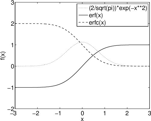
Notice that we chose the PNG format for our Web image files. As a rule, avoid using JPEG image-file formats for line drawings, because when bitmap compression is turned on (the usual case), the 8 × 8 discrete-cosine transformation of the JPEG compression algorithm fuzzes sharp edges, and near them, introduces unwanted artifacts that are easily visible under even modest magnification.
For the gnuplot system, you can get reasonable sizes as shown in this set of commands for plotting two trigonometric functions:
reset

set terminal postscript portrait enhanced monochrome "Helvetica-Bold" 14
set output "cossin.eps"

set xlabel "x"
set key off     # no legends!

PI = 3.141592653589793238462643383279503

set size ratio 0.5

set xrange [-3:3]
set xtics 1
set format x "%1.0f{/Symbol p}"
set xlabel "x"

set yrange [-1:1]
set ytics 0.5
set format y "%3.1f"
set ylabel "sin(x) and cos(x)"

plot sin(x*PI) with lines lw 3, cos(x*PI) with lines lw 3, 0 lw 1
The resulting plot looks like this:
For the maple system, the input file
plotsetup(ps,
          plotoptions=`
                           discont    = true,  \
                           resolution = 600,   \
                           adaptive   = true,  \
                           noborder,           \
                           color      = rgb,   \
                           width      = 300pt, \
                           height     = 300pt  \
                      `,
          plotoutput=`psi.eps`
        ):

plot
(
         [ Psi(x), GAMMA(x) ],
         x              = -5 .. 5,
         y              = -5 .. 5,
         labels         = [ "x", "" ],
         thickness      = [ 2, 4 ],
         title          = "Gamma(x) [thick blue dash] vs. psi(x) [thin red solid]",
         axesfont       = [ "HELVETICA", 10 ],
         labelfont      = [ "HELVETICA", 12 ],
         titlefont      = [ "HELVETICA", "BOLD", 15 ],
         linestyle      = [ "solid", "dashdot" ],
         scaling        = "unconstrained",
         color          = [ "Red", "Blue" ]
);
followed by an ImageMagick format conversion and image size report
$ convert -rotate 90 -trim psi.eps psi.png

$ identify psi.png
psi.png PNG 519x374 519x375+0+1 8-bit sRGB 34.9KB 0.000u 0:00.009
produces a plot like this:
The font sizes shown in the plot are not optimal, but the point here is to illustrate how to change them.
Controlling the aspect ratio, and figure rotation, in maple remain unsolved problems. It appears that both of the specified dimensions are ignored, because the bounding box dimensions are 375bp wide by 519bp high. Adding portrait to the comma-separated option list inside the backquoted plotoptions string changes the orientation to the desired upright, but the plot is then tall and narrow, which is likely to be unsuitable for inclusion as a figure in another publication.
Getting Greek letters and mathematical symbols into text strings with most of the illustrated programs is difficult or impossible. If you need that feature, it is better to leave the labeling to TeX, and use the LaTeX picture mode to make the label-positioning job easy:
\documentclass{article}

\usepackage{graphicx}

\begin{document}

\pagestyle{empty}        % suppress page numbering when preparing plot images

\begin{center}

    %% Choose an appropriate rescaling of the original figure,
    %% which has bounding box coordinates of 0 0 485 259.
    \setlength{\unitlength}{0.75bp}

    \begin{picture}(485, 259)(0, 0) % <- insert (width,height)(lower-left-x,lower-left-y)

    %% Mark the image box corners with large black dots

    \put (  0,   0) {\circle*{25}}
    \put (485,   0) {\circle*{25}}
    \put (485, 259) {\circle*{25}}
    \put (  0, 259) {\circle*{25}}

    %% Position the plot first so that our labels can overlay it.
    %% Notice that the scale factor matches our setting of \unitlength.

    \put (  0,   0) {\includegraphics[scale = 0.75]{cossin}}

    %% Mark the label origins with small black dots

    \put (200, 200) {\circle*{10}}
    \put (200, 150) {\circle*{10}}
    \put (200, 100) {\circle*{10}}

    %% Add left unboxed label.

    \put (200, 200) {\mbox{\small \itshape (200, 200) left}}

    %% Add right- and center-adjusted boxed labels.

    \put (200, 150) {\makebox[0in][r]{\framebox{\small \itshape (200, 150) right}}}
    \put (200, 100) {\makebox[0in]{\framebox{\small \itshape (200, 100) center}}}

    %% Demonstrate centered math text just above the figure.

    \put (242, 255) {\makebox[0in]{\framebox{\bf \boldmath
                    Plot of $ \sin( 2 \theta / \tau ) $ and
                            $ \cos( \theta / \pi) $:
                    Quiz: what are $ \tau $ and $ \theta $?}}}

    \end{picture}

\end{center}

\end{document}
This time, we manipulate the image by giving it a colored background when we do the conversion, because we want to emphasize the image boundaries.
$ convert -trim -transparent white -background skyblue figpos.pdf figpos.png
LaTeX then produces a plot like this:
If your browser does not show the colored background, then perhaps it has problems with bitmaps and transparency. The colored background is there when the image is displayed with some image viewers.
The result is somewhat cluttered, but the point here is to demonstrate how to place, and adjust, properly typeset labels in the prevailing document fonts at specified places in the image box, which differs here from the box formed by the axes. We use boxing around labels here to highlight the parts produced by LaTeX, but we would omit the label boxes in a plot intended for publication.
We note in the section Figure macros that internal TeX macros obtain figure size information that is then used for positioning and scaling. Regrettably, too many image-producing programs, especially those that create PostScript, EPS, or PDF output, either record incorrect image dimensions, or omit them entirely.
One solution is to supply the bounding box information in the macro that requests graphics inclusion, although the drawback is replication of that information each time the figure file is reused in other documents:
\includegraphics[bb = 71 32 271 332]{myfig}
The four values are the coordinates of the lower-left corner (71,32) and upper-right corner (271,332) of the smallest enclosing rectangle around the image that does not touch the image. The coordinate system is the standard left-handed Cartesian system with the origin (0,0) at the lower-left corner of the page.
If TeX dimension suffixes (bp cc cm dd in mm pc pt) are omitted on the bounding-box numbers, then units of the PostScript default of bp (big points, 72bp ≡ 1in ≡ 25.4mm) are assumed.
If the image file is PostScript, then the image dimensions are recorded in the first comment from the start of the file that looks like this:
%%BoundingBox: 71 32 271 332
The units are always bp: dimension suffixes are not supported. The numbers must be integers, not fractional values. If the true values are fractional, then the corner coordinates must be rounded away from the image.
Sometimes the bounding-box comment looks like this:
%%BoundingBox: (atend)
In that case, there should be a normal bounding-box comment close to the end of the file. If there are multiple such comments, the last one applies.
If the PostScript file is in ASCII (pure text) form, as is normally the case, then you can probably edit the file to correct, or supply, a %%BoundingBox comment. However, your text editor must be able to do that safely: the Unix vi editor cannot, because it rejects, or silently truncates, exceptionally long lines.
If the PostScript file contains binary data, it still begins with an ASCII header. The emacs editor can safely edit such files.
The Unix stream editor, sed, can also be easily used for the job if a bounding-box comment exists:
$ sed -e 's/^%%BoundingBox:.*$/%%BoundingBox: 71 32 271 332/' < infile > outfile
Recent versions of the GNU version of that editor can do the job in-place:
$ sed -i -e 's/^%%BoundingBox:.*$/%%BoundingBox: 71 32 271 332/' in-and-out-file
If your PostScript figure files are large, and have bounding box dimensions at the end, rather than at the beginning, of the file, then you can save considerable time in your TeX runs by moving the comment to the front, so that the PostScript file begins like this:
%!PS-Adobe
%%BoundingBox: 71 32 271 332
If the image file is a PDF file, then the bounding box is defined by a text fragment that looks like this:
/BBox     [0 0 612 792]
/CropBox  [0 0 612 792]
/MediaBox [0 0 612 792]
Those three commands may appear in any order, and some of them may be absent.
The PDF box dimensions are always in bp, and for compatibility with PostScript, should be integer values. The example here is typical in giving dimensions that correspond to US A-size (letter) paper: 8.5in (≡ 612bp) wide by 11in (≡ 792bp) high.
Although PDF files can be encoded entirely in ASCII, that is rare. You should always assume that PDF files contain a mixture of text and binary data. The emacs editor can handle such files, but only if you visit them with M-x find-file-literally.
If you do not know what the true bounding box is, then ghostscript can compute it for you so that you can add it manually:
$ gs -sDEVICE=bbox -dNOPAUSE myfile.ps quit.ps | grep BoundingBox
%%BoundingBox: 0 0 612 792
%%HiResBoundingBox: 0.000000 0.054000 611.999981 791.999976
The quit.ps file is automatically found in ghostscript's search path. The input file can be either PostScript or PDF.
Some systems, including all recent TeX Live releases, have the pdfcrop utility that can be used to repair faulty bounding boxes:
$ pdfcrop --help
... documentation omitted [regrettably, no manual pages are available] ...

$ pdfcrop --clip infile.pdf outfile.pdf
The pdfcrop utility runs gs behind the scenes, and all knowledge of PostScript and PDF is inside that program.
It is important to note that the bounding box in the PostScript or PDF file need not correspond to the actual image dimensions. You can make it somewhat larger to obtain a blank margin around the image, and you can make it smaller to clip out a small portion of the image.
If the image file is a bitmap format, such as BMP, GIF, JPEG, PNG, or TIFF, then you can use a utility from the ImageMagick software suite to find its width and height:
$ identify photo.jpg
photo.jpg JPEG 900x1200 900x1200+0+0 8-bit DirectClass 924kb
Image viewers, such as display and xv, can also usually report the image size in pixels, but you may have to hunt through their menus to find out how to do so.
Most image files, including those from digital cameras, have the origin (0,0) at the lower-left corner. The units, however, are pixels, which do not correspond to any particular physical size. Instead, you must relate them to the characteristics of the output device. Modern laser printers usually support resolutions of 300, 600, and 1200 dots/inch (dpi), so a pixel width of 900 corresponds to 3in, 1.5in, or 0.75in, and a pixel height of 1200 to 4in, 2in, or 1in. PostScript and PDF rasterizers can rescale bitmaps arbitrarily, but if the input pixels are not an integer multiple of the output pixels, the image must be resampled, with some deterioration in image quality. You should therefore be careful to preserve integer scaling factors when you include a bitmap image as a figure. For the sample file, we could use a LaTeX command like this to display the image without resampling on 300-, 600-, and 1200-dpi printers:
\includegraphics[bb = 0 0 3in 4in]{photo.jpg}
If you lack software that can compute accurate bounding boxes for PDF and PostScript figure files, it is possible to get them in a couple of other ways.
The first way is to prefix a copy of your PostScript file with the bb.ps file, and then display it on your screen, or print it:
$ cat bb.ps myfile.eps | gv -

$ cat bb.ps myfile.eps | lpr
The output contains a line of text above the figure showing the correct bounding-box comment that you can then add to the preamble of your figure file.
A second way is to print a dimensioned grid on transparency material in your printer, and then overlay it on figures printed on the same device. That is particularly useful if you want to select a rectangular subregion, without modifying the file. The grid file is bboxgrid.ps .
$ lpr -o MediaType=Transparency bboxgrid.ps

$ lpr myfile.eps
The options needed to select alternate output media are printer dependent: examine the output of the Unix command lpoptions -l to see what your printer expects. If you are sure of immediate printer access, you can just load the transparency sheet into the manual feed tray (transparencies are likely to jam, and even burn, when supplied from the normal paper trays), select manual feed on the printer control panel, and then issue a normal lpr command.
The reason for requiring use of the same printing device for both files is that the (0,0) point is rarely exactly at the lower-left paper corner. Even different instances of the same printer model may have slightly different origins, and for precise bounding-box selection, you need accuracy to at least 1bp.
Sadly, most programs that produce figures in PostScript or PDF format get the bounding box wrong. We showed earlier how to get accurate box dimensions for insertion in PostScript files, but most software for converting PostScript to PDF loses that critical information. Fortunately, there is one important tool that does not: TeX Live's epstopdf. Use it like this:
$ epstopdf infile.eps                           # produce infile.pdf

$ epstopdf infile.eps outfile.pdf               # produce outfile.pdf

$ epstopdf -o outfile.pdf infile.eps            # produce outfile.pdf

$ epstopdf --outfile outfile.pdf infile.eps     # produce outfile.pdf
Students sometimes have their theses rejected by the University Thesis Office because the text width and height are wrong. If the students have not changed LaTeX's \textheight or \textwidth length variables, then pages formatted by the uuthesis class should be correct. Investigation then shows that the student printed the file from a PDF viewer, such as acroread, evince, ghostview, gv, kpdf, okular, qpdfview, or xpdf. Some of those viewers have options in their Print menus to rescale the output, and they remember scaling settings from previous runs. You should therefore use a normal Unix lp or lpr command to print the entire file, or if you just want to print a portion of it from a PDF viewer, examine the Print panel carefully, and remove any previous scaling request.
When printing with Adobe Acrobat Reader, look for lines like these near the left middle of the Print panel:
Page Scaling: Fit to Printable Area

Page Scaling: Shrink to Printable Area

Page Scaling: Multiple Pages per Sheet

Page Scaling: Booklet Printing
Select the pull-down menu after the colon, and change the setting to
Page Scaling: None
With evince, check the menu-panel sequence Print → Page Setup → Scale: 100.0%.
The qpdf program provides another way to select pages for printing, although its syntax is a bit peculiar:
$ qpdf thesis.pdf --pages thesis.pdf 3-7,11,13 -- temp.pdf

$ lpr -r temp.pdf                           # delete file after queuing for printing
The gv program for viewing PDF and PostScript files allows you to select particular pages for printing by first marking them with the middle mouse button in the page-directory panel on the left side of the window, then selecting the menu-panel path File → Print Marked Pages.
If a sectional heading contains inline mathematics, you need to take special care to preserve a bold heading in the text, but a roman heading in the table of contents, because a TeX \bf or LaTeX \textbf command does not set mathematics text in boldface. You need two versions of the heading, encoded like this:
\section[The           $\Gamma$ function]
        {The \boldmath $\Gamma$ function}
The LaTeX \boldmath command must be placed before the math mode fragment, and applies to all following math-mode blocks in the current braced group. Here is an example:
\section[The           $ \Gamma $ and $ \psi $ functions]
        {\boldmath The $ \Gamma $ and $ \psi $ functions}
It was once common in English to hyphenate words beginning with the prefix non, and the Oxford English Dictionary still uses such hyphens extensively. However, modern American style manuals recommend dropping the hyphen, if it does not change the meaning. Thus, you should write nonincreasing, nonmonotonic, nonnegative, nonzero, and so on.
However, keep the hyphen after non in already-hyphenated phrases: non-diffusion-controlled reaction and non-heat-generating process. Retain it also before words that might lead to pronunciation confusion: non-ionic molecules and non-nuclear weapons.
Lyn Dupré, in her book Bugs in Writing , recommends use of an en-dash when that prefix is attached to a capitalized word, or to a phrase or hyphenated word, as in these examples: non--left-to-right scan, non--red-black ordering, non--English, non--Hermitian, and non--Monte Carlo. She gives this example where the hyphen (or here, an en-dash) changes the meaning:
The furry mass is a non–grizzly-bear creature.  % furry mass is not bear-like
The furry mass is a nongrizzly-bear creature.   % furry mass is bear-like, but not grizzly-like
However, the American Chemical Society and the American Mathematical Society use a normal hyphen between non and a capitalized word, such as non-Euclidean geometry. A dozen other style guides that I checked were silent on this topic. Thus, expert advice is mixed on this fine point of typography.
Many native speakers of English misuse reflexive pronouns, and the objective form of pronouns. Here are examples of the right and wrong way to use them:
Me and Bob did the work.                % WRONG
Bob and me did the work.                % WRONG
Bob and myself did the work.            % WRONG
Bob and I did the work.                 % correct

I myself did the work.                  % correct (emphasized, with stress on myself)
I did the work myself.                  % correct (unstressed)

As for myself, I have no opinion.       % WRONG
As for me, I have no opinion.           % correct

I gave the book to himself.             % WRONG (unless you are writing Irish dialect)
I gave the book to hisself.             % WRONG
I gave the book to him.                 % correct

She gave the book to myself.            % WRONG
She gave the book to me.                % correct
Avoid self words in most technical writing, except in phrases like self-correcting algorithm and We hold these truths to be self evident, that all men are created equal, ....
In scientific writing, write with the present and past tense, but avoid the future tense, because it is usually superfluous, and won't be `future' by the time your reader encounters it. Thus, construct input like this:
Planck showed in 1900 that radiation is not
a continuous stream, but rather, is omitted
in tiny bundles that he called quanta.

In Chapter 3, we show how Planck                % not: will show
derived his famous radiation formula.
For technical writing, you can probably eliminate the words shall and will from your vocabulary.
Those words are appropriate, however, if you wish to emphasize a statement:
We will complete the research in one year.      % correct: promise of completion date

Students shall complete their exams in March.   % correct: requirement for completion

The judge said:
``You shall serve three years in prison.''      % correct: legal requirement
In wishes, and in conditional clauses where the condition is uncertain, English grammar calls for the subjunctive mood of verbs:
I wish I were in New York City, so that I could attend a Broadway play.

She could pass her examinations, if her concentration were better.
The commonest words in Western European languages are words that are almost unnoticeable, until they are missing, whereupon their absence disturbs understanding by native speakers. Those words are called articles, and in English, they are the words a, an, and the. The first two are called indefinite articles, because they indicate one of several possible objects, when the distinction between them is unimportant. The last is the definite article that indicates a particular object.
Many human languages lack the concept of articles: most notably, the Slavic languages (Byelorussian, Croatian, Czech, Polish, Russian, Serbian, Slovenian, Ukrainian, …), and languages of the Far East (Chinese, Japanese, Korean, …). Native speakers of those languages often find it difficult to remember just when to use articles in Western European languages, and so must take special care in writing to put them in when they are required, and omit them when they are not. Thus, if your native language is one of those without articles, you are advised to have the assistance of a proofreader who is a competent speaker of the language that you are writing in.
The importance of those little words is illustrated by an anecdote related by the Nobel Prize-winning mathematician, philosopher, and peace activist, Bertrand Russell, who co-wrote a famous book of hieroglyphics in mathematical logic, called Principia Mathematica. Russell was one day visiting his co-author, Alfred North Whitehead, with whom he had worked closely for years on their great triumph in logic. He noticed on the table a bowl of fruit containing several oranges, and a single apple, and feeling hungry, asked: Whitehead, may I have an apple?. Whitehead glanced quickly at the bowl, and retorted No!. Russell felt somewhat hurt, until he looked again at the bowl, and rephrased his question: May I have the apple?. The response was immediate: Yes!. Russell's use of the indefinite article a was incorrect, because it implied that there were several apples to choose from. Switching to the definite article, the, repaired his grammar, satisfied Whitehead's need for rigor, and relieved Russell's hunger.
Be careful with qualifying adjectives applied to countable collections of things. Fewer means a reduction in the number of objects, whereas less means a reduction in the amount.
There are few apples on the tree.               # never less apples
There are many apples on the tree.

There are fewer than five apples on the tree.   # never less than
There are more than five apples on the tree.
By contrast, when the collections are not countable, or at least are impractical to count, different qualifiers are appropriate:
There is little wheat in this year's harvest.
There is much barley in this year's harvest.

There is less wheat in this year's harvest than in last year's.
There is more barley in this year's harvest than in last year's.

There is much water in the reservoir this season.
Use this and these to prefer to following material, and that and those to preceding material.
In this equation, $ E = m c^2 $, the left-hand side is the
energy equivalent to a mass $ m $.  That equation was first
discovered by Albert Einstein in the Fall of 1905.

Some car manufacturers --- Chrysler, Ford, and GM ---
originated in Detroit. Those brand names are widely known
throughout the world.  These others --- Hupmobile, LaSalle,
and Maruti --- are likely to be unfamiliar to most car buyers.
The two words then and than sound similar enough when spoken that writers sometimes mix them. Be sure to use them correctly, as in these examples:
I am taller than Bill is.           % than is a comparative

If she fails, then she must         % then indicates a condition or time
repeat the exam next month.
Spoken English frequently omits then and that in text like this:
If I delay lunch, I'll be hungry.

The house Jill built is solid.
Those omissions can cause reader confusion, so restore them, and for technical writing, eliminate all contractions:
If I delay lunch, then I will be hungry.

The house that Jill built is solid.
The two words because and since are often used interchangeably in spoken English when they indicate a reason. However, in technical writing, they have distinct meanings:
Because the professor was late to class, we left.  % reason for action

Quantum phenomena have been studied since 1900.    % reference to time
Two English words that begin relative clauses are frequently confused by speakers and writers, and that confusion extends to their listeners and readers:
The equation that Einstein           % restrictive relative clause takes
discovered in 1905 changed           % that with no commas
history.

The equation $ E = m c^2 $,
which Einstein discovered in 1905,   % nonrestrictive relative clauses takes
changed history.                     % which with surrounding commas
TeX's author, Donald Knuth, gets the credit for the phrase wicked whiches.
I recently examined some book files, both modern technical ones, and 19th-Century novels, and found that the word that occurs six to eight times more often than which.
Representation of computer input and output in typeset documents is best done with a font in which all characters, including space and punctuation, have identical widths. Such a font is called a fixed-width, monospaced, or typewriter font (even though some typewriters supported typing with characters of different widths).
Plain TeX does not provide any standard mechanism for typesetting such material, but it does discuss how to do so as an exercise, for which a solution can be found in an appendix of the TeXbook.
LaTeX provides four standard ways of handling verbatim input:
This text is typeset verbatim: \verb|\verb is a command|.

This text is typeset verbatim with visible spaces:
\verb*|\verb is a command|.

\begin{verbatim}
This is verbatim input: ! @ # $ ^ & * ( ) - + | ~

It may continue for arbitrarily many lines.
\end{verbatim}

\begin{verbatim*}
This is verbatim input where all spaces are
visible: ! @ # $ ^ & * ( ) - + | ~

It may continue for arbitrarily many lines.
\end{verbatim*}
When TeX processes verbatim text, it enters an abnormal world where control words, control sequences, math mode, and comments are absent. All input characters are typeset in a fixed-width font with their standard ASCII character set glyphs. Line breaks are preserved, and automatic hyphenation is suppressed. Horizontal and vertical spaces are preserved exactly as typed, instead of being collapsed into a single space, as happens in normal prose. An ASCII horizontal tab is converted to a single space.
There are only three possible escapes from that peculiar world:
LaTeX reaches end of input and reports an error; or
LaTeX sees a delimiter identical to that following the leading \verb or \verb* command; or
after a \begin{verbatim}, LaTeX sees the exact string \end{verbatim} (ditto for the starred pair). Those two commands are usually on separate lines, but they also work when coded compactly, like this:
\begin{verbatim}this is verbatim text\end{verbatim}
That processing model means that it is impossible to get macros expanded inside verbatim text, because backslash, braces, and other characters that normally have some special meaning for TeX lose that significance, and simply represent themselves. Thus, once you begin a verbatim string or environment, you cannot change font size, font style, font weight, text color, produce index entries, or do anything else that could be done in TeX by invoking a macro. If you really do need such features, then look at the documentation of the fancyvrb package.
When TeX collects a braced argument for a macro, it is in yet another world where special things happen, and where verbatim text cannot appear. So, how do you get such text into a macro argument, such as for a sectional heading, or a caption?
The answer is tricky: you must mark up the verbatim mode input as if it were set in a typewriter font (\texttt{...} or {\tt ...}), and for each of the 10 characters that are normally special for TeX (& $ # % _ { } ^ ~ \), represent them as backquote-backslash escape sequences:
%% I want to write
%% \section{Verbatim stuff: \verb|^_{}$%\|}
%% but verbatim text cannot appear in macro arguments.
%% Instead, I must write it like this:
\section{Verbatim stuff: \texttt{\char`\^\char`\_\char`\{\char`\}\char`\$\char`\%\char`\\}}

%% The output should look like this, with the material
%% before the caret set in a bold roman font, and the
%% remainder in a typewriter font
Verbatim stuff: ^_{}$%\
TeX was designed more than a decade before the World-Wide Web existed, and consequently, there was no need foreseen at the time for typesetting of sometimes rather long, and difficult-to-break, strings of verbatim text, such as the kinds listed in our section heading.
Fortunately, TeX's programmability, plus its ability to change the meaning (TeX's category codes) of individual characters, have made it possible to write macros that do the job, and guarantee correct output, including output that contains hyphenless line breaks at user-specifiable characters. The first of them, the path package, was written in 1992 at the instigation of the author of this document. It lets you write text for both TeX and LaTeX in a similar manner to the LaTeX verb|...| command:
\usepackage{path}   % in top-level preamble [between \documentclass{} and \begin{document}]
...
Write to me at \path|beebe@math.utah.edu|,
or visit my home page at \path=http://www.math.utah.edu/~beebe=.
One of the recent versions of TeX is stored in our local
filesystem in the file
\path+/usr/local/texlive/2017/bin/sparc-solaris/tex+.
The leading comments in the path.sty file document the package, and show how you can change the characters after which line breaks are permitted. For most users, the default break set is perfectly acceptable.
Four years later, when a PDF-producing variant of TeX was being developed as a Ph.D. research project in the Czech Republic, it became desirable to add support for getting active hypertext links from TeX input into the PDF output. Such links are not feasible with the normal TeX-to-DVI-to-PostScript-to-PDF route, because only the last of those worlds has any notion of a hypertext link. The url package works much like the path package, except that its arguments may also be brace-delimited. The previous example could then be coded as before, just by replacing path by url, or by using the latter with braced arguments, like this:
\usepackage{url}   % in top-level preamble [between \documentclass{} and \begin{document}]
...
Write to me at \url{beebe@math.utah.edu},
or visit my home page at \url=http://www.math.utah.edu/~beebe=.
One of the recent versions of TeX is stored in our local
filesystem in the file
\url|/usr/local/texlive/2017/bin/sparc-solaris/tex|.
Both packages allow you to change the typewriter font. One nice alternative to the standard Computer Modern fixed-width font is that provided by the luximono package: its characters are clear, highly legible, and somewhat narrower than the default. As a result, you can have several more characters per line, which is often useful for typesetting computer input and computer output. You can select it with this preamble command:
\usepackage[scaled]{luximono}
In other sections of this document, we discussed use of PostScript for typeset output, and for included figures. Encapsulated PostScript (EPS) is a subset of the full PostScript language, and Adobe Systems provide an informal specification of EPS in Appendix H of the second edition (1990) of the PostScript Language Reference Manual . Alas, the third edition (1999) drops most mentions of EPS.
A language subset is needed for figure inclusions because it must be possible to control the placement, rotation, and scaling of an inserted figure. Certain PostScript operators prevent such actions by changing the graphics environment, or referring to absolute page positions, or changing the page-transformation matrices.
An EPS file should be displayable on a single printed page, and in order to be itself printable, it must contain the PostScript showpage command, which has the effect of finishing off the rasterization, and sending the page image to the print engine. It would be unpleasant to have to comment out, or remove, the showpage commands, so Adobe Systems recommend that software that includes EPS figures should provide a temporary redefinition of that operator to make it do nothing, then restore the original definition after the file has been included.
Here is a list of PostScript commands that are forbidden in EPS files at PostScript language-level 2:
banddevice              initgraphics            setdevice
copypage                initmatrix              setmatrix
erasepage               note                    setpageparams
exitserver              nulldevice              setsccbatch
framedevice             quit                    setscreen
grestoreall             renderbands             settransfer
initclip
Here is an extended list that applies to EPS files at PostScript language-level 3:
banddevice              nulldevice              setoverprint
clear                   quit                    setpagedevice
cleardictstack          renderbands             setscreen
copypage                setblackgeneration      setshared
erasepage               setcolorrendering       setsmoothness
executive               setcolorscreen          settransfer
exitserver              setcolortransfer        setundercolorremoval
framedevice             setflat                 startjob
grestoreall             setglobal               statusdict
initclip                setgstate               undefinefont
initgraphics            sethalftone             undefineresource
initmatrix              setmatrix               userdict
If any of those operators is present in your PostScript figure file, then it is likely that the figure will appear at an incorrect page location, or in the wrong size or rotation, or even disappear off the page entirely. Sadly, far too many PostScript-figure-producing programs use those forbidden operators, even though they should never be necessary in such applications.
The FIND-BAD-POSTSCRIPT script searches PostScript files for the forbidden operators.
If your attempt to include a particular PostScript figure file in your document fails as described, there are a couple of things that you can do.
The first is to print the figure and then scan it as an image file. That is rarely a good thing to do, because the new file is likely to be much bigger, and has lost image and color quality, and importantly, text searchability. Nevertheless, it may be the only solution for particularly egregious PostScript files.
The second is to convert the PostScript file to a PDF file, and then back to a PostScript file. The simplification forced by the PDF representation may remove the forbidden operators. There will be some reduction in image quality under magnification, because smooth curves have been reduced to sequences of tiny line segments, but color quality and text searchability should be identical to that of the original file. If the PostScript file contains a bitmap image, then the image may deteriorate due to rescaling or to downsampling; fortunately, the tools have command-line options to control those actions. Here are commands to do the conversion in three different ways:
# Round-trip conversion with Adobe Acrobat tools:
# [change -level2 to -level3 for possibly more compact output,
# at the risk of not being usable on older PostScript printers]

$ cp      myfile.ps myfile.ps.save
$ distill myfile.ps
$ acroread -toPostScript -level2 myfile.pdf myfile.eps


# Round-trip conversion with ImageMagick tools (they interface
# to ghostscript):

$ cp      myfile.ps  myfile.ps.save
$ convert myfile.ps  myfile.pdf
$ convert myfile.pdf myfile.eps


# Round-trip conversion with ghostscript tools

$ cp      myfile.ps  myfile.ps.save
$ ps2pdf  myfile.ps  myfile.pdf
$ pdf2ps  myfile.pdf myfile.eps
Some of our systems have an additional PostScript-to-PDF conversion tool based on an entirely independent software development project. Here is how you can use it as an alternative to the distill, convert, and ps2pdf programs:
$ pstill -o myfile.pdf myfile.pdf

$ pstill -H | less                 # to view its built-in help information
The pstill program has many options that modify its behavior, and you might find it worthwhile to experiment with some of them during your file-conversion efforts.
In each case, the bounding box information is likely to have been corrupted, or lost, and you then have to supply a correct bounding box in the output myfile.eps file. It is truly deplorable that almost 40 years after the birth of PostScript, and almost 30 years after that of PDF, there appear to be no tools that can automate the conversion to EPS without loss of information in the figure or its bounding box. Also, there is a bug in the Unix version of distill that sometimes produces output that has been rotated by 90 degrees. This author documented all of the Adobe Systems tools in Unix manual pages, and donated them to that vendor. He also reported the rotation bug to the vendor long ago, and supplied test input files that differ by a single comment character: one output file gets rotated, and the other does not. Sadly, Adobe Systems has not shipped any new PostScript or PDF software on platforms other than those from Apple and Microsoft, so the bug remains.
It is even more annoying here at the University of Utah, because the roots of PostScript and PDF are in our own Department of Mathematics, Department of Electrical Engineering, and School of Computing!
Typewriters traditionally offered only two kinds of quoting marks: a (usually upright) apostrophe ('), and the upright quotation mark ("). However, traditional English typography has long had variants of those, with open (66-like) and closed (99-like) double and single quotation marks, and a sometimes separate glyph shape for the apostrophe. The ASCII character set that is prevalent on computer keyboards has only the original two, plus a backquote (`).
Some continental European languages employ different quoting styles. For example, German lowers the open delimiter, and uses the English open delimiter as its close delimiter, so that input reads Die ,,Klassische Philologie``. French traditionally uses the guillemet pair with the points outward, and padding space, as in La « philogogie classique ». Other European languages use the guillemets, but some point them inward, and their spacing conventions may differ from the French ones. In Germany, guillemets (Gänsefußchen — goosefeet) point inward, but in the German-speaking parts of Switzerland, they point outward. All of them have both double and single forms of the guillemets. Some languages, including German and French, also use conventional English-style quotation marks. The Unicode character set provides hundreds of special symbols, including several that serve in various languages for marking text that has been imported from another source. To add to the complexity, some of the glyphs used for quoting text have also been usurped for use as accents on letters, usually above them, but also sometimes before, after, or under the letters.
PostScript fonts contain the guillemets, but through an unfortunate mistake, they were named guillemots, which is the French name for a particular seabird! [The two words have the same etymology in French.] The mistake is now encoded in probably tens of millions of printers, and billions of computers, so it can never be rectified.
French typographical practice with guillemets in long quotations is unusual in that it repeats the open delimiter on each line, but not the close delimiter:
Alexandre Dumas' famous four-volume novel Le Comte de Monte Cristo begins:
« Le 24 février 1815, la vigie de Notre-Dame de la Garde
« signala le trois-mâts le Pharaon, venant de Smyrne, Trieste
« et Naples.
«
« Comme d'habitude, un pilote côtier partit aussitôt du port,
« rasa le château d'If, et alla aborder le navire entre le cap
« de Morgion et l'île de Rion.
«
« Aussitôt, comme d'habitude encore, la plate-forme du fort
« Saint-Jean s'était couverte de curieux; car c'est toujours
« une grande affaire à Marseille que l'arrivée d'un bâtiment,
« surtout quand ce bâtiment, comme le Pharaon, a été
« construit, gréé, arrimé sur les chantiers de la vieille
« Phocée, et appartient à un armateur de la ville. »
That short passage also shows how critical accented characters are in some languages: there are 194 vowels without accents, and 19 with accents.
The worldwide character-set mess resulted in hundreds of keyboard mappings and character subsets. The needs of several European languages for additional letters, and accented letters, sometimes led to replacement of standard ASCII characters, such as braces and brackets, with letters, making for dreadful-looking TeX files and computer programs.
The Unicode Consortium was formed in the early 1990s to solve that problem, for all of the world's languages that have writing systems in long use. It even includes George Bernard Shaw's Shavian alphabet, and Utah's own Deseret alphabet. However, proposals to include Klingon have so far been resisted, because that language may have originated on another planet, and is spoken only by small numbers of Star Trekkies on Planet Earth.
Unfortunately, handing keyboard users a larger character-set repertoire, particularly when apparently identical glyphs are assigned different positions in the character set, dramatically widens the scope for coding errors. A brief examination of Web pages written with just a few Unicode characters beyond those needed for ASCII (the first 128 positions in Unicode) soon uncovers misused glyphs, and the problem is almost certain to get much worse in the future.
As an example, several English letters have the same shape in Latin, Greek, and Cyrillic alphabets, so what looks like a familiar string to you, IBM.COM, could in fact be written in Greek, Cyrillic, and any combination of the three alphabets, and thereby masquerade as the Internet address of a legitimate business. [The letter C is not part of the traditional Greek alphabet, but is sometimes used in northern Greece in place of the normal uppercase Sigma, Σ].
TeX was designed about 15 years before Unicode, and had to address the issue of quotation marks and accents within the limitations of ASCII keyboards. At the time, MIT and Stanford both had unique extended computer keyboards, different from each other, and from those elsewhere in the computer world, and the Stanford extensions affected some of the character choices in TeX.
The trouble spots for TeX users are the English-language quotation marks and apostrophe. They are perfectly fine in verbatim mode, and are set as they appear on the keyboard. However, in normal typeset text, the upright apostrophe is typeset as a 9-like raised glyph, and ASCII quotation marks should never appear: instead, code your input like this: ``Well!'', he said. If quotes are nested, you can use a thin space (\,) to separate the marks: She wrote: `\,``Well!'', he said'.
If your TeX document contains no verbatim modes or environments, then the ASCII quotation-mark character " should be entirely absent, except possibly in comments. You can then easily check for such mistakes with a search command like one of these:
$ grep '"' *.ltx *.tex *.sty

$ grep \"  *.ltx *.tex *.sty
When Donald Knuth designed TeX, he soon found that acquiring suitable fonts for its output was a huge problem, because they were output-device-specific, licensed, proprietary, and in the case of some typesetter vendors, it was impossible to get the font glyph dimensions that are needed to set type! Consequently, he diverted from work in TeX to developing the Metafont system for font design. Metafont is a technological marvel that deserves to be used much more, but font design is a difficult task that only a few dozen people on Earth seem to be capable of. As a result, the Computer Modern family that Donald Knuth designed to match the Monotype Modern 8A family that was used in earlier editions of his books is often the only one that (La)TeX users see. That is a great shame, because there are more than 20,000 different fonts on the market, most of them specialized display fonts for advertising, but among them are certainly a few hundred families that are perfectly fine for typesetting prose. For a catalog of commercial fonts, see the book Precision type font reference guide .
The problem for plain TeX users is that the low-level macros for font selection are just that: low level! You write something like \font \mytt = Courier at 10pt to get a typical size of a popular typewriter font, and then discover in your output that some of its glyphs are in unexpected locations, making your output wrong. [This author knows of at least one published book where a mismatch between author fonts and typesetter fonts riddled it with errors.] The plain TeX user also does not have generic font-independent commands for resizing text as tiny, footnote size, normal size, large, and so on. Too much knowledge about fonts is hardcoded inside TeX, so it is impractical to handle glyph remapping and glyph-combining (as for accents) in TeX itself. Knuth's virtual font idea in 1990 made such actions possible at the font level, but still requires support from every DVI output driver.
LaTeX provides a reasonable solution to the font resizing problem with its commands \tiny, \footnotesize, \normalsize, and so on. However, the real problem for (La)TeX users who need mathematical typesetting is that there is a distinct lack of math fonts that provide a satisfactory match with text fonts in style, weight, and color (visual density, not rainbow hues). In addition, Computer Modern has a relatively large repertoire of mathematical glyphs that may be unavailable in math fonts from other font vendors, and you are then out of luck if you need those glyphs in your document.
For those of you who would like to try alternate font families in your documents, try adding one of these to your LaTeX preamble:
\usepackage{bookman}
\usepackage{concrete}
\usepackage{fourier}
\usepackage{lmodern}
\usepackage{lucidbrb}   % needs extra fonts
\usepackage{mathpazo}
\usepackage{mathtime}   % see Mathematics Department systems staff for instructions
\usepackage{newcent}
\usepackage{tgadventor} % TeX Gyre, with enhanced math support, resembling URW Gothic L
\usepackage{tgbonum}    % TeX Gyre, with enhanced math support, resembling URW Bookman L
\usepackage{tgcursor}   % TeX Gyre, with enhanced math support, resembling Nimbus Mono L
\usepackage{tgheros}    % TeX Gyre, with enhanced math support, resembling Nimbus Sans L
\usepackage{tgpagella}  % TeX Gyre, with enhanced math support, resembling URW Palladio L
\usepackage{tgschola}   % TeX Gyre, with enhanced math support, resembling Century Schoolbook L
\usepackage{tgtermes}   % TeX Gyre, with enhanced math support, resembling Nimbus Roman No9 L
\usepackage{times}
Elsewhere in this document, we make numerous references to the tex, pdftex, latex, and pdflatex programs. For special typesetting needs, there have been two important developments, both first announced in 2005, that modify TeX itself to produce new programs with greater capabilities: Jonathan Kew's XeTeX, and Hans Hagen's and Taco Hoekwater's LuaTeX.
The first extends TeX by removing its native handling of fonts, and pushing that job to a lower level in an operating-system-dependent layer of font machinery. With that change, in XeTeX, you can use in your (La)TeX documents any named font known to your operating system, without worrying about having to create font glyph-map files, font name-map files, virtual-font files, or anything else that is font related. You can mix left-to-right text that is typical of most European languages with the right-to-left text of the Semitic languages (Arabic, Aramaic, Hebrew, Maltese, ...), Persian, and Urdu, as well as using vertically displayed oriental languages (Chinese, Japanese, and Korean) in the layout styles traditional in literary texts. Those languages normally switch to left-to-right typesetting for technical text. Vertically aligned text in those three language families is set with the columns displayed from right to left. Mongolian also uses vertical alignment, but text columns are displayed from left to right. With right-to-left text display, you place a book with the binding on the right before opening it to begin reading. Curiously, in the right-to-left languages, embedded numbers and mathematics are often typeset from left to right!
LuaTeX does something entirely different: it grafts onto TeX a small, clean, and powerful scripting language, Lua, developed by Brazilian computer scientists in the mid-1990s. Lua is unusual in providing for bidirectional communication with its host language, so TeX can call Lua, and Lua can call back to TeX. The authors of LuaTeX are gradually replacing the hard-coded parts of TeX that were previously inaccessible to TeX users, such as much of the machinery of font handling, line breaking, and page breaking, with Lua-coded equivalents that are now accessible to the LuaTeX user.
One of the great strengths of TeX since its inception is its guarantee of identical typesetting results on all platforms, from mobile devices to microcomputers to supercomputers. XeTeX loses that, because line breaking now depends on string-width results returned by the font machinery in the operating system. The reason for part of the complexity of the problem is that Arabic traditionally achieves text justification by stretching and reshaping glyphs in words, rather than by stretching spaces between words. That means that a single letter may have many different forms in any one document, and those forms must be generated on-the-fly, rather than being precomputed and stored in fixed font files. Some of the languages of India have additional complexity of rearranging, and sometimes, reshaping, letters in words. Neither of those requirements is supportable by standard TeX, because it has always assumed that glyphs have constant dimensions that can be found in font files, and that words are constructed as consecutive sequences of glyphs that match their input order, after which, line-breaking and page-breaking can be done by optimizing the spacing between word boxes.
LuaTeX can also introduce platform dependence, because Lua uses floating-point arithmetic, and even though that arithmetic is largely standardized by the IEEE 754 Standards of 1984 and 2008, there are still dark corners of the specifications where implementors are allowed slightly different behavior to help them optimize their designs.
Except in the area of multilingual typesetting, such as might be required for a dissertation in a Department of Linguistics, XeTeX is likely to be of interest primarily for its extended font support. It is still hard to predict to what extent users will be interested in experimenting with new ideas in typography inside LuaTeX.
When humans create data in a computer, it is often important to maintain a development history. You can use it to record the reasons for making changes, as well as to take frequent snapshots of your work so that you can recover from editing disasters, or simply change your mind, backtrack to an earlier version, and start off in a different development direction.
Fortunately, several good, and generally quite portable and stable, systems for doing so exist. They include cvs, git, hg, rcs, sccs, and svn. Most of them were designed to allow distributed authors and software developers to work on files stored in a common data repository somewhere on the Internet. As such, issues of Internet file transfer, and permission and access control, add to the management, and also user, complexity.
However, one of the oldest of them, the Revision Control System (RCS), is geared towards use on a single computer, or a set of computers sharing a common filesystem, such as the facilities of a small organization. You only need to learn four RCS commands to use it effectively: ci (check-in a file to the repository), co (check-out a file from the repository), rcsdiff (compare different file versions), and rlog (examine change log history). A fifth command, rcs, allows you to manage the repository, but most users never need to invoke it.
You can find a brief tutorial on RCS at roughly question 21 in our Files FAQ (frequently asked questions) pages in the section How can I keep a history of file changes?
The version control systems store differences, rather than complete files for each version. One of this author's most frequently edited files is the bibliography of Albert Einstein's work and its influences: after more than 750 versions, the RCS file is only 1.37 times larger than the latest edition. Thus, file storage requirements for version control are modest.
Many authors who use computers for writing do their work entirely at the keyboard, rather than working first on paper. That means that before files have been backed up, data loss from either a hardware failure, or an editing disaster, is catastrophic, because there is then no record of their writing.
It therefore makes sense when you begin a writing project to check-in initial versions of every human-created file related to your project, including your Makefile, all of your figure files, and any other files needed to generate those figures. There is no need to do that for output files, such as DVI and PDF files, as long as they are easy to regenerate by a computer program. Then, at suitable intervals — at least once, but preferably several times, a day — check-in all of the recently changed files. You can easily find them on a Unix system like this:
$ find . -mtime  -1 -type f         # find files less than one day old

$ find . -mmin -120 -type f         # find files less than two hours old
The files and the RCS repository should be backed up as well, to at least one more computer with an independent filesystem and electrical-power source, or to a detachable storage device, like a USB thumb drive, or to a reliable remote cloud storage facility. The University of Utah provides several possibilities for remote storage: see http://it.utah.edu/services/cloud/ . Well-run computer facilities, such as we believe ours to be, provide reliable storage with nightly backups and snapshots , but for an intense writing project, shorter backup intervals are important.
Interestingly, at least one Unix filesystem design, Hammer on DragonFlyBSD, provides automatic snapshotting of file changes every few minutes, and its undo command has options for comparing pairs of versions, and recovering any particular snapshot.
We describe elsewhere in this document why hypertext links cannot be supported in traditional TeX, because there is no easy way to pass them along the format conversion chain that begins with DVI output.
The extended TeX programs that produce PDF output directly, such as pdftex, pdflatex, and xetex, have full support for hypertext links, and other PDF features, such as transparency, and multimedia embedding.
Those PDF-producing programs are no longer under active development, have been stable and reliable for several years, and are in daily use at many sites around the world, including at the production shops of several major book and journal publishers. There is therefore no reason now to avoid them for fear of software instability or introduction of incompatible changes, and because the Web and the Internet have become so much a part of the lives of much of humanity, it makes sense to try to exploit the extensions made possible with PDF output.
For LaTeX users, it is easy to get active hypertext links into a PDF file: just add this command to the document preamble:
\usepackage{hyperref} % must ALMOST ALWAYS be the last package loaded!!!!!
The hyperref package is one of the few LaTeX packages where the package-loading order matters. It almost always comes last, because it does its magic by redefining large numbers of standard LaTeX commands to make them produce hypertext links in the output PDF file. With that package, many typographical objects become user-selectable links, including entries in the table of contents, lists of figures and tables, and index. The same is true of text references generated by \pageref{...} and \ref{...} commands.
When you wish to emphasize a phrase in prose, the correct way to do so is with \emph{...}. In normal prose set in a roman font, the emphasized text is usually in an italic font. However, if the surrounding prose is in some other font, then the font of the emphasized text is different. Avoid use of \textit{...} of {\it ...} when you really mean \emph{...}!
In some fields, certain phrases or proper names are conventionally emphasized in prose. If you have such names, consider marking them up in your input according to what they are, rather than how they might look. For example, a document in biology-related fields might have in the preamble or private style file the definition
\newcommand{\bioname}[1]{\emph{#1}}
Later in the document, the author would then write \bioname{Escherichia coli} in the first instance, and \bioname{E. coli} in later uses.
Use of new document- or subject-specific markup is particularly useful if you later decide to create an index for your document, because you can then have your private macro generate suitable \index{...} commands to record all uses of that special text.
The LaTeX \newcommand and \newenvironment commands are useful when you want to ensure consistent typesetting of particular phrases or displays. If you do so, prefix them with some commentary that explains how, and why, they are used.
However, it is an extremely bad idea to introduce synonyms for standard LaTeX commands, such as
\newcommand{\be}{\begin{equation}}
\newcommand{\ee}{\end{equation}}
because your abbreviations are likely gobbledygook to anyone else, particular the production staff at your journal or book publisher.
Most publishing houses have well-established automated procedures for dealing with author-submitted LaTeX documents, and they often translate those documents to other markup systems, such as SGML or XML. When your LaTeX documents use standard markup, the translations should be automatic and trouble free. However, as soon as you introduce new markup, it may force the production staff to patch your text to make it through their translators. They are often under severe time and economic pressure, and may be more likely to make mistakes in that work than you would. They may also have less interest than you should have in producing correct typeset output.
Especially in bibliographic work, but also in scholarly prose in some fields, it is common to encounter text in a foreign language. Unless your readers all know that language, it is of doubtful utility to cite it unless you also provide a translation into your main document language. In the past, even if you had a bilingual dictionary for that language and yours, translation was a tedious, and often difficult, process, unless you yourself happen to know both languages.
There are now freely available computer-generated translation services, among them Google Translate and Microsoft Translator . They allow you to specify input and output languages, and supply a block of text to be translated. You can even ask them to guess the input language, if you supply enough input text. Translation quality varies, and is unlikely to be acceptable for translation into a language that you do not know well, or at all, but for translation to your own language, the computer output can often be quickly edited into acceptable form, and more quickly than you could type a translation yourself if you also knew the input language.
We recently added a command-line interface, trans, to several translation services, and here are some examples of its use:
# Get help on its options
        % trans --help

# Translate the title of a Carlos Santana song:
        % trans 'Oye como va'
        Oye como va

        Hey, how is it going

        Translations of Oye como va
        [ Español -> English ]

        Oye como va
            Hey, how is it going, Hey hows it going, Oye como va

# List the translation engines:

        % trans -S
        * google
          bing
          apertium
          yandex

# The starred one is the default, and the currently most sophisticated.

# List the supported human languages:

        % trans -R
        [long list of 119 languages, including Chinese, Japanese,
        Korean, Greek, Russian, Swahili, Hindi, ...]

# Translate from Danish to English:

        % trans da:en 'rød grød med fløde'
        Red porridge with cream

        Translations of rødgrød med fløde
        [ Dansk -> English ]

        rødgrød med fløde
            Red porridge with cream, Red porridge with cream, rødgrød with cream

# Translate a headline from the Süddeutsche Zeitung newspaper in Munich:

        % trans 'Türkei greift in den Kampf um Mossul ein - gegen den Willen des Irak'
        Turkey engages in the battle for Mosul a - against the will of Iraq
        ... remainder omitted ...

# Add the -p option to play a sound reproduction of the input and output.

# Add the -b option for a brief translation, without supplementary
# material, such as these dictionary lookups of a technical phrase:

        % trans -b :fr 'cotter pin'
        goupille

        % trans -b :da 'cotter pin'
        splitten

        % trans -b :de 'cotter pin'
        Splint

# Use the "-i filename"  option to translate the contents of a file.
The translation technology is based on automated understanding of texts produced by human translators for pairs of languages, rather than on grammar rules and dictionaries of words. It is far from perfect, but it does make it possible to quickly get a reasonable overview of a text in a language that you don't understand yourself.
Another useful application of trans is translation of foreign-language titles in bibliographies. For example, following the practice of the AMS and SIAM, this author has long made a habit of including such translations in BibTeX entries, like this:
@Article{...,
  ...
  title =        "{Diesseits der Pragmatik: Gedanken zu einer
                 Funktionsbestimmung der hermeneutischen
                 Wissenschaften}. ({German}) [On this side of
                 pragmatics: Thoughts on a functional determination of
                 the hermeneutic sciences]",
  ...
  language =     "German",
}
Human language is often ambiguous, and difficult to translate correctly. The innocuous Danish phrase frugt flyver som en banan becomes the curious English fruit flies like a banana, and in the reverse direction, Ask Miss Jensen if she'll wait a little might be literally translated as Spørg frøken Jensen, om hun venter en lille, which inquires if she is pregnant. Thus, caveat interpres (translator beware).